Pupilica
Pupilica is a specialized digital learning platform that brings together Softtech's technological leadership and Koç University's educational leadership with the belief of 'taking from Anatolia and giving back to Anatolia.' It focuses on learning and exploration.Pupilica, born with the goal of promoting educational equity, offers a wide range of completely free courses spanning from software to innovation, and from social skills to leadership. The platform aims to encourage learning by providing students with the opportunity to discover their potential, striving to deliver the most effective and personalized learning experience.




Target
We created the visual language of Pupilica, aiming to be a digital learning center that prepares individuals for the future, inspires, and adds value to society. We began by defining brand strategy and name studies with a modern perspective. Strengthening its visual identity, we established coherence not only through the logo and corporate identity studies but also through interface designs. Emphasizing Pupilica's contemporary and innovative character, we highlighted it with minimalist and timeless design elements.


Brand Strategy and
Name Study Process
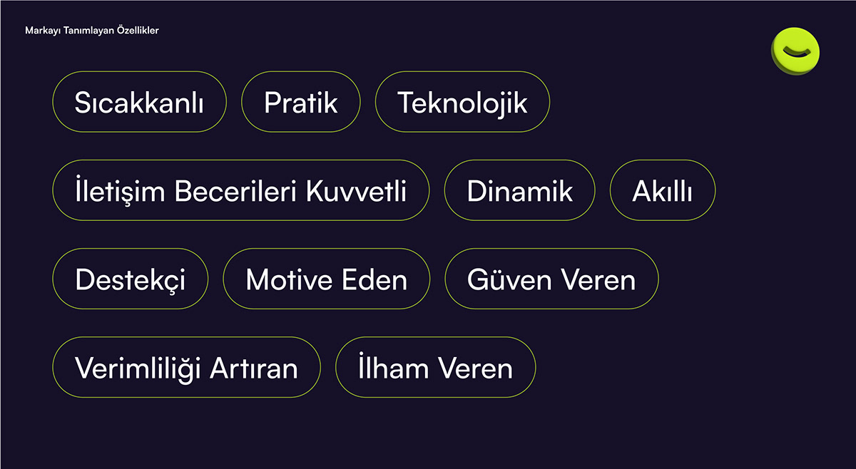
In our brand strategy and name study process, we adopted a unique approach to uncover Pupilica's identity and goals. In the initial step, we analyzed critical factors such as the brand's basic values, target audience, and competitive advantages. While evaluating various name options, our focus was on finding a memorable, unique, and easily pronounceable name. By combining the meaning of "pupil," referring to a student, with the connotation of community added by the suffix "-ica," we created a brand name that aligns with the target audience of the brand.


Logo Design
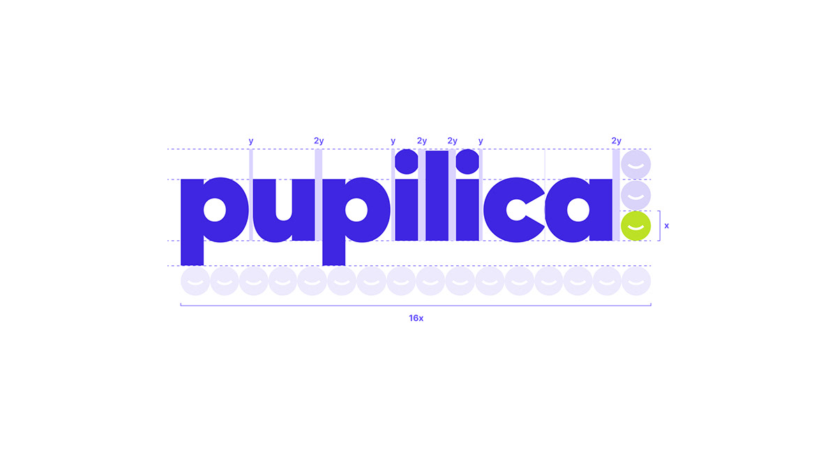
We created a logo that reflects the essence of Pupilica in line with its positioning in the industry and its aligned goals. The abstraction of the "smile" used in the emblem forms a visual narrative emphasizing the brand's positive and friendly identity. The design not only strengthens the overall coherence of the brand but also reflects our intention to create recognizability and a positive perception.





Brand Guideline
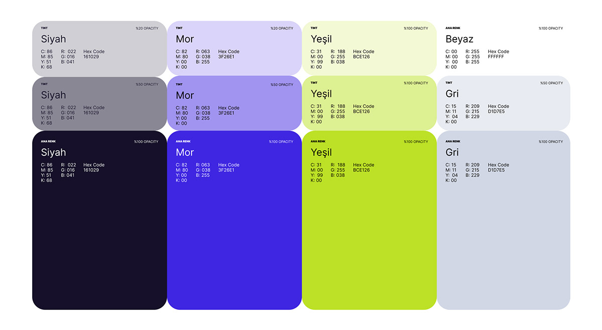
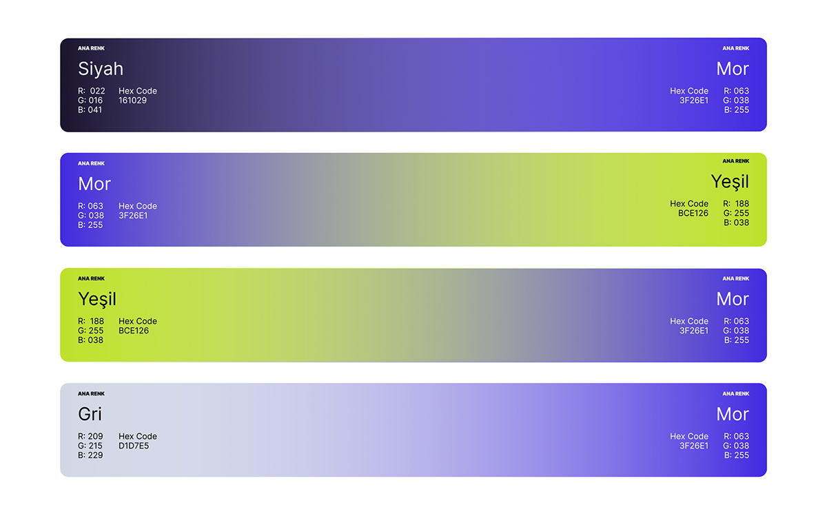
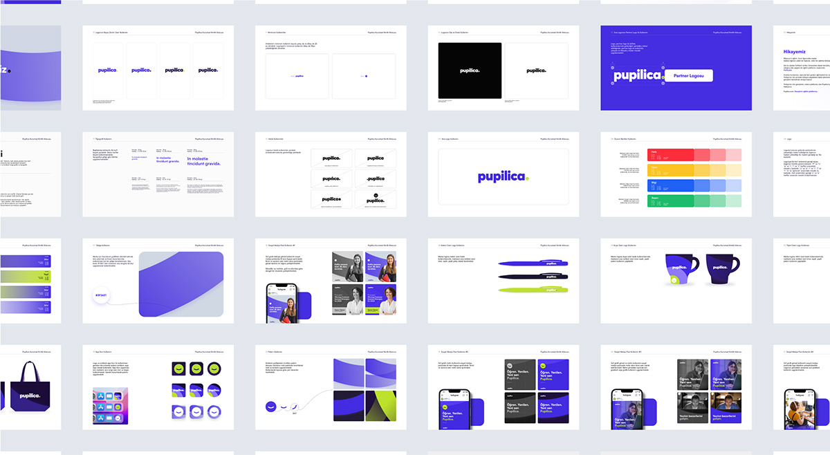
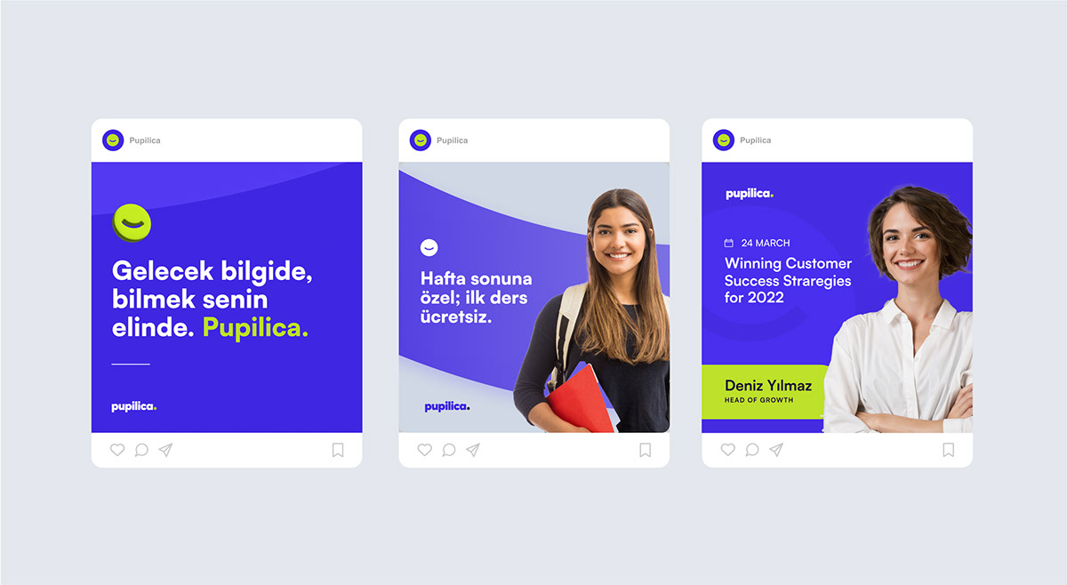
In our corporate identity guide, we provided a detailed roadmap covering aspects ranging from the minimal use of the logo to its interaction with partner logos, color palettes, design, and layout considerations. Additionally, we supported the guide with visual materials aimed at the effective use of the logo on online and offline platforms. This guide, defining how visual materials are to be used in different sizes and placements, assisted in presenting a consistent visual identity for the brand.





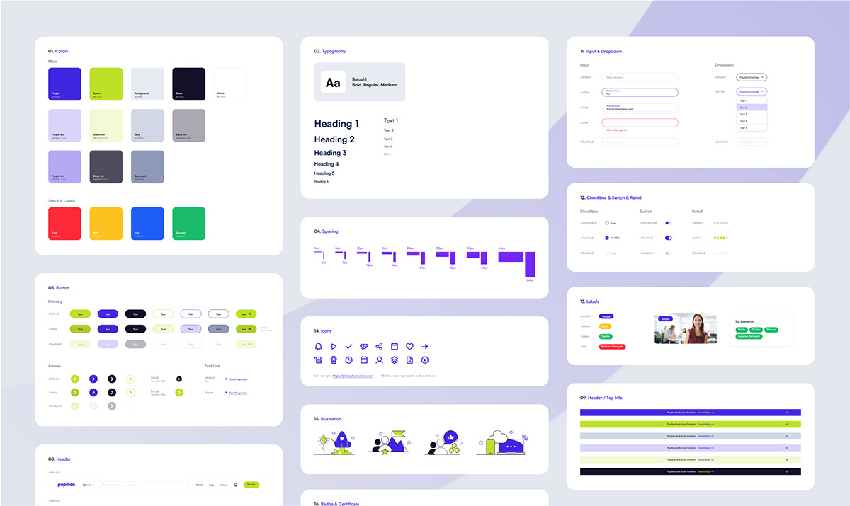
UI Style Guideline
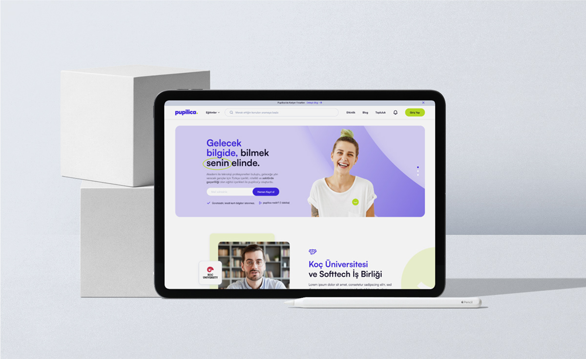
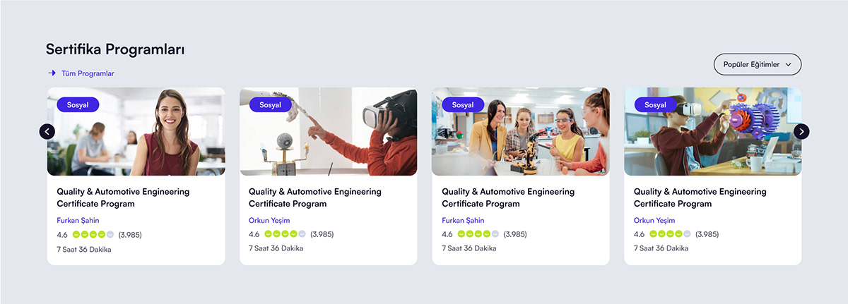
With the aim of reflecting the brand identity in the interface design, we designed a user-friendly and interactive website. In this project, which includes corporate identity elements and original page designs and creating cohesion, we illuminated the path of the Softtech design team with our style guide.

