Pazarama
Pazarama, a shareholding of İşbank, is an e-commerce platform that meets user needs through a single application. It aims to bring together companies operating in Turkey on a different scale and develops cooperation models. It offers secure next-generation payment solutions, aims to improve the experience and provides digital companionship to users. It offers incentivizing, secure, and convenient payment options such as discounts, installment plans, and reward points during the payment process.


What did we do?
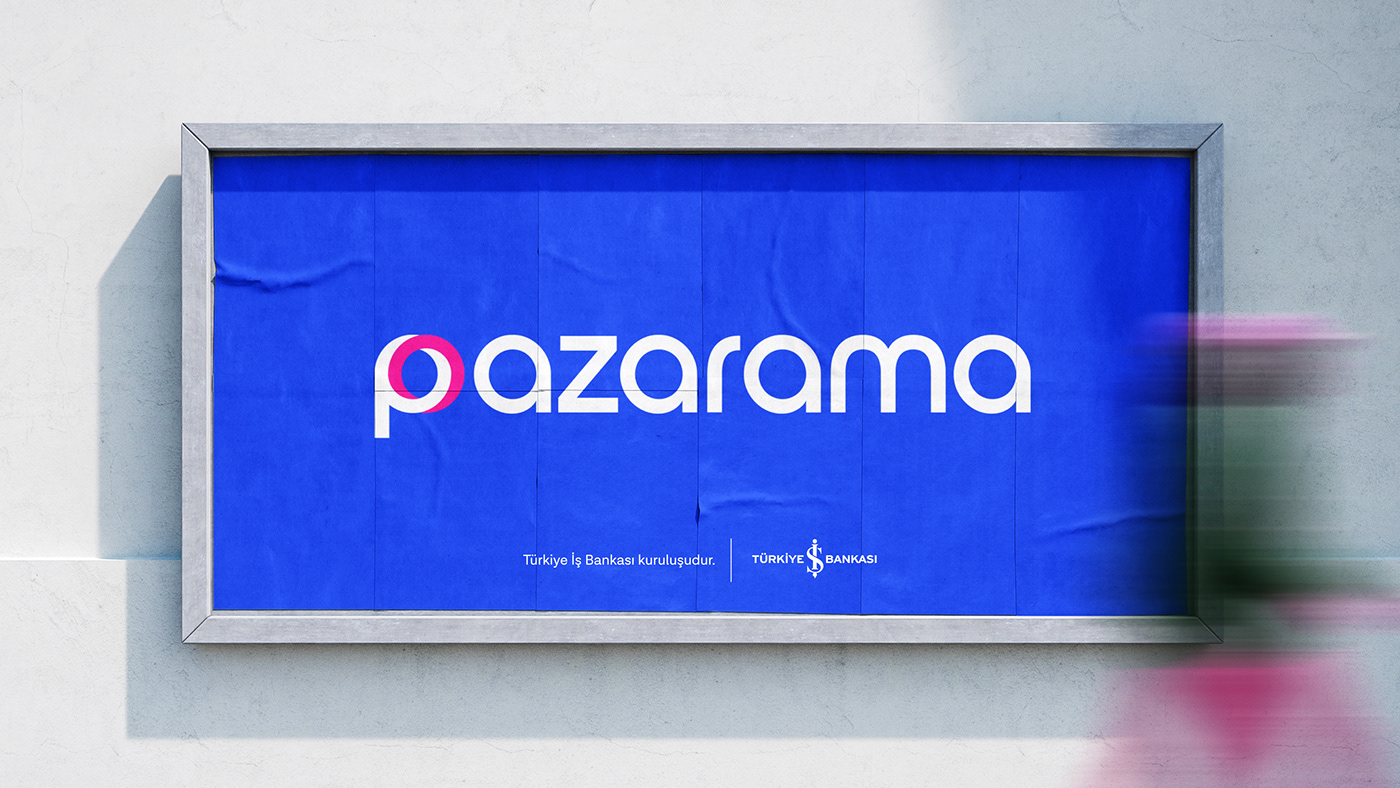
For the brand identity that we are working on in cooperation with the Primer team, we have prepared a detailed brand book containing logo design, color, typography studies, a consistent visual identity for use in digital and traditional media, and directives for all studies.


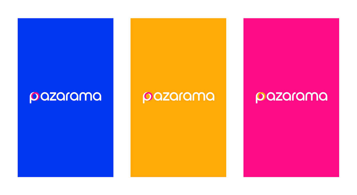
A powerful logo that acquires
dimension with geometric shapes
In order to differentiate it in the market, we have worked out a dimensional logo for Pazarama that reflects brand awareness, perspective and user's journey from end to end. We took advantage of the combination of geometric shapes for marketing, which takes into account the needs of vendors and purchasers, defines finance and shopping subject. With the Escher graph technique, we created a three dimensional feeling on a two dimensional ground. We have described together empowermentand brand transformation in the graphic lines that create the ”P".


Emphasizing aesthetic and technical harmony
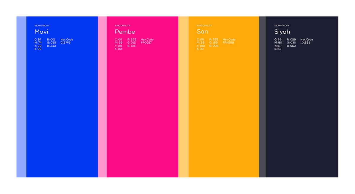
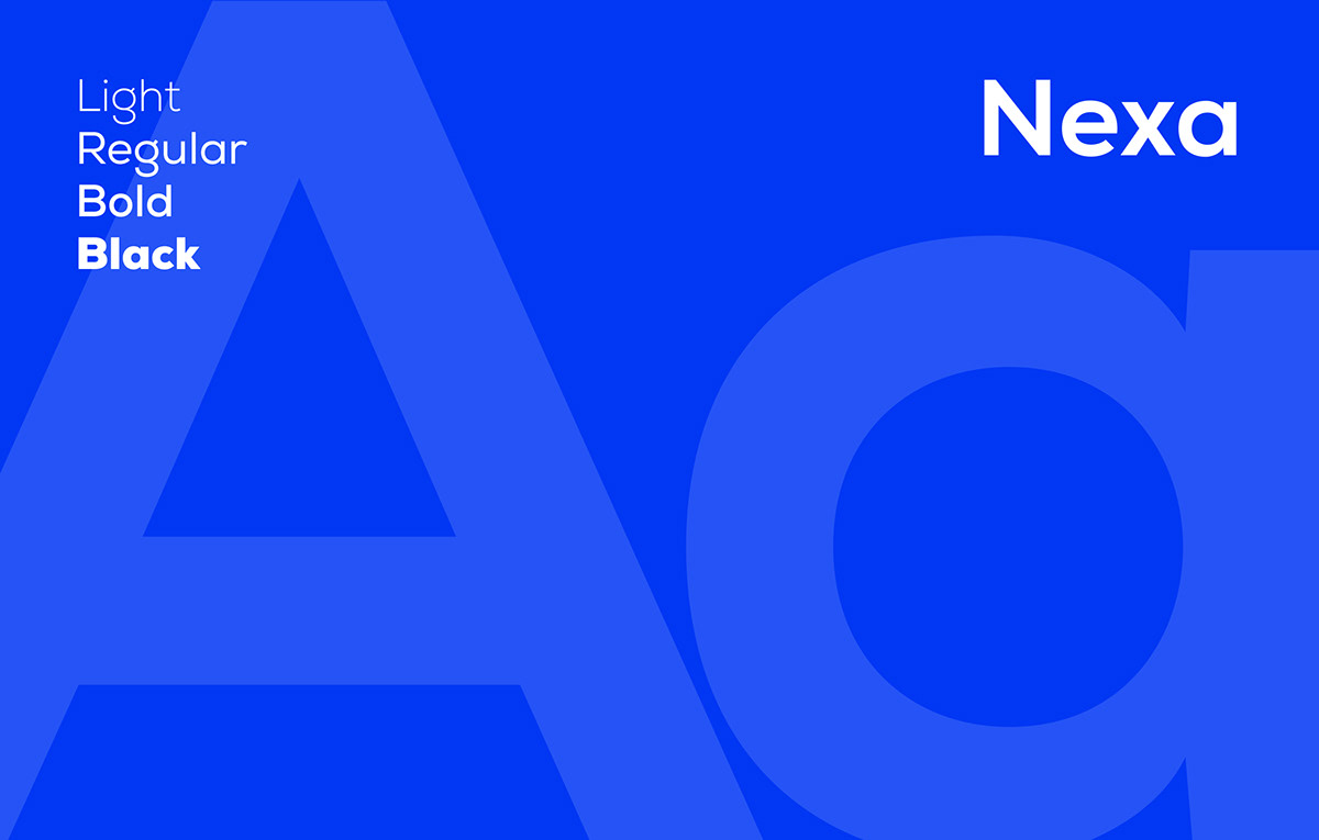
We have prepared a corporate identity book containing logo, color, typography and marketing visual directives with the strategy created by Primer for marketing. In the corporate identity book, where aesthetic and technical harmony are characterized as a whole, we have created an image in which we emphasize brand values by using a custom typography and color palette. By preparing materials that can be used in digital and traditional medias, we have also made design proposals that can be diversified for Pazarama.


Patterns that take strength
from the emblem
We produced the patterns, which are an auxiliary element in the design, from the emblem graphic and shaped them with the brand's color palette. With these patterns, we have preserved brand integrity while at the same time providing flexibility in various application areas. By enriching the visual story of the brand, we offered customers the opportunity to create an emotional connection with the brand. In order to distinguish in the competitive market, we have designed it as a powerful visual element.


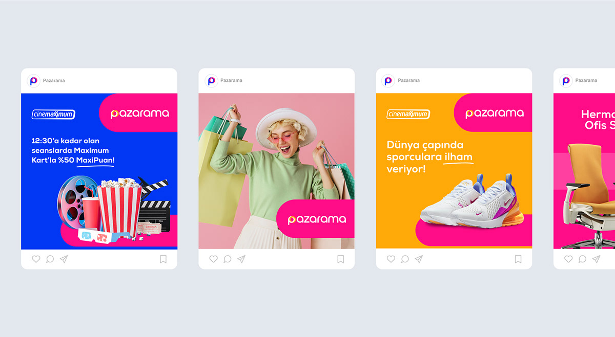
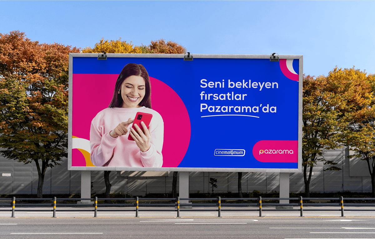
Marketing Images
We have progressed with strategic communication in marketing images. Therefore, we inspired by showing examples of how brand identity can be spread in design. In order to aim to highlight the attractiveness of products and services, we have created visuals. We have focused on photography rules and content strategies in the compositions we have created to convey the basic messages of the brand.