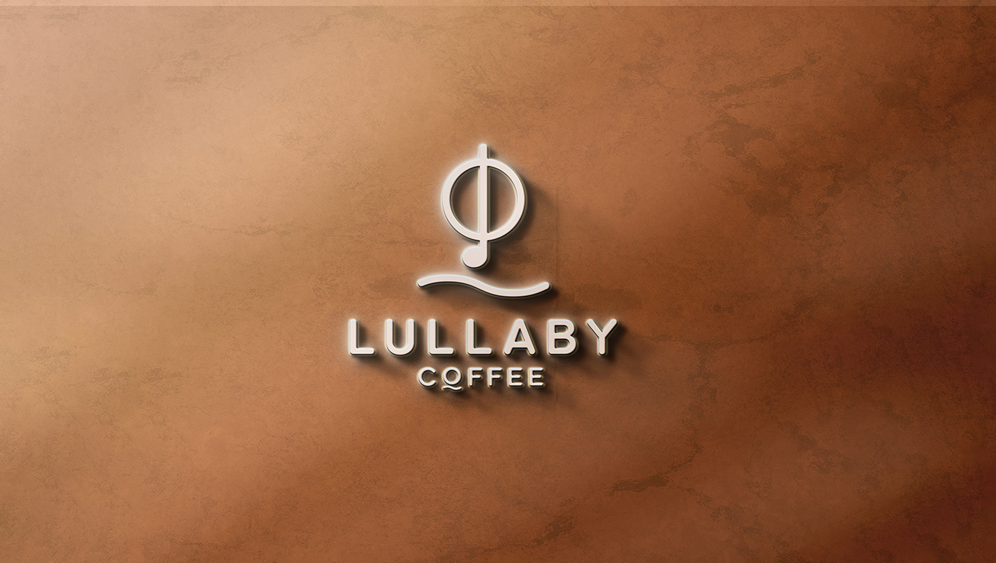
Lullaby Coffee's logo is made up of a simple circle - the image of a quintessential coffee cup. The line that bisects the logo represents the intersection of two of Lullaby's core elements: coffee bean and musical note. Coffee bean represents quality and passion, while musical note represent lightness and mellowness. Besides, the soft and winding ripples combined with the musical note form create the "L" of the brand name. This not only shows the harmonious interaction between the two elements of music and coffee, but also evokes images of calm waves, like a lullaby from the heart. That is the gentleness that Lullaby drinks bring.
The color brown and yellow in Lullaby Coffee's brand identity are not only aesthetically pleasing, but also carry some profound meanings. Brown is a warm and intimate color. In the coffee industry, brown is generally accepted as a symbol of roasted coffee beans, natural color and high quality. Yellow is often associated with positive energy, brightness and cheerfulness.
Lullaby is not just a word for a lullaby but also carries a deep meaning of a state of peace and comfort for us to relax and find balance in life. With a unique brand identity, Lullaby Coffee brings a wonderful experience where coffee beans and musical notes blend into an emotional story.


