


"No, we didn't invent local food, but we've made it our sole purpose to present it in a way you've never seen.”
Böw is Ghana’s first African fast-food restaurant chain, offering a menu inspired by local fast-food culture and influenced by homemade African recipes. The brand’s vision is to provide Ghanaians with a new choice in their everyday routine, in an atmosphere as colorful and vibrant as the streets of Accra.
xU was tasked to create a unique identity for Böw, one that reflects the brand’s personality and values, and connects with the target audience. We approached the project with a holistic perspective, considering every aspect of the brand experience, from the logo to the interior design.
The journey began with a deep dive into Accra's streets, a canvas of pulsating energy and kaleidoscopic colors. We immersed ourselves in the rhythm of local markets, the sizzle of street food vendors, and the contagious laughter echoing from bustling corners. This sensory feast became the foundation for Böw's visual language.
The result: a symphony of sight, sound, and taste
Böw is more than just a fast-food chain; it’s an experience. And this experience is defined by its unique identity, a symphony of sight, sound, and taste that celebrates the very essence of Accra.
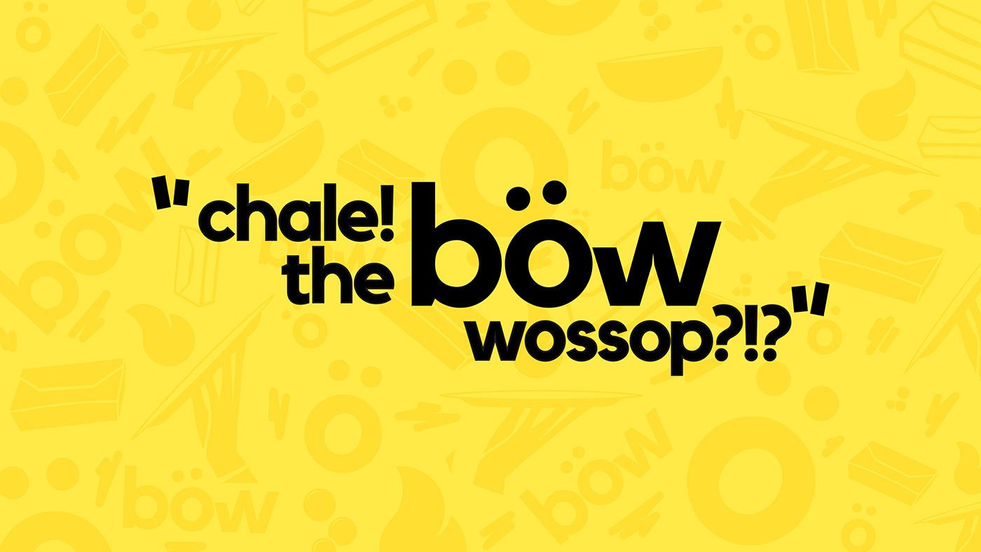
It’s a love letter to Ghanaians, a celebration of local flavors, and an invitation to experience the joy of “wow” with every bite.
In crafting Böw’s brand, xU didn’t just create a logo or a color scheme; we created a cultural tapestry, an invitation to join a delicious revolution in fast food. We worked closely with the client to understand their vision and goals, and delivered a design solution that exceeded their expectations.
We are proud to have been part of Böw’s journey, and we look forward to seeing them grow and succeed in the fast-food market.


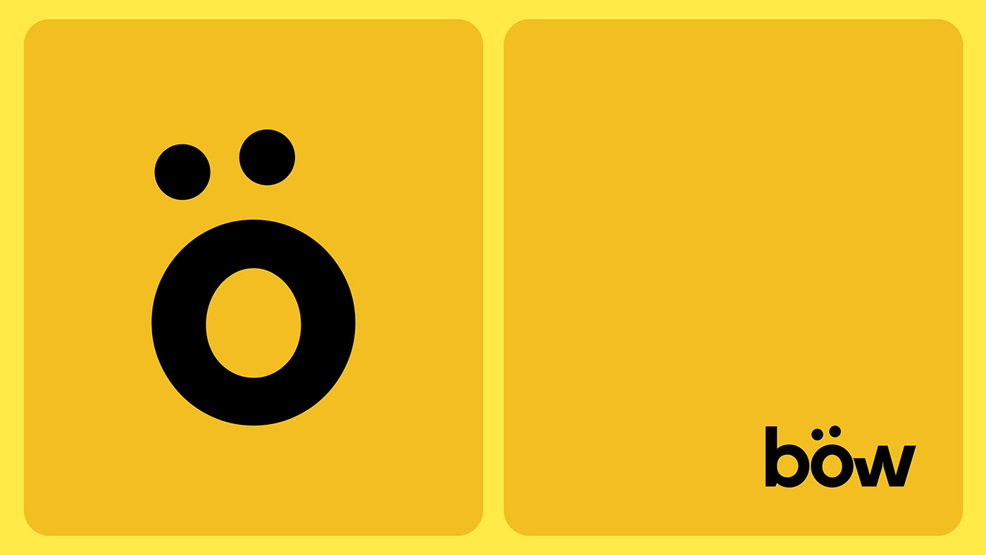
The logo: a burst of flavor and joy
The logo is a simple yet powerful representation of the brand’s mission to make food that makes you go “wow”. A single, bold “ö” – not just a vowel, but a burst of flavor, a joyous exclamation. It’s the curve of a calabash, the swirl of fufu on a plate, the shape of a smile ready to bloom. Designed to evoke feelings of delight, anticipation, and satisfaction. It’s the sound you make when you see your mouth-watering meal coming your way, and the feeling you get when you take the first bite of your favorite dish.
The logo is versatile and adaptable, as it can be used in different sizes, colors, and contexts. It can also be combined with the brand name or used as a standalone symbol. The logo is a nod to the local culture, as the letter ö resembles a calabash, a traditional African container used for food and drinks.


The color palette: a canvas of energy and warmth
The color palette consists of black and yellow, two contrasting colors that create a strong and dynamic impression. Black represents the urban and modern aspect of the brand, while yellow represents the warmth and energy of the food and the people. The color palette also stands out from the typical red and white colors used by most fast-food chains, giving the brand a distinctive and memorable identity.
Black and yellow, like the sun rising over the bustling markets, became our color palette – a timeless duo that sings with the spirit of Accra.

The visual language: a connection to the heart of Ghanaian culture
We knew this identity needed more than just colors and shapes. It craved a connection to the beating heart of Ghanaian culture. Bold geometric patterns, inspired by traditional textiles, danced across packaging and signage, while hand-painted murals transformed interiors into vibrant street art galleries. The result? A visual symphony that resonated with the soul of Accra, a space where the familiar comfort of local flavors met the electrifying energy of a modern fast-food experience.
Every element, from the playful typography to the energetic patterns, resonated with the vibrant spirit of Accra, transporting customers to the heart of the city with every bite.


Client / Bow - Ghana.
Location / Accra, Ghana
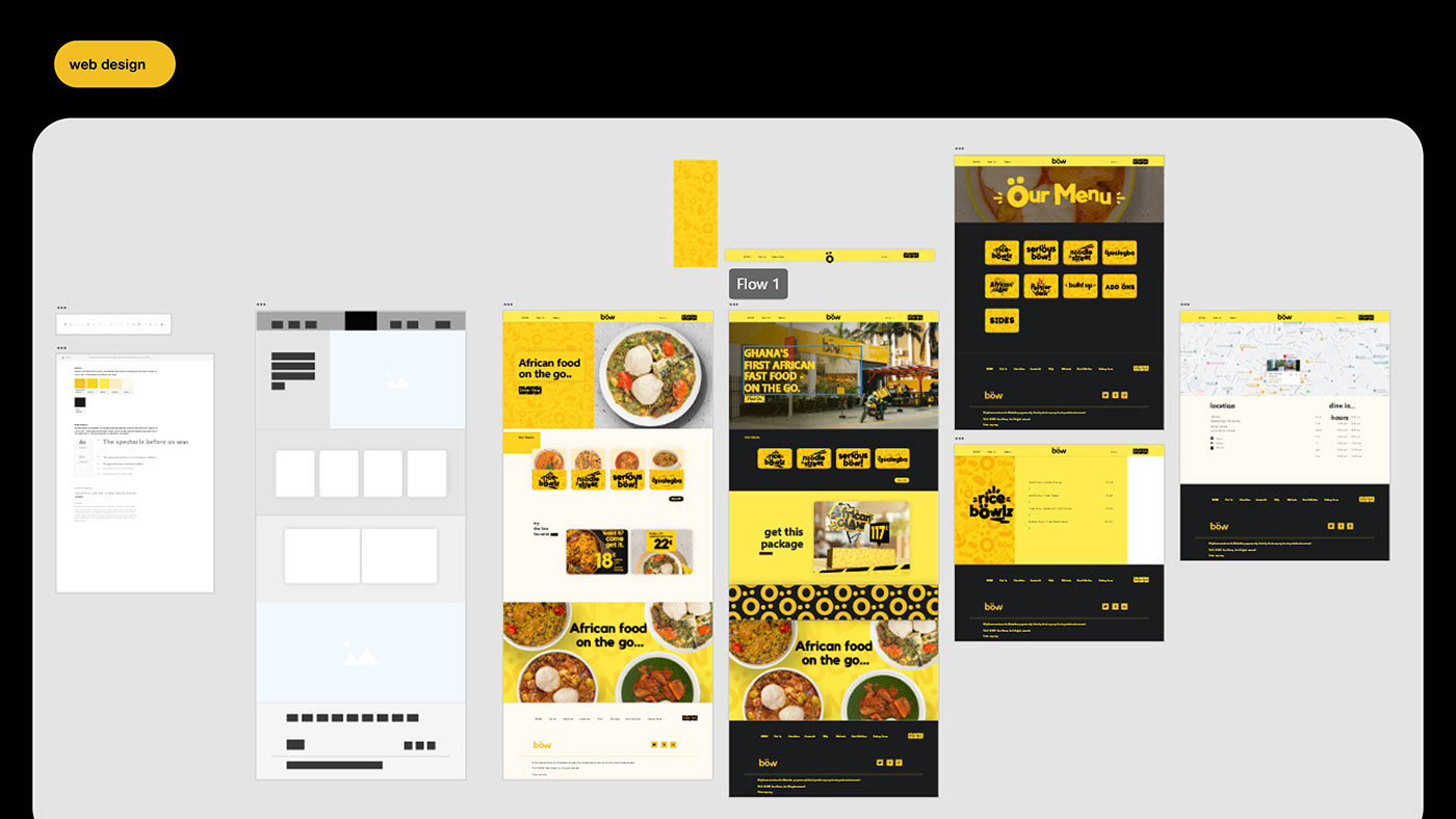
Project / Brand identity - Website UI - Graphic x Motion Design
Executive Art Direction / Jay
Location / Accra, Ghana
Project / Brand identity - Website UI - Graphic x Motion Design
Executive Art Direction / Jay
Let's work together - xtremely.unusual@gmail.com
Follow us: linktr.ee/xtremelyunusual


