


SMARTRES
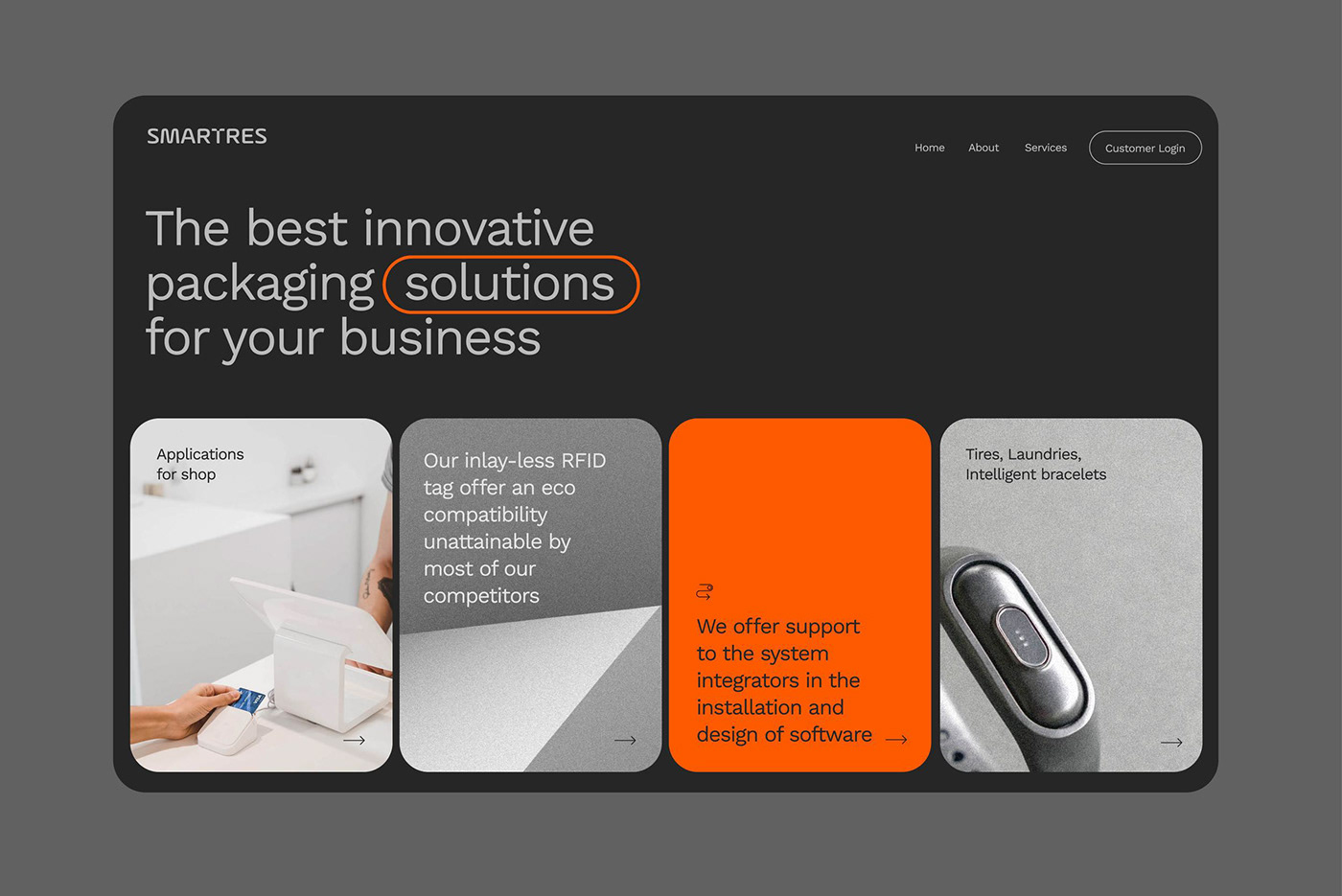
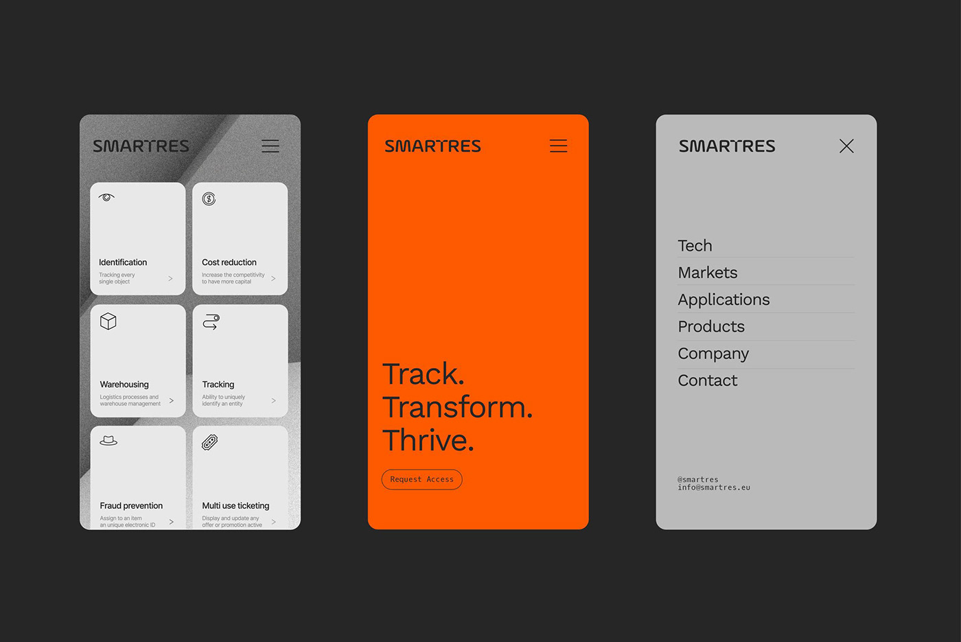
After 15 years of activity, Smartres felt the need for a rebranding of the corporate image, while retaining the official color, orange, reminiscent of the copper wire used in the early RFID models. The new image includes an updated color palette, a new logo, website, and internal corporate communication materials. The identity reflects the brand's values: innovation, dynamism, and authority.
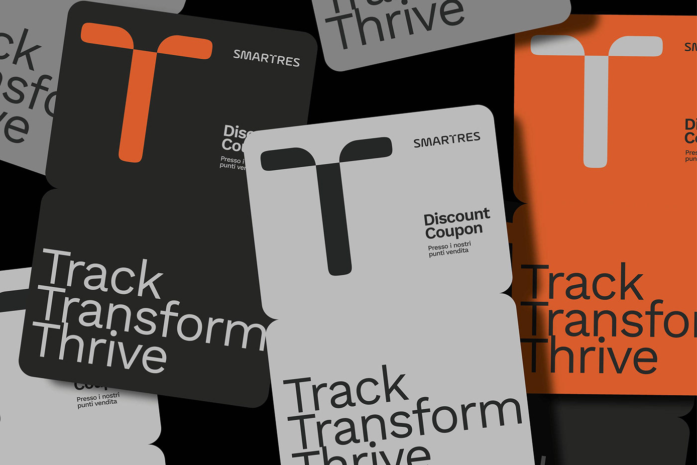
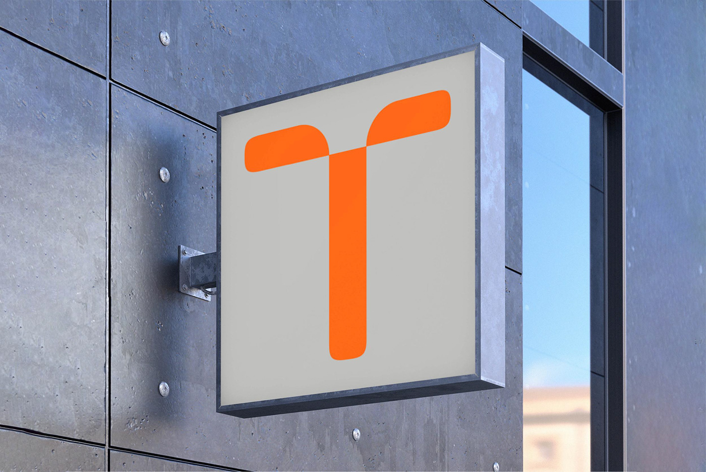
The corporate logo was created based on a modification to the design of the letter T. This letter was chosen both because it serves as a dividing line between the two words that make up the name and because it is the letter that lends itself most to being used as a logo, as it already resembles an antenna.
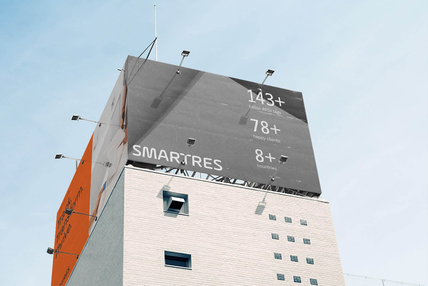
The chosen color palette is in continuity with the company's historical one and consists of a range of grays and a Pantone orange, much more saturated than the original version and more contemporary.
The corporate logo was created based on a modification to the design of the letter T. This letter was chosen both because it serves as a dividing line between the two words that make up the name and because it is the letter that lends itself most to being used as a logo, as it already resembles an antenna.
The chosen color palette is in continuity with the company's historical one and consists of a range of grays and a Pantone orange, much more saturated than the original version and more contemporary.


