


Client: LIV
Services: Research & Moodboards, Visual Identity, Brand Support
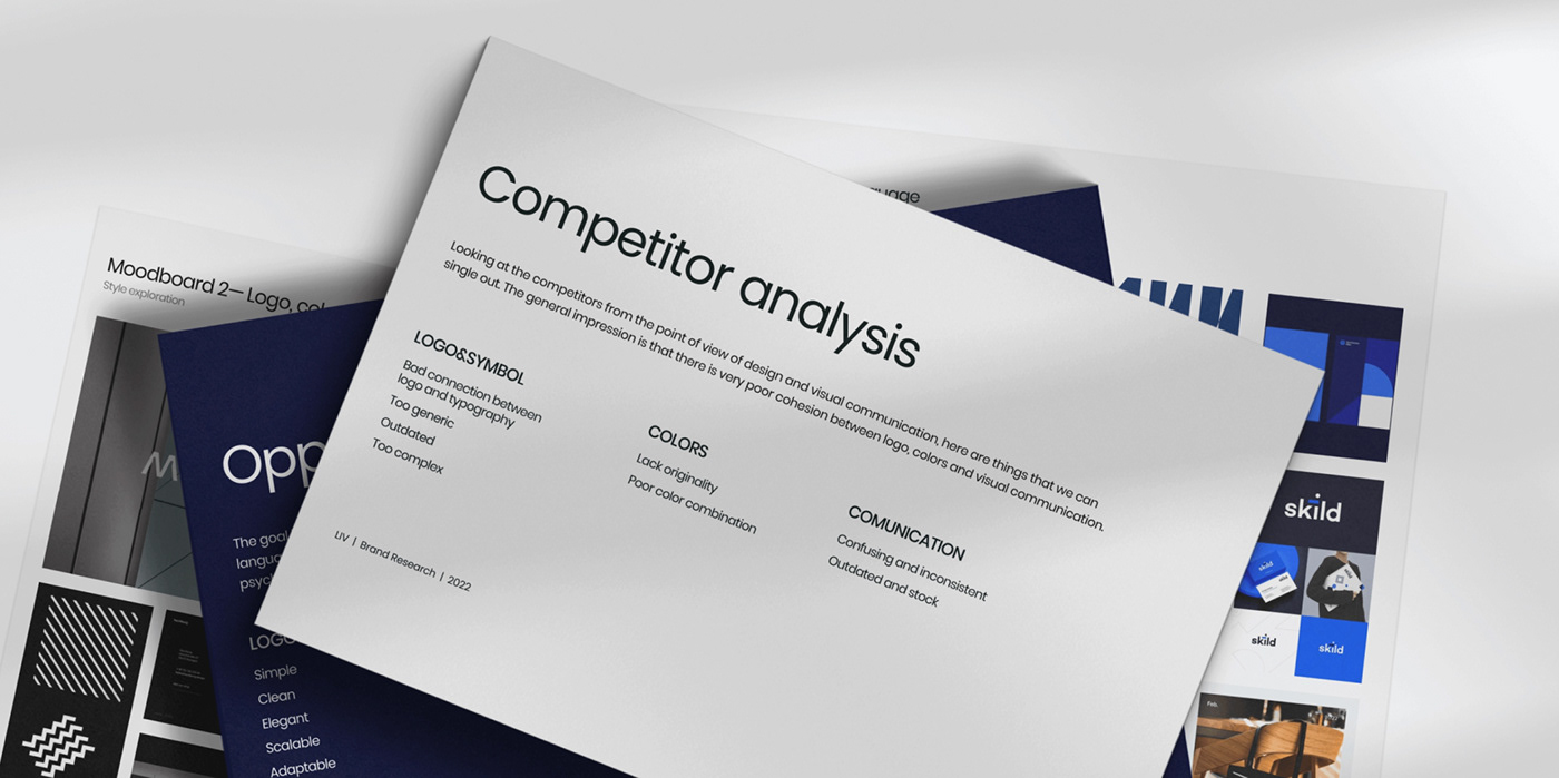
Year: 2023
Design: Kreativa Studio
Approached by LIV, a company devoted to enriching living experiences, we were tasked with creating a brand that truly embodied their vision. With the tagline "Home is where the heart is and we are here to enhance," LIV's aim is to help building managers attract and retain joyful residents, creating unforgettable communities that offer exceptional experiences.
Our mission was to craft a brand that was both forward-thinking and sophisticated, tailored to suit both tenants and managers, while also conveying LIV's fundamental values of trust, coherence, and proficiency. By delving into LIV's mission and objectives, our team worked closely alongside LIV's team to design a visual identity that is both unforgettable and easily recognizable, ensuring that LIV's target audience would resonate with the brand's message.
Moodboard
Amidst the endless array of brands vying for attention, LIV aimed to stand out as a brand that enhances living experiences for communities. To create a visual identity that would capture their mission and vision, we embarked on a journey of research, exploration, and discovery.
Concept & Exploration
With the knowledge we’ve acquired by researching through community living, tenants, managers, and competition, we created moodboards that presented two distinct directions, each with its own unique personality. After much exploration, we decided on a visual approach that was rich in metaphor yet visually simplistic. This approach hinted at the boundless possibilities and versatility of the tenants, managers, and communities.
The new brand identity was designed to be flexible and adaptable, with various elements that could be combined in different ways to create unique visual approaches. The result was a brand that spoke to the heart of what LIV stands for — trust, coherence, and proficiency — and that would resonate with their target audience.


Logotype
Our team assembled the logo from basic geometrical elements, forming a recognizable mark that is walking the fine line between a logomark and a wordmark. The lowercase spelling of LIV was intended to signal inclusivity, with ‘l’ as a tall rectangle, ‘i’ as a short rectangle, and ‘v’ as an inverted triangle, all coming together in a modern, minimalistic affair.


Patterns
The patterns we created were just as integral to the brand’s identity, with underlying and overlaying designs that used the brand’s primary colors of yellow and blue. The underlying patterns blended the main logo shapes into the background, while the four overlaying circular patterns communicated elegance, equality, community, and balance. These were meant to be placed up front, overlaying the content and metaphorically showcasing the true face of LIV.


Brand Guide
Harmonizing Brand Conduct.
By crafting clear and unwavering brand guidelines, we have empowered LIV's team to uphold a cohesive look and feel throughout diverse traditional and contemporary platforms.


Brand Support
A strong foundation for LIVing up to expectations.
As the sun sets on our journey with LIV, we reflect on the creation of a comprehensive brand support system that will enable them to shine bright across all mediums. With the brand identity firmly in place, we crafted a range of versatile brand assets for both digital and print applications, designed to keep LIV’s message and image strong and consistent.


Thank you for watching and appreciate!
— WE MAKE THE NEW.
Kreatva Studio® 2023


