A brief set to rebrand the existing Hallam Union branding. The existing branding was cited as being 'bland', 'uninspiring' and 'boring'; it was clear that a completely different approach would be necessary in order to create a lasting, modern brand.
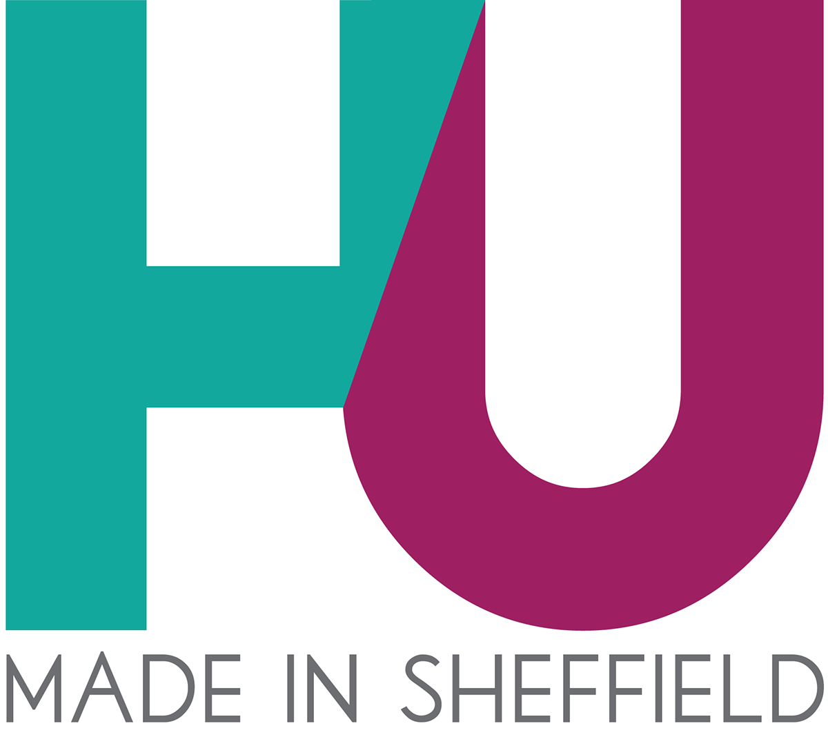
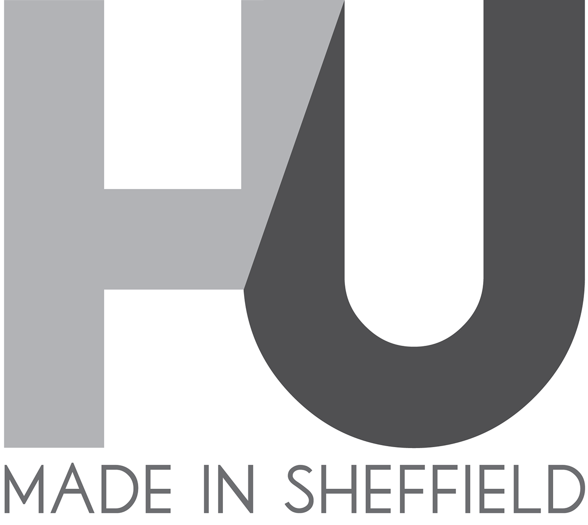
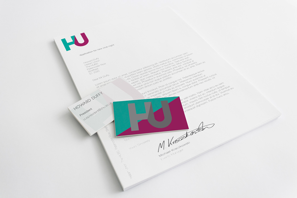
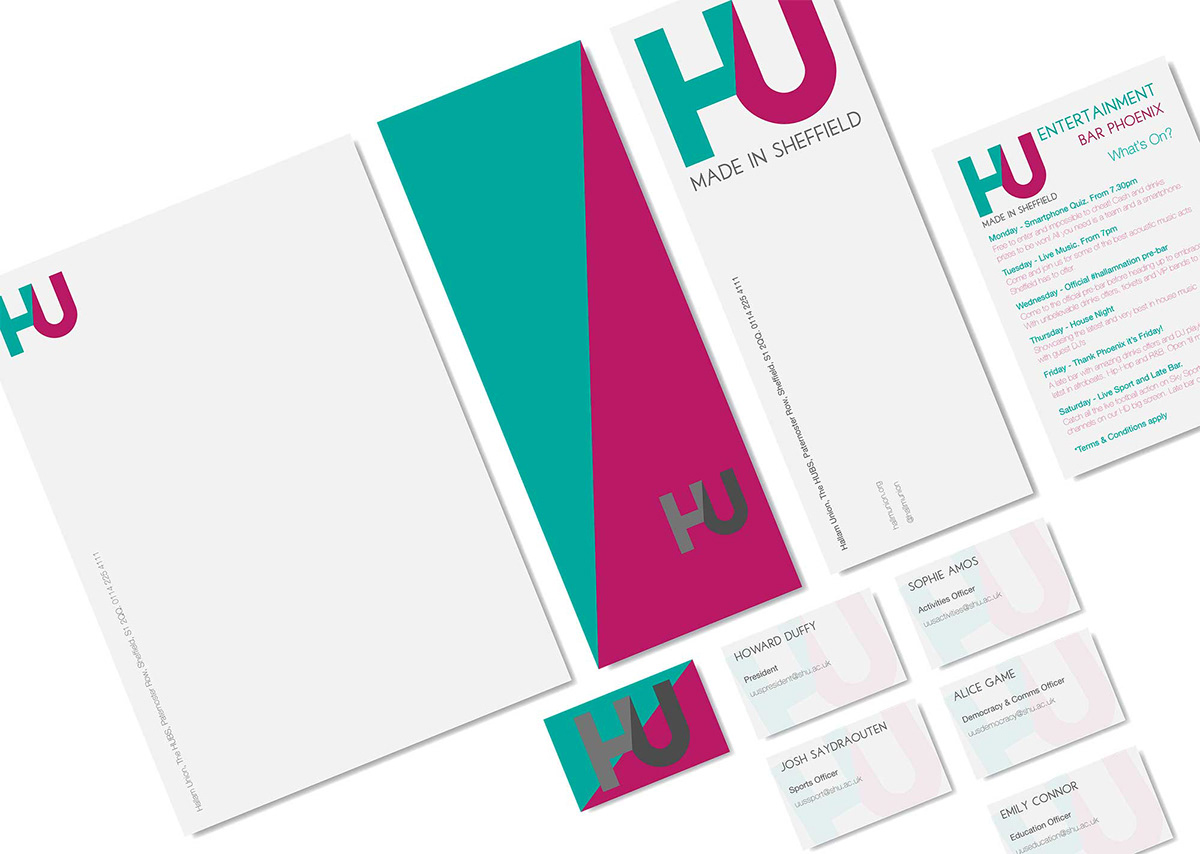
I went for the 'HU' acronym for my response. I feel that it creates a simple and recognisable shape that is already much better than the original branding. I used the primary colour from Sheffield Hallam University
I used these two colours as I wanted the purple/red colour so that it could tie in with the university and allow students to feel that the two are interlinked to form the best service to the students. I also decided on a teal colour as I needed a green, to represent the environmental aspect of Sheffield. However, I didn't want to go for a grass green so gave it a bit of a blue hue in order to give it a more pastel-like colour. I also played about with different typefaces to see whether I would be able to find a good one to use as the brief specified that the logo had to work with the tagline 'Made in Sheffield' as well as without.