


CABANA 3901
-
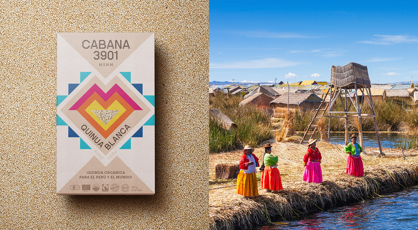
The packaging had to be created for a brand that offers quinoa from an area surrounding Lake Titicaca in Puno, Peru.
We drew inspiration from the colors observed around Lake Titicaca: the blue of the lake and the sky, the color of the straw used by the people living within the lake to construct their artificial islands (made of straw!), and the vibrant colors seen in their traditional costumes. These costumes consist of bright colors that contrast with the previous neutral tones. Additionally, we incorporated the colors of quinoa itself: white, red, and black.
Quinoa has transitioned from being an exotic food to being known and consumed worldwide. Therefore, it was essential to create a distinct identity that truly sets the product apart and represents its ancestral origin, the land from which quinoa originates.
FIBRA
BRANDING & PACKAGING @
@fibra_branding


STUDIO: FIBRA BRANDING
IG: @fibra_branding
CREATIVE & ART DIRECTION: Andrea Gálvez
GRAPHIC DESIGN: Andrea Gálvez
PHOTOGRAPHY RETOUCH: Andres Abad
3D: Oscar Gomez
PROJECT MANAGER: Mariela Alata


