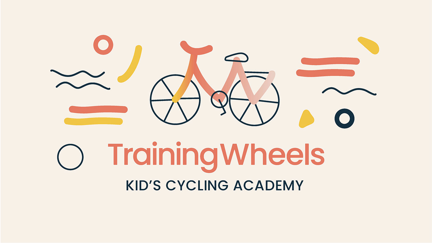
TRAINING WHEELS LOGO DESIGN
In crafting the design and logo branding for Train Wheels Kid's Cycling Academy, the focus has been on striking the perfect balance between playful appeal for kids and a reassuring aesthetic for parents. As an academy dedicated to teaching children how to cycle, the Training Wheels logo embodies a sense of fun and quirkiness that resonates with its young audience. To seamlessly merge these elements, the logo takes the form of a bike, presenting a visual representation that is both enjoyable and educational.
The vibrant and engaging design of the logo ensures that it captures the attention of kids, with playful elements and lively colors that evoke a sense of excitement. Simultaneously, the incorporation of clean lines and a subtle sophistication aims to appeal to parents, instilling confidence in the academy's commitment to providing quality cycling education. The Training Wheels logo becomes a dynamic symbol that bridges the gap between youthful enthusiasm and the trust that parents seek in an educational institution.
In this logo presentation, the emphasis is on the importance of creating a visual identity that not only communicates the academy's mission effectively but also resonates with its target audience. The Train Wheels Kid's Cycling Academy logo is envisioned to be more than just an emblem; it is a friendly and encouraging companion in a child's journey towards learning the joy of cycling.