
KINDAKOL believes that coal will continue to play an important role in global production and it is important that this is done cleanly and satisfactorily. They created an eco-friendly lump of coal made of sheep faces and we helped them with a visual identity for their company.
Logotype
The logotypes describe the combination of an eco-friendly product developed in a harsh environment like Iceland. The rocky environment inspires straight angles, and the letter “O” was changed to describe the new sustainable coal developed by KINDAKOL.
The logotype intention is to be serious, and stable but with a soft approach. The contrast between rectangular shapes, angles, and round shapes communicates the association between natural spirituality and the engineering part of the business.


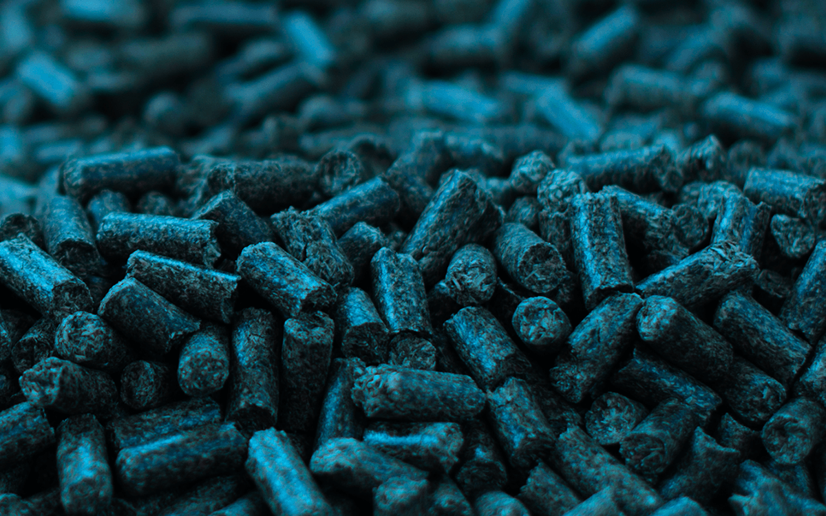
eco-friendly lump of coal made of sheep faces
Visual Identity
The design language follows the idea that engineering and environment work together maintaining the balance for a healthy planet.
KINDAKOL Shapes are designed to obtain a mix of serious and playful look.


Advertising materials

Business cards

Employee helmet


Visual identity guidelines


