The main idea of the project was to create a brochure for Harley Davidson. The criteria for the project were 8 A4 sized paper and linked together to be folded. I had them printed landscape and folded vertically. The brochure had to have a timeline and their sustainability features. The final end product images were unavailable as they were kept by my tutors.
The cover page was the first thing I did, looking back I still liked the design. I wanted something flashy and catchy to imitate Harley Davidson's style. At the same time it served the purpose of enticing users to open it.
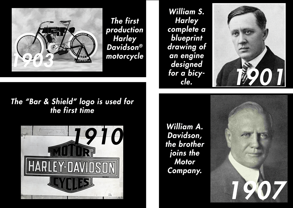
I had the idea of using purely black and white to show Harley Davidson's style, as in my opinion they had a classic style that suited black and white. Also I wanted hints of yellow on the road as to sprinkle a little surprise to the black and white. I wanted a sense of continuity and flow in the timeline therefore I had a bold white line to link their heritage together. (Pardon the unaligned lines)
Also I wanted to show Harley Davidson's sustainability features in a way that isn't overwhelming. I had the idea of using high resolution photos with a few words that potrays the Harley Davidson lifestyle. I had coined the words to be as succint as possible like a Japanese Haiku.
These are some of my thoughts about this project. I still prefer a Vespa over a Harley, but I really admire Harley Davidson's branding.