


small scale
close relationships
close relationships
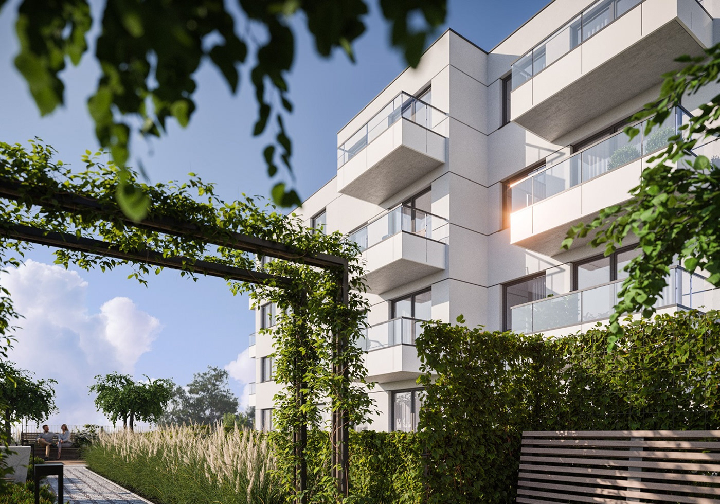
The identification was created for a residential investment by the developer Ekolan, which is very intimate and is meant to indicate the closeness of bonds among new residents who can use common spaces for playing chess or cultivating plants. The idea for the name "Modo" comes from the Spanish words and means "opportunity” and “fashion, trendy”. The essence of choosing this word is to emphasize that a change or a new home can be the beginning of something comfortable and stylishly planned.
→ E K O L A N x R O C H E x Z J E D N O C Z E N I E
challenge
Our task was to create a classic and harmonious identity, characterized by an elegant black and white theme, similar to looking through a fashion or interior design editorial. Just as one carefully selects high-quality clothing or furniture, the goal is to emphasize the choice of a good, original living space designed in every aspect.
& solution
During the design process, we created a sign using the form of an "M" from the word "Modo." The font style is minimalist, matching to fashion brands, and in this case, tailored for luxury apartments. The overall character is in the style of design magazines. In our branding, we emphasized a strong use of white (associated here with novelty and spaciousness), visible on the building and interiors. As a counterpoint we introduced black, which standing out and referencing elegance and luxury. Everything is tasteful, sometimes sterile, but subtle accents ensure that we still want to feel - sophisticated and stylish.


|
|
project menagment —— marta wołejko
art direction & design —— konrad roche
development —— zjednoczenie
client —— ekolan

|
|


