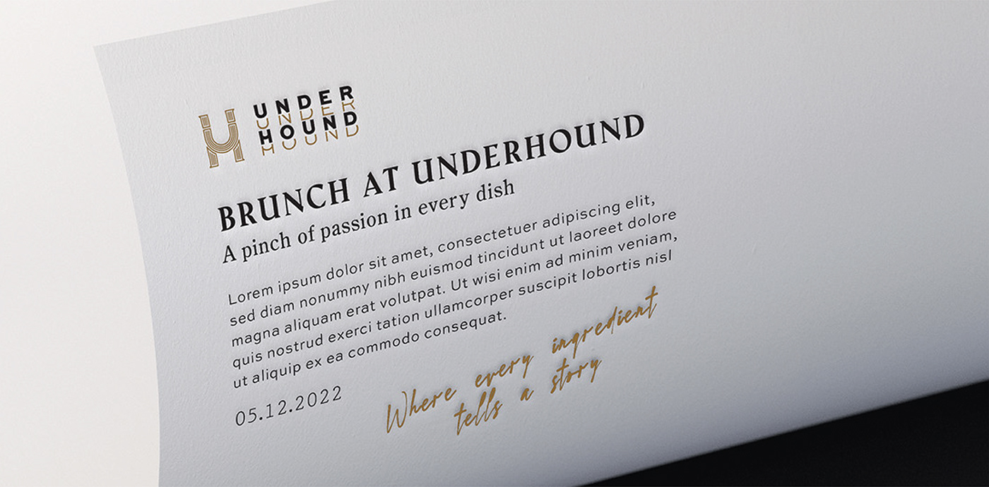
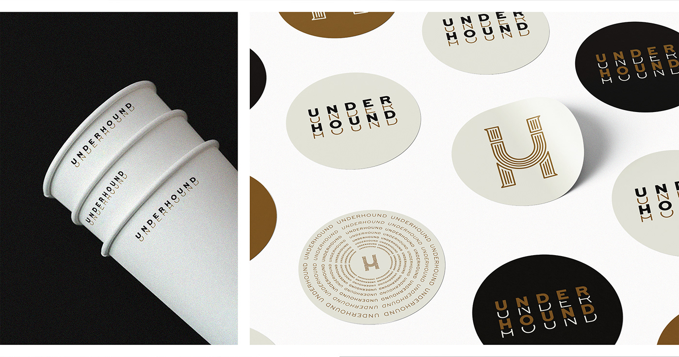
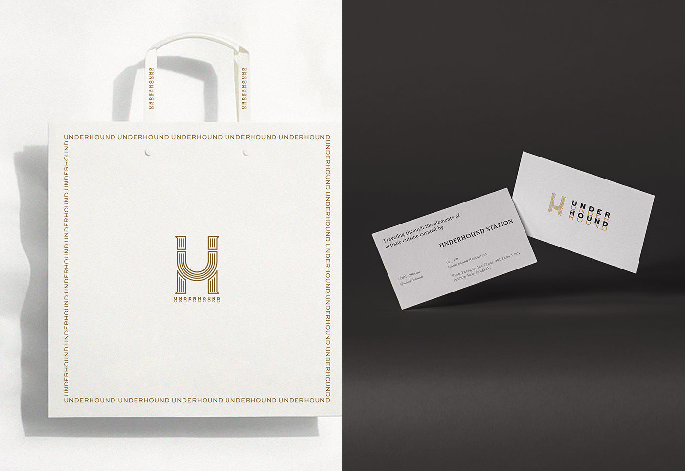
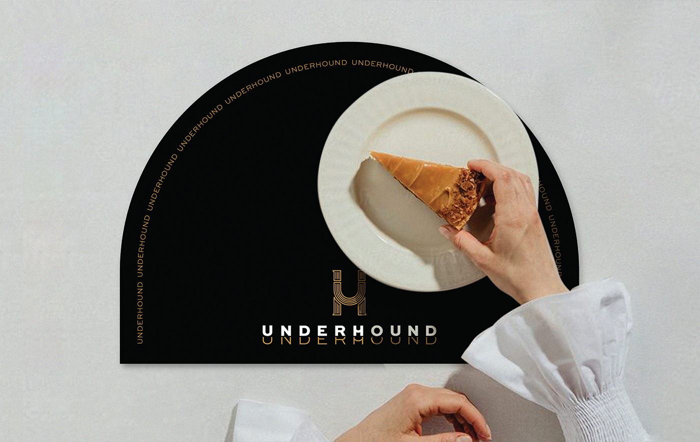
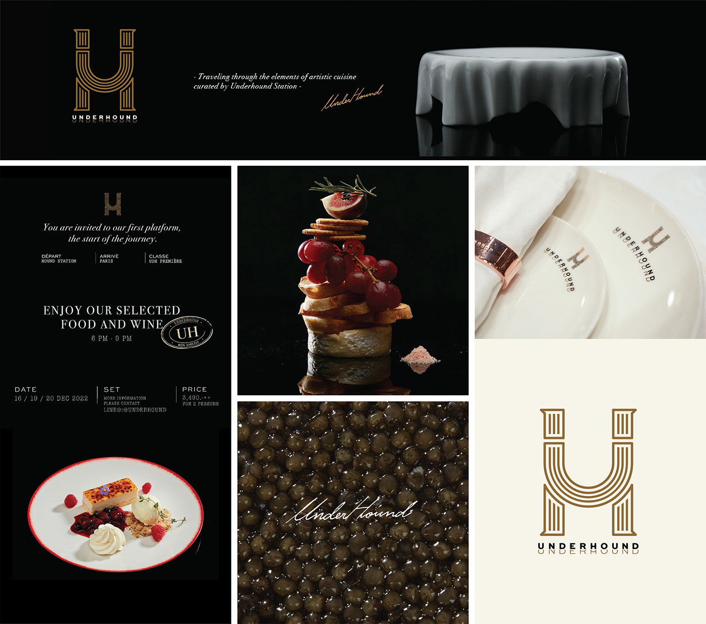
UNDERHOUND / brand identity - packaging design
objectives:
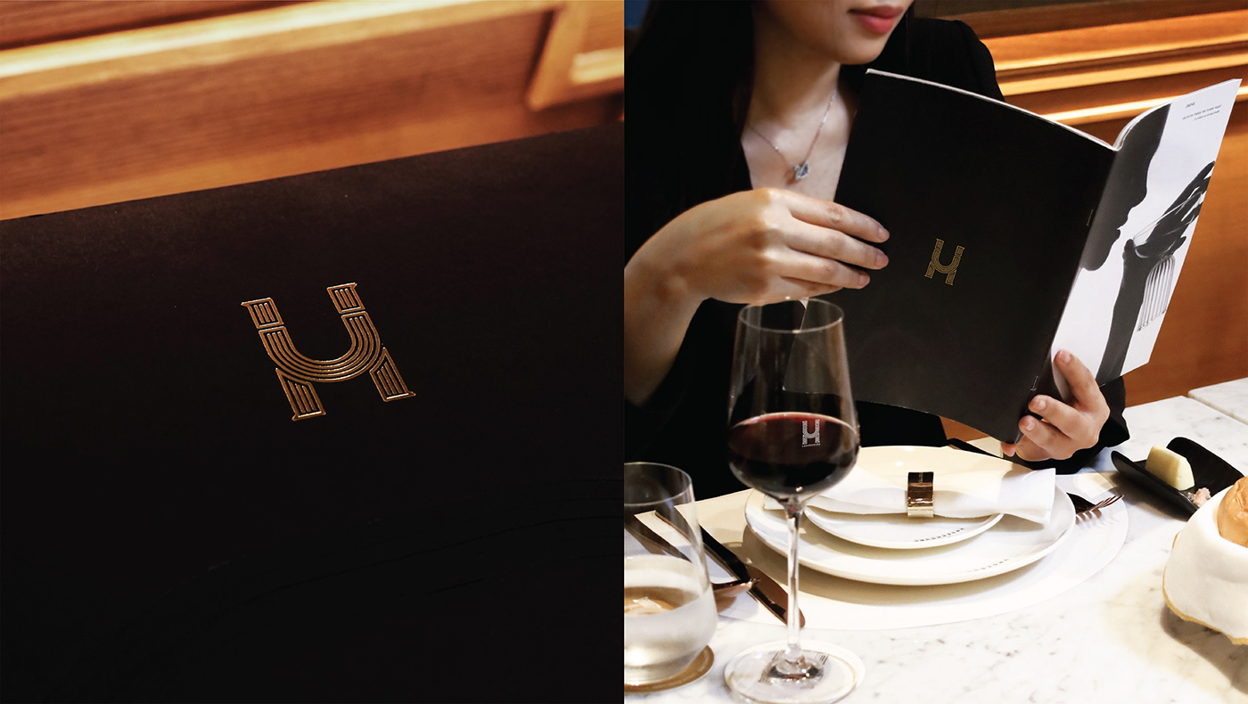
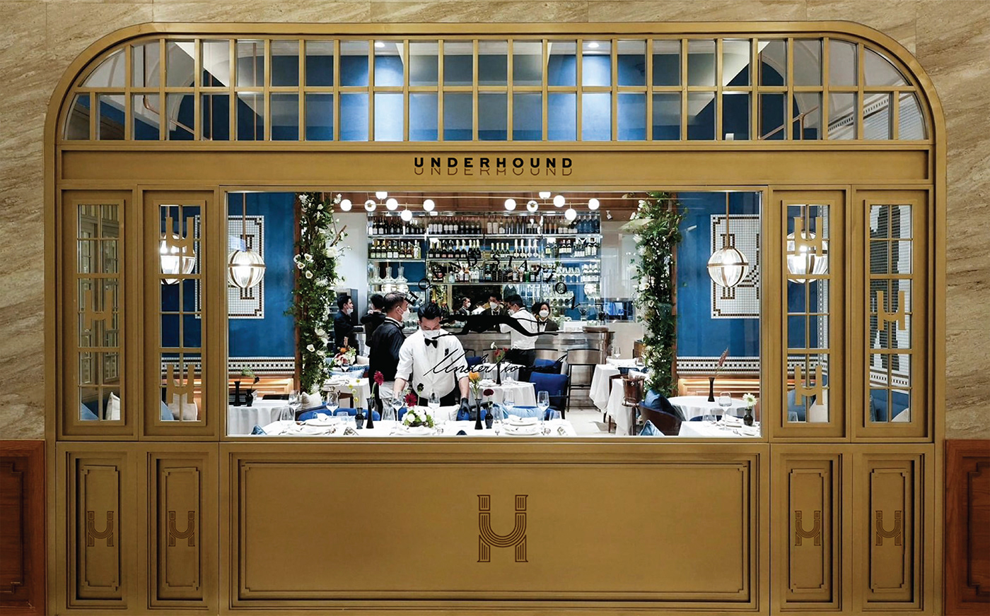
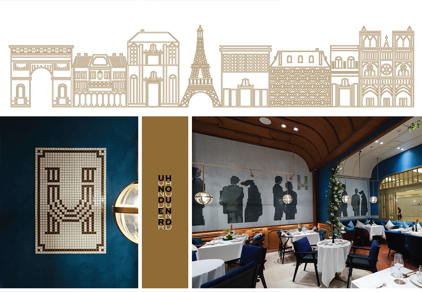
A French Brasserie-styled restaurant that will take you on a journey to discover the beauty of food. The dishes are meticulously and delicately created so you may experience the art of cuisine through the taste and presentation of food. This restaurant virtually takes you to dine in France, where the style of the Greyhound Café is blended into every menu. Serving you ingredients of high quality and flavors of Asian food, this restaurant provides customers with a twist of flavors, the unique style of Greyhound that perfectly combines deliciousness.
logo design:
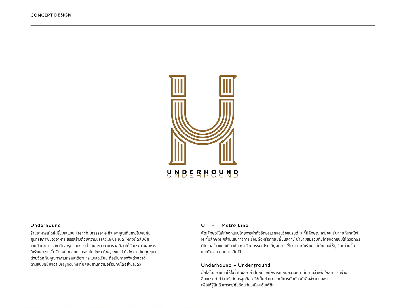
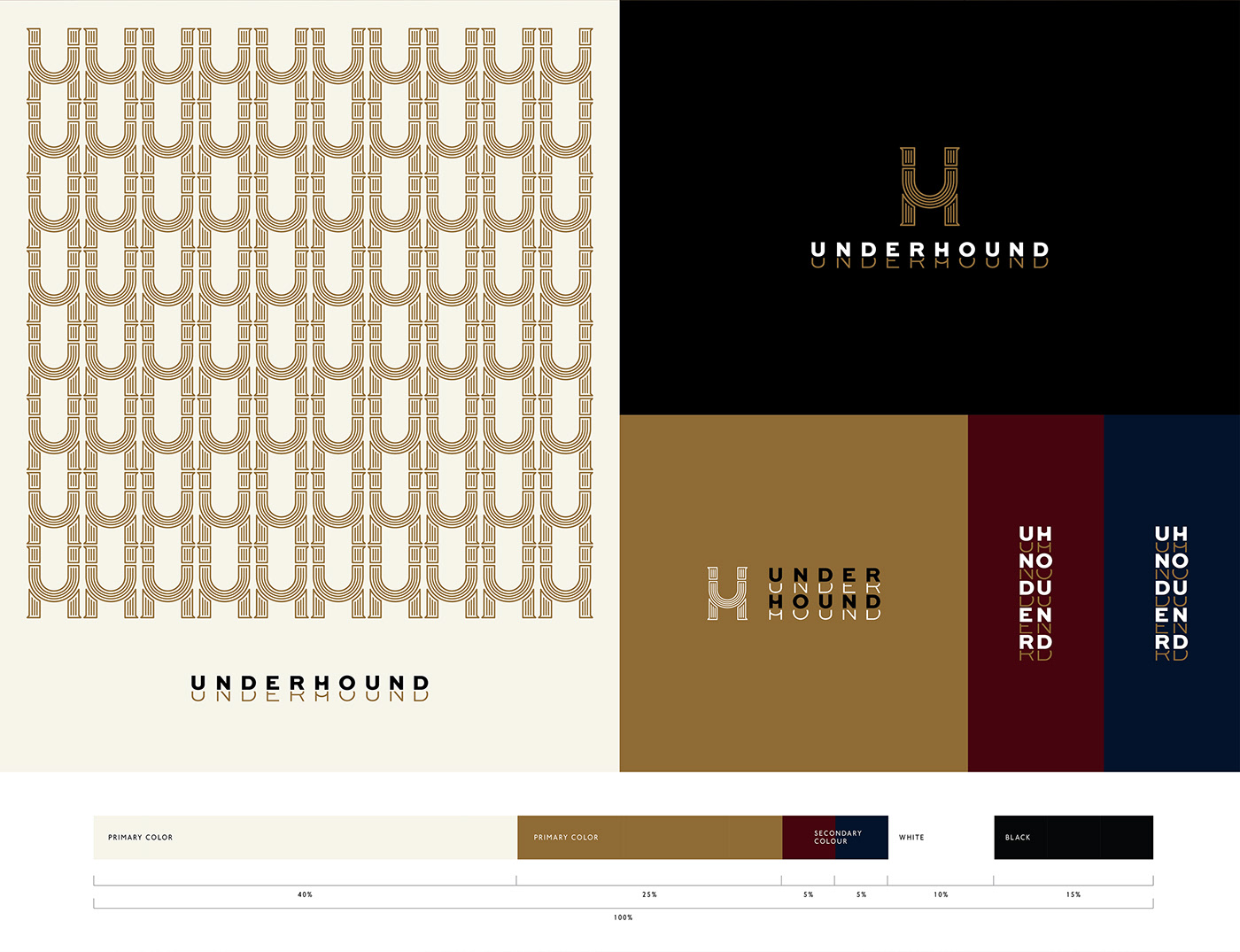
U + H + Metro Line
The logo is designed by using and combining the first letter of the brand, U, which looks like a train track, and the H letter, which looks like routes, connections, or hopping between stations. The letters are integrated into the logo by designing them to have the same but simplified structural characteristics as the European architecture that is used to decorate the shop, making it look simpler while maintaining its classic look.
The brand name represents the use of experiences from traveling with the underground trains to create the Underhound restaurant. The logotype is designed to have two duplicated terms. The first letter is thicker so the brand can be read and recognized easily. The second letter is thinner, where the upper part of the letter is removed, in order to represent the feeling of overlapping, like being in the basement.
special edition packaged:
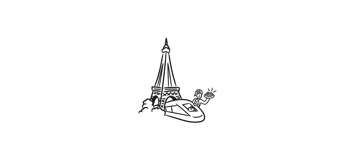
The Choux Cream Box Set: we designed this box set with the intention of capturing the travel experience, the essential inspiration that gives birth to these 3 exquisitely delicious dessert dishes, namely, the Tahitian Vanilla Choux Cream, the Truffle Choux Cream, and the Golden Choux Cream. We put drawings of French architecture around the inside of the box. The outside of the box has curved windows, like train windows that allow you to see the countryside as the train runs past it. The letter positioning is inspired by the train ticket. Therefore, opening the box set gives you the feeling of traveling back in time to a train station in Paris.


AGENCY :
Andon Design Daily Co.,Ltd.
CREDIT :
Design Director by Pongtorn Wachirapoka
Designed by Tenzin Tsega Lama
Photo by Underhound (FB/IG)
VIA :
https://www.facebook.com/UnderhoundRestaurant
https://www.instagram.com/underhoundrestaurant/
Copyright © Andon Design Daily Co.,Ltd. All Rights Reserved.


