Visual identity
Client: Joana Production
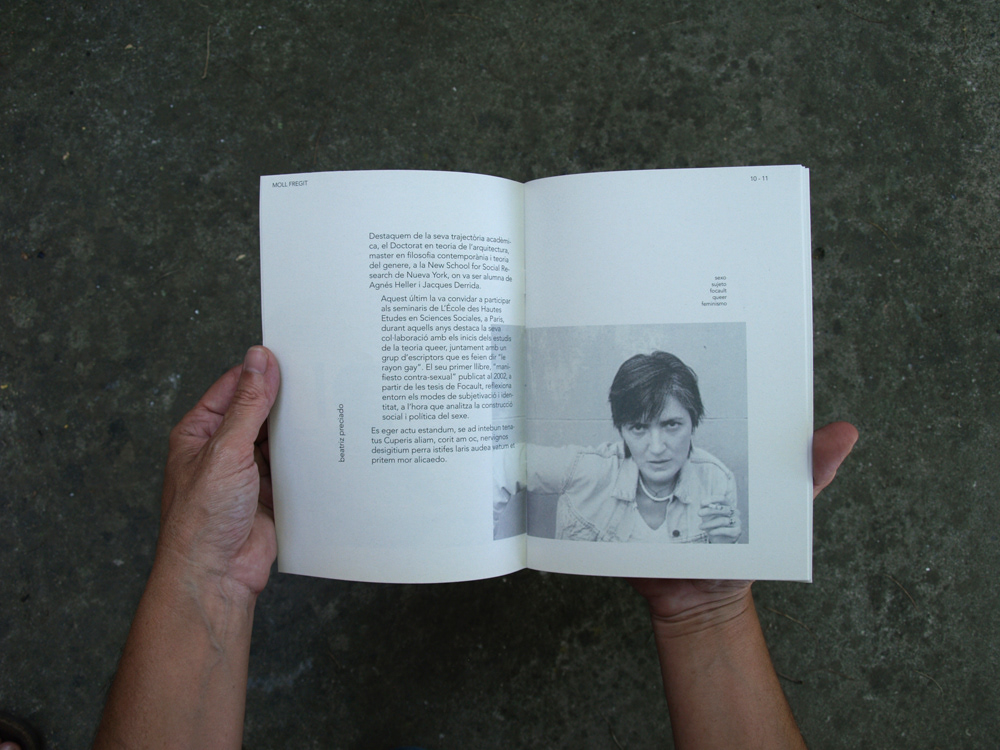
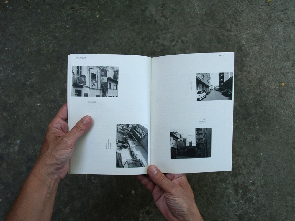
Photos by: Joana Capella
Moll Fregit is an Usefull Art Festival. Joana Capella, the girl behind the project, wanted to concentrate differents art projects that appear and shock in her town, Mollet del Vallés. Metaphorically she wanted to fried Mollet, the Festival name's means: Fish Fried, Moll is the fish that name the town.
Assault was the central idea of all the festival.
Moll fregit es un festival en torno al arte útil en el pueblo Mollet del Vallés. Las propuestas artísticas que aglutina pretenden generarse a partir del concepto de asalto.
Moll Fregit es una metáfora de la intención del festival, freir Mollet.
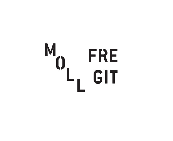
The visuall identity is created just with typography for two reasons. The first is to reconized the festival name, it was his first time. The second point is the possibility to modified the logo with diferents languages but keep the identity.
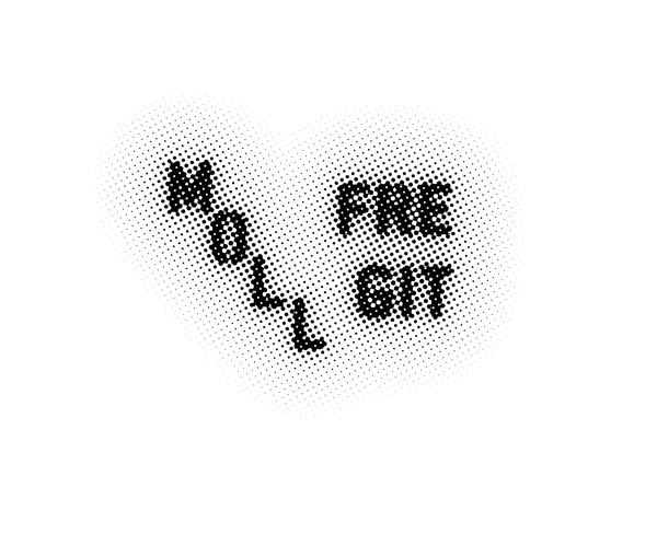
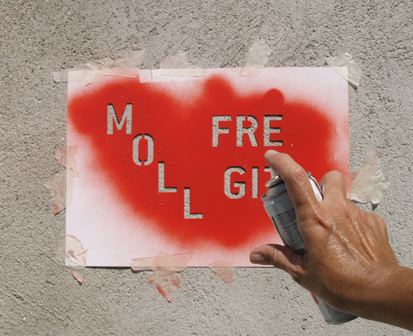
The system propose to create it with two different languages, street languages: spray and photocopy. We has differents variations for use directly in any material or in the same street.
La identidad visual está creada únicamente con tipografía, para hacer reconozible el nombre del festival y para poder variar la técnica pero respetar la forma y que sea identificable. A partir de aquí se ha realizado la imagen corporativa y sus aplicaciones, las cuales cobran presencia por el modo en el que aparecen más que en la forma que adoptan, por ello el lenguaje del stencil y el de la fotocopia vinculan todo el trabajo, así siendo la calle la que habla.

Typography used: Conduit ITC Bold
The corporative colors are
K:100
Pantone 7599 // RAL 3020 (for sprays actions)
Our corporative color is black, because it is cheaper. We can use it in any place with a photocopy machine. But for some pieces as postcards, and also for future speciall material, we use the red with a exactly traduction to spray (RAL version).
El color corporativo es el negro, la imagen ya cobra relevancia con el lenguaje y la escasez de medios obliga a ello. Sin embargo, tenemos un pantone, que tiene una perfecta traducción en Ral para nuestras graffitadas.
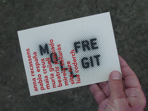
The superposition of languages always appear with the color attacking the black, the pantone Traffic Red or with the spray.
Los lenguajes cuando se superponen, siempre se mezclan con el Traffic Red.
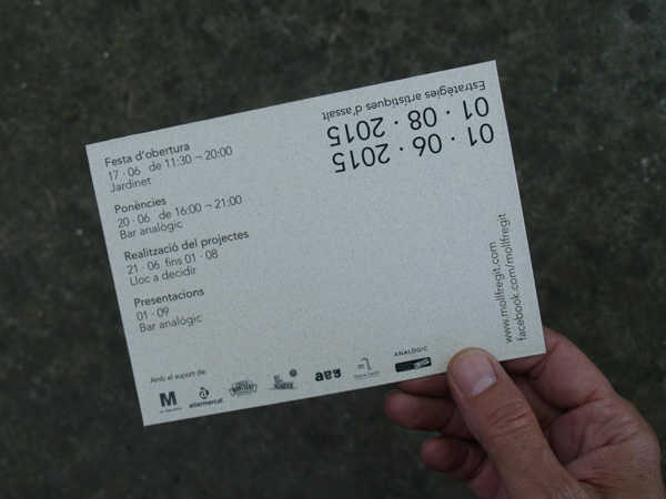
Postcard
Postal
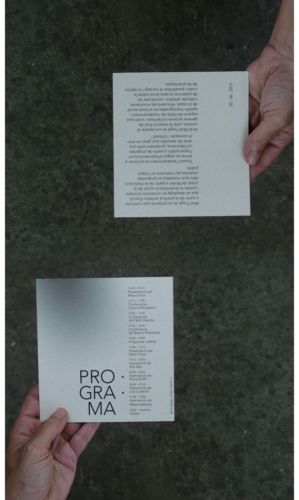
Programme
Programa
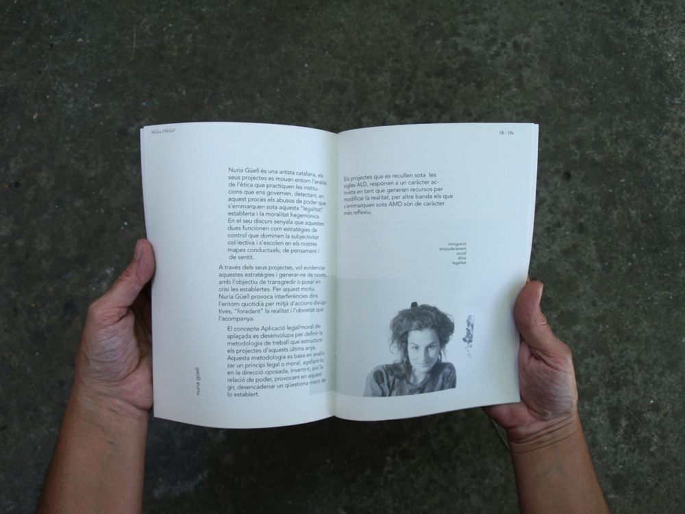
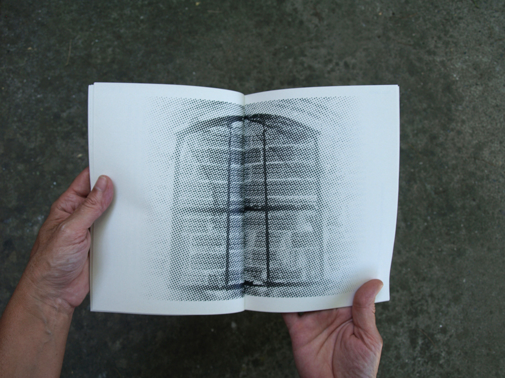

Brochure
Folleto
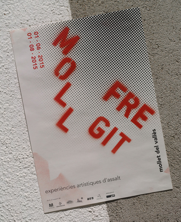
Poster
Cartel
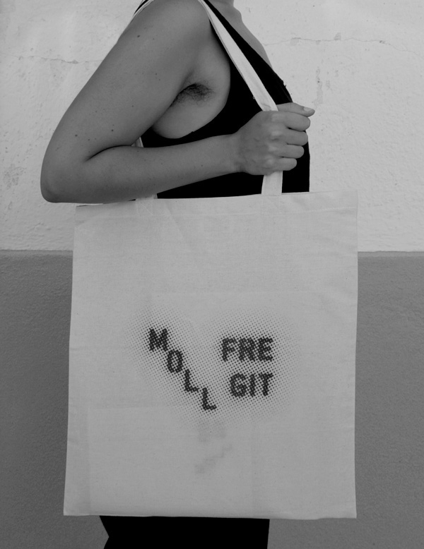
Bag
Bolsa
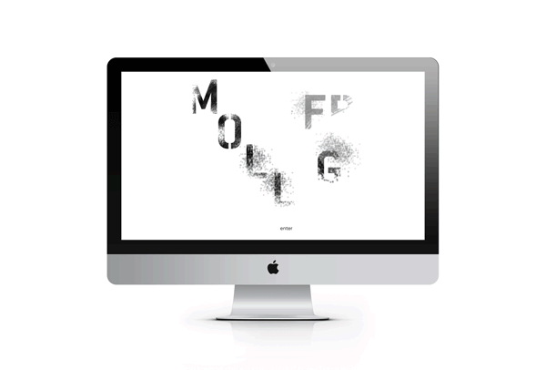
Website
Página web
Thanks to you,
for read
and also to
Joana Capella & Oriol Ocaña


