VISUAL STYLE INSTEAD OF WORDS
THE EXPERTS is an educational platform for experienced
professionals in the field of finance.
It is a semi-closed community, but the client did not want to directly
mention its elitism, so we had to reflect this fact through visual style.

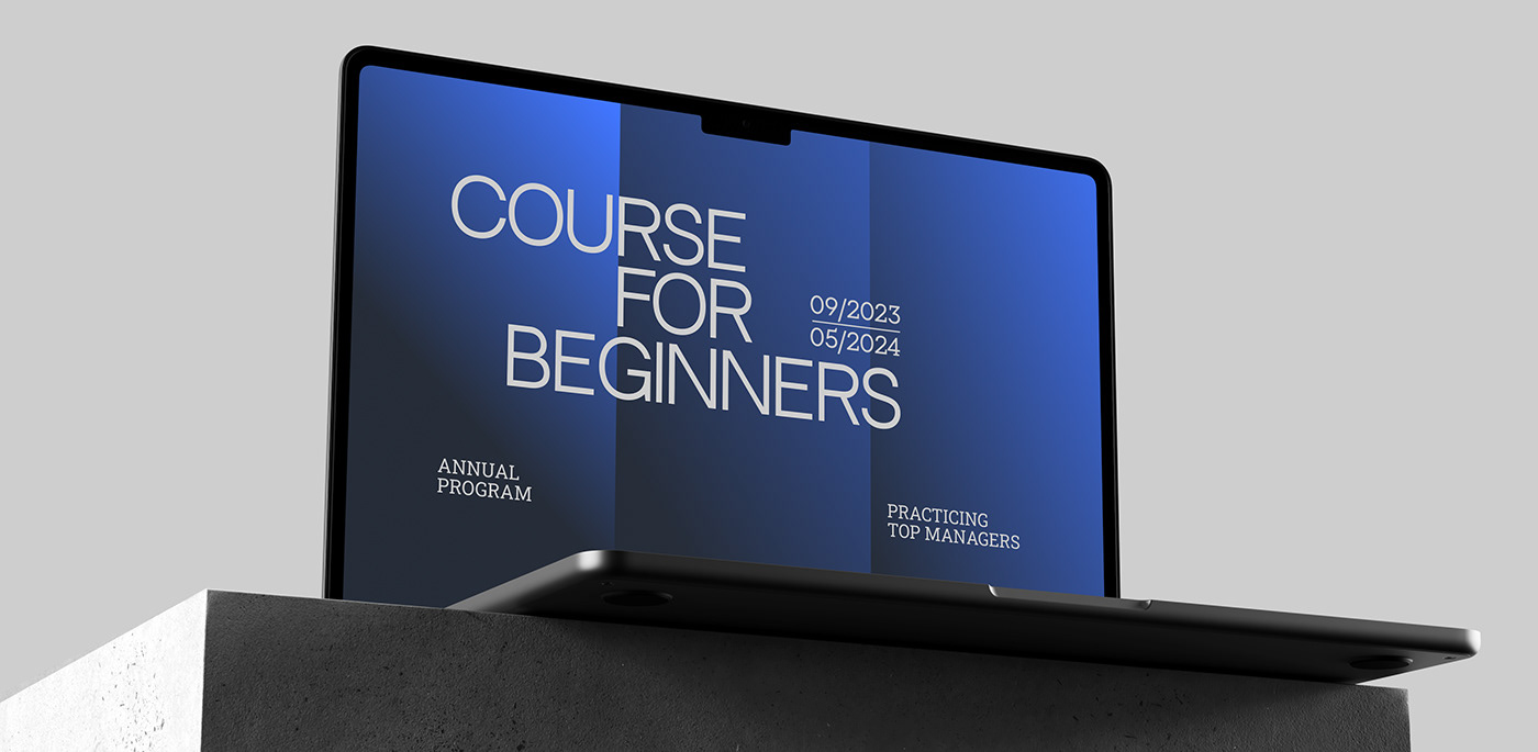
VISUAL STYLE
We came up with a metaphor of sunlight passing through
window blinds: like them, THE EXPERTS only let selected
rays into their windows.
We based the brand identity on this metaphor:
elongated horizontal shapes resembling blind slats,
and a graphite dark tone giving the identity a premium
feel and emphasizing the semi-closed community.

LOGO STYLE
The logo consists of a symbol and lowercase typography.
The dominant element is the blind panels that form the initial
letter of the school's name and represent a ladder to career
and economic growth.
Horizontal shapes easily transform into recognizable elements,
and they can create an effect of transparent distortion in photos.


The result is a modern premium look without vulgar black color,
with the aesthetics of print financial newspapers.

BRAND FONT
We used two fonts: the technological neutral face paired
with the block-like Roboto Slab. This way, the brand remains
progressive but retains a light accent of traditional
financial companies.