Design Team
Lead Designer: Yong Jieyu
Design Principals: Donn Koh, Lee Tze Ming
Design Team: Cheng Siew Ming,
Design Team: Cheng Siew Ming,
Design Support: Basit Abdul Khan, Darryl Lim
Designed and developed in Jan 2012 - Jun 2013. Launched on Dec 2013
Please do not reproduce in any form or post on blogs without the expressed written consent from STUCK.
Designed and developed in Jan 2012 - Jun 2013. Launched on Dec 2013
Please do not reproduce in any form or post on blogs without the expressed written consent from STUCK.
707 Visual Identity
Brand Refresh for Cheong Hock Guan Water Heater Centre, 2011
Brand Research and Strategy / Branding Design / Collateral / Packaging Design / Industrial Design / Product Graphics
A brand refresh commissioned by Cheong Hock Guan Water Heater Center, the owner of home-grown heater brand 707. Holding more than 50 years of history in producing quality water heaters, 707 looks to reconnect with their consumers in the local market and grow their pressence internationally. We were engaged to understand their users and provide fresh perspective that will coherently tie their brand with the needs and aspiration of users through design.
Rebranding without Alienating
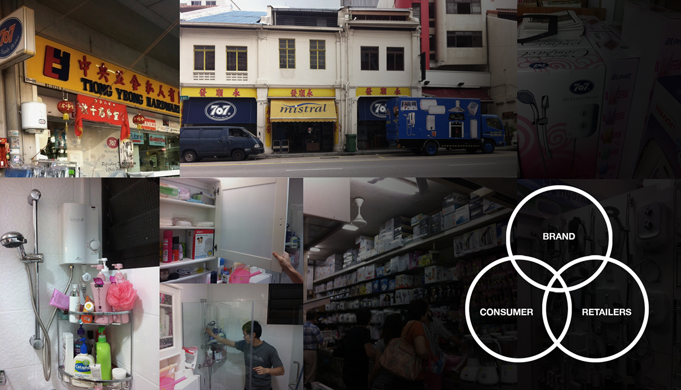
Through Mystery Buyer, Home Visits, and interviews with retailers and users, we got a good grasp on the perception of the brand 'on the ground'. Matching these findings and insights to the 707's brand values and aspirations, we created a visual strategy to not only refresh the brand's image, but also to cater to the needs of their retailers and buyers.
Working with graphic agency Terrain-RD, a new visual identity was created. The vision was to create a youthful and energized look to reflect the revitalised energy of the brand. Retaining and reinforcing 707's existing brand values allow us to create a new identity without alienating existing brand subscribers. Consideration was also taken to incorporate a chinese tagline as the brand prepares to enter the China market.

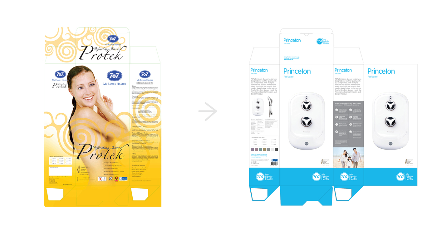
Images that directly reflects the function of bathing are replaced by more aspirational images of a 'happy fulfilled life' with asian models that speak more to the local market. Brand, taglines and product naming are given proper heirachy with clear markings on all sides of the boxes to facilitate retailers in finding the right product on their tightly stacked shelves.
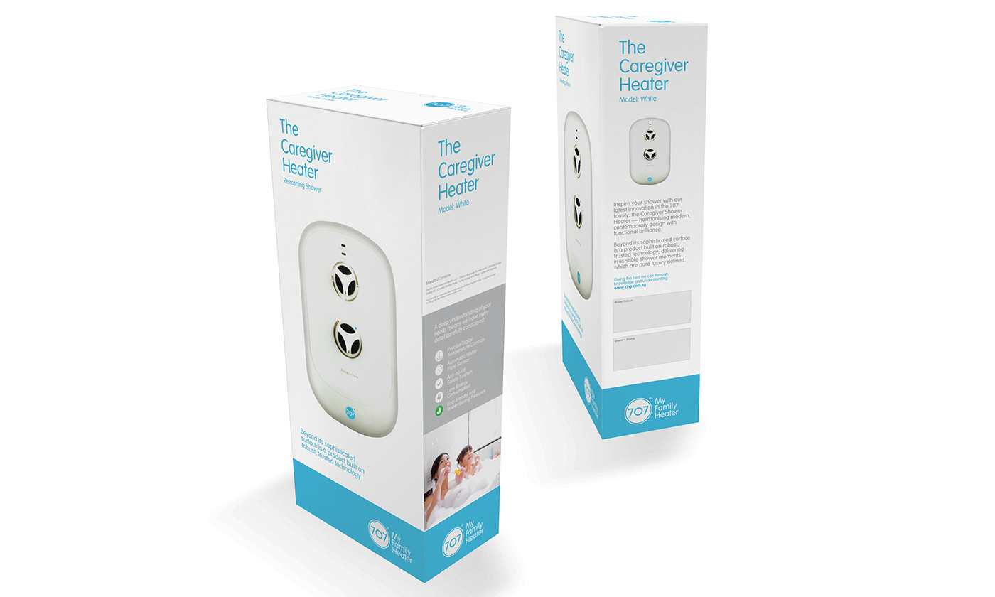
A clean 'quiet' packaging stands out from the clutter of brands in the retail stores. This approach is specifically designed to appeal to the confident, educated target market of 707. Clear product icons designed to clearly communicate the features of the product are placed on the side of the packaging with a supporting aspirational image. The front is catered to a full view of the product that 707 is so proud of.
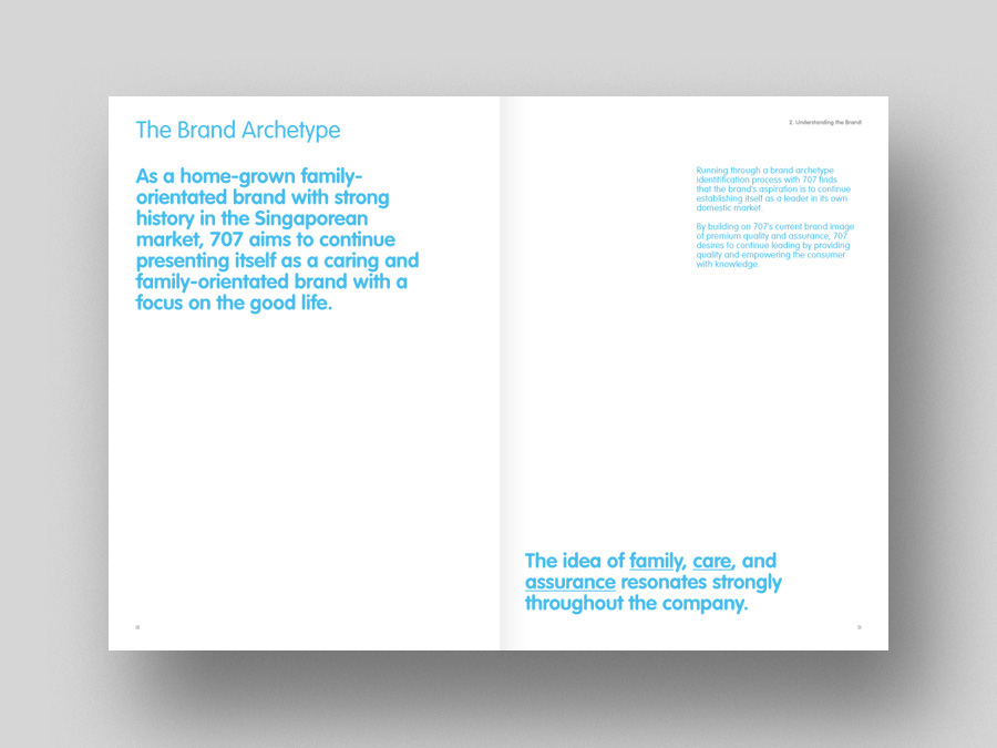
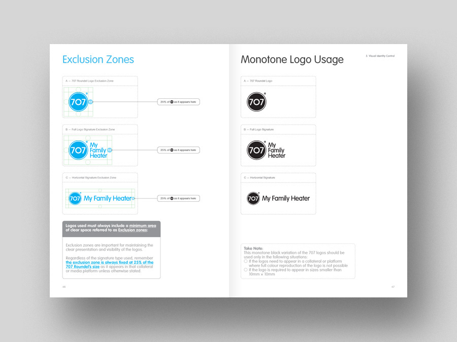
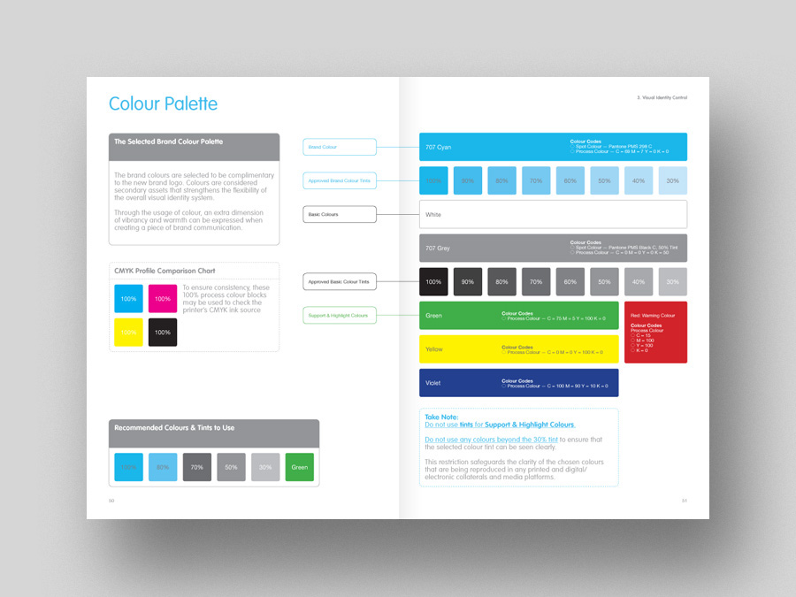
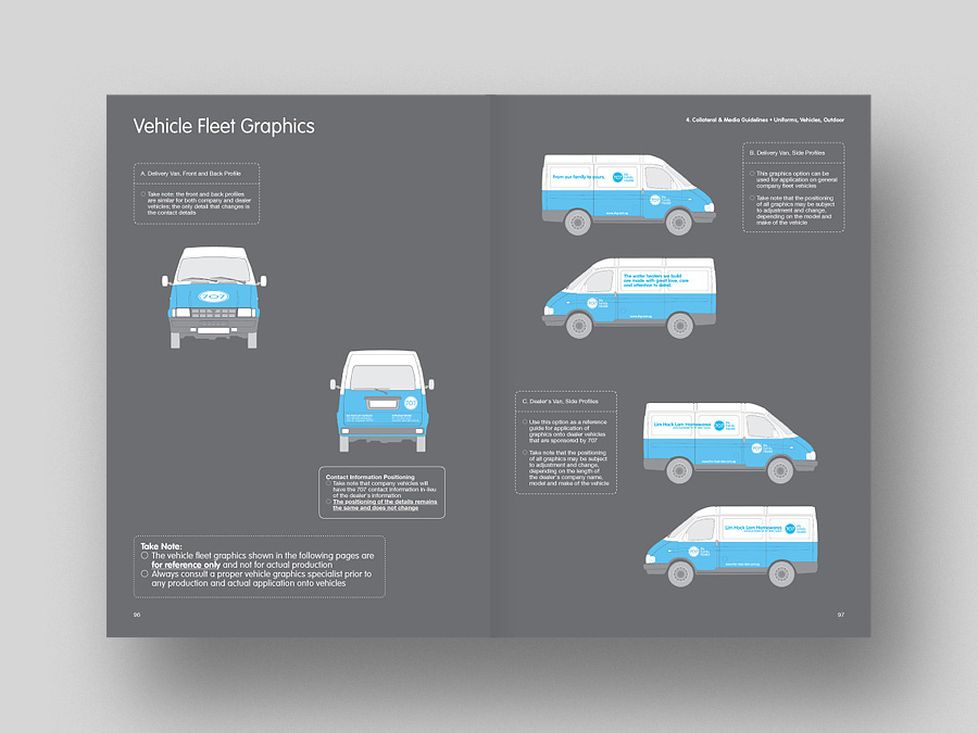
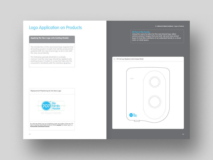
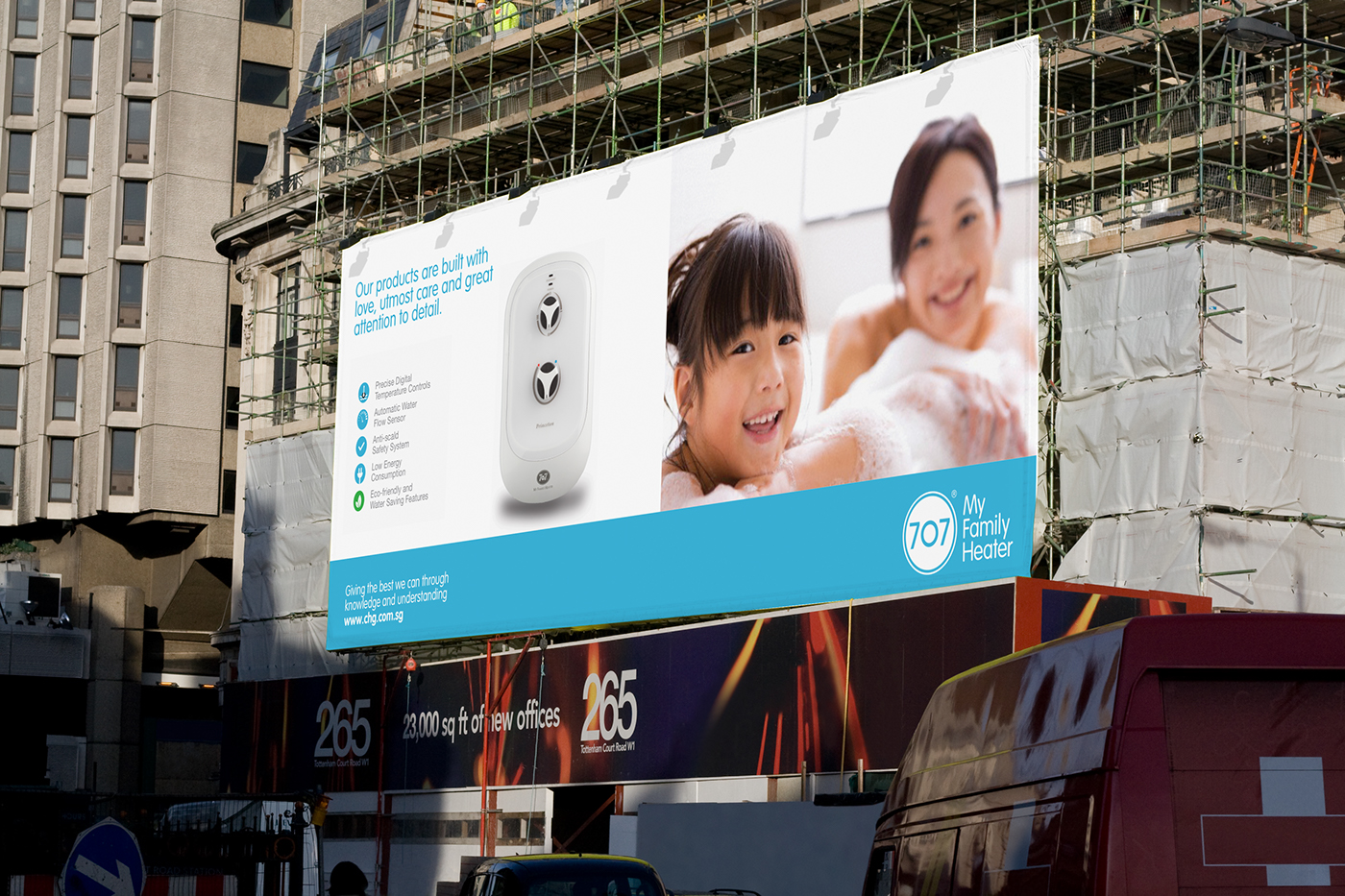
Outdoor advertising and marketing collaterals reflect the same values and are guilded by a visual identity guidebook.
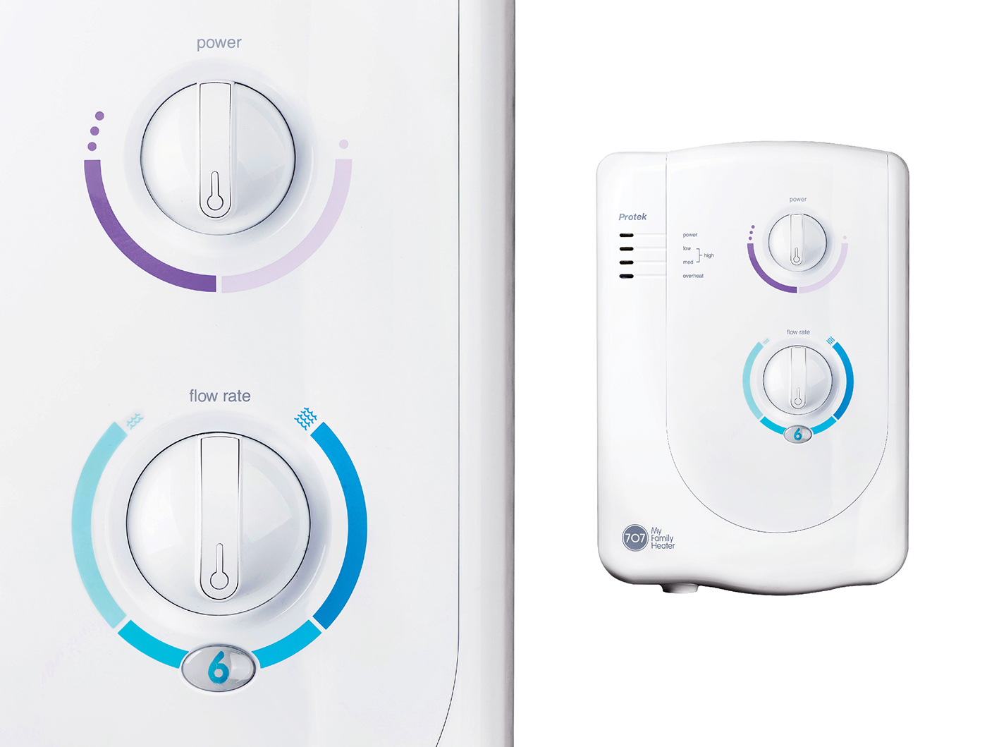
The identity refresh project included contemporary reinterpretations of product graphics for flow rate and power.

