品牌簡介
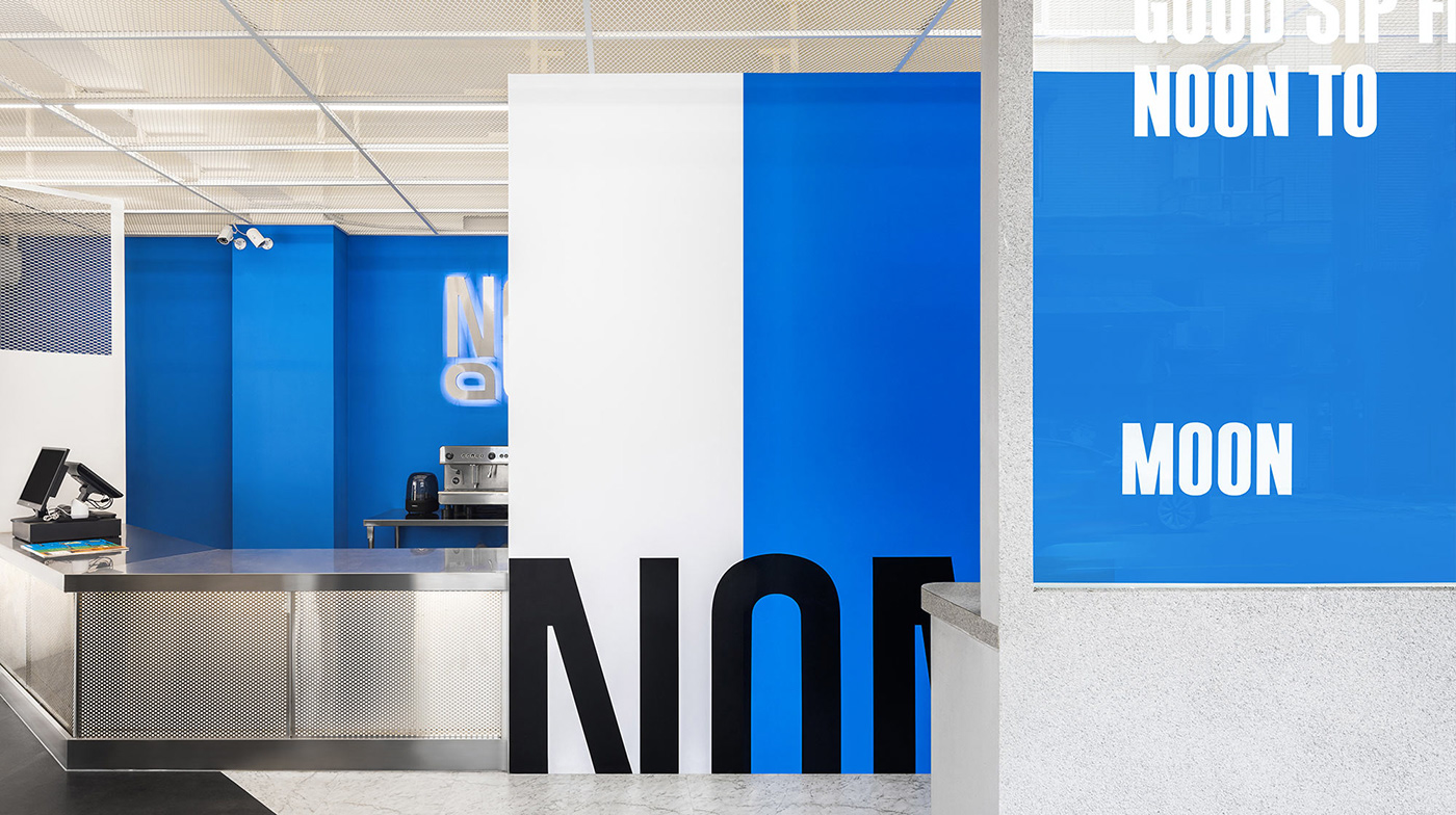
座落在城市街角,NOOM 是轉換心情的充電站,為繁忙的都市人打造一個喘口氣的角落。這裡是自由放鬆、暢所欲言的平台,拋開所有不順心的瑣事,用繽紛可口的飲料為生活重新上色。聊天的話語如同隱形的氣泡框,在空中愜意漂浮,人們在一段段交談中解開煩惱。NOOM 是個可以隨時拜訪、自在休憩的空間,從白天到黑夜,提供源源不絕的歡樂能量!
Background
Located on city corner, NOOM is a beverage shop offers diverse drinks selection, creating a place for busy urbanites to take a breath. This is a platform where you can relax and speak freely. Put aside all the unpleasant trivial matters and recolor your life with colorful and delicious drinks. Chatting words are like invisible dialog box, floating in the air, and people forget their worries during conversations. NOOM is a space that you can visit anytime, embracing the endless joyful energy from day to night.
設計方案
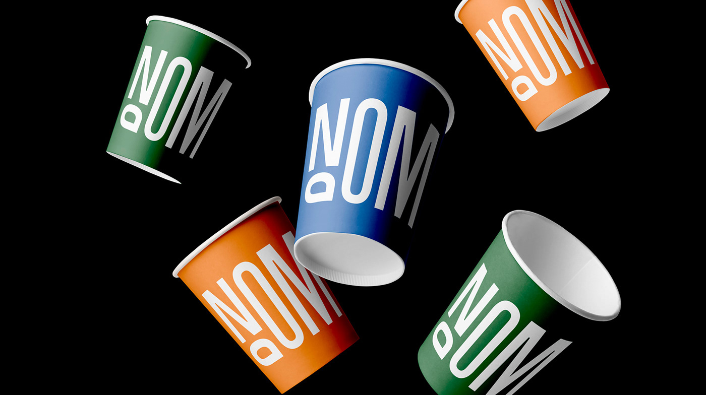
標誌給人的第一印象靈活多變,整體骨架瘦長,表現自由無拘束的動態感。字母 “O” 的長短、排列不一,象徵在聊天時的暢所欲言;右下角以方形作收尾,模擬對話框的符號。輔助圖標採用左右交錯的字母 “O”,如同對話時的有來有往,與標誌共用方形收尾,強調視覺的一致性。團隊為品牌打造了自由多變、熱情親切的形象,匯聚都市中的人群與故事,一起享用美好飲料、共度愜意時光。
Design
The first impression given by the logo is flexible and changeable. The overall frame is long and slender, expressing a sense of free and unrestrained dynamics. The length and arrangement of letter "O" vary, symbolizing that people can speak freely; the lower right corner ends with square outline, simulating the icon of a dialog box. The team created a free, warm and friendly image for the brand, bringing people together to enjoy amazing drinks and cheerful time.