
Gilano is one of the leading dates exporters and suppliers in Pakistan. Their product goes from Pakistan's soils directly to USA, UK, Canada, Japan, and Norway.
Our mission was to redesign the entire company's visual identity and to create a new packaging architecture and design for their product.

New Logo
The old logo had a lot of difficulties in implementation because of the inconsistency in line drawing and level of detail. The solution was to design a logomark as jewelry that can work with any kind of printing technique including engraving and embossing. The new logotype is simplified keeping alive the personality of the old one but improving readability and usability.
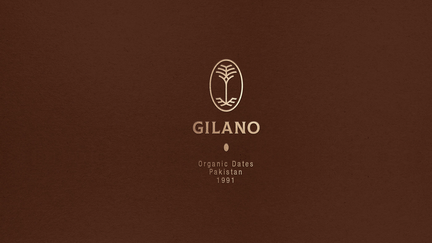

The overall shape of the logomark
can be read as a date and a date palm tree.
Visual Identity
The graphic language contains curved lines and patterns, denoting the diversity of both featured elements varies in nature. All these lines enhance the organic look and feel of the brand.


Packaging Architecture
GILANO is about culture and heritage created by Pakistani families from all around the country. To incorporate this in our story, we created a pattern that shows unity and a color palette inspired by the dominant colors of each Pakistani region where dates are harvested.


