G-HAUS
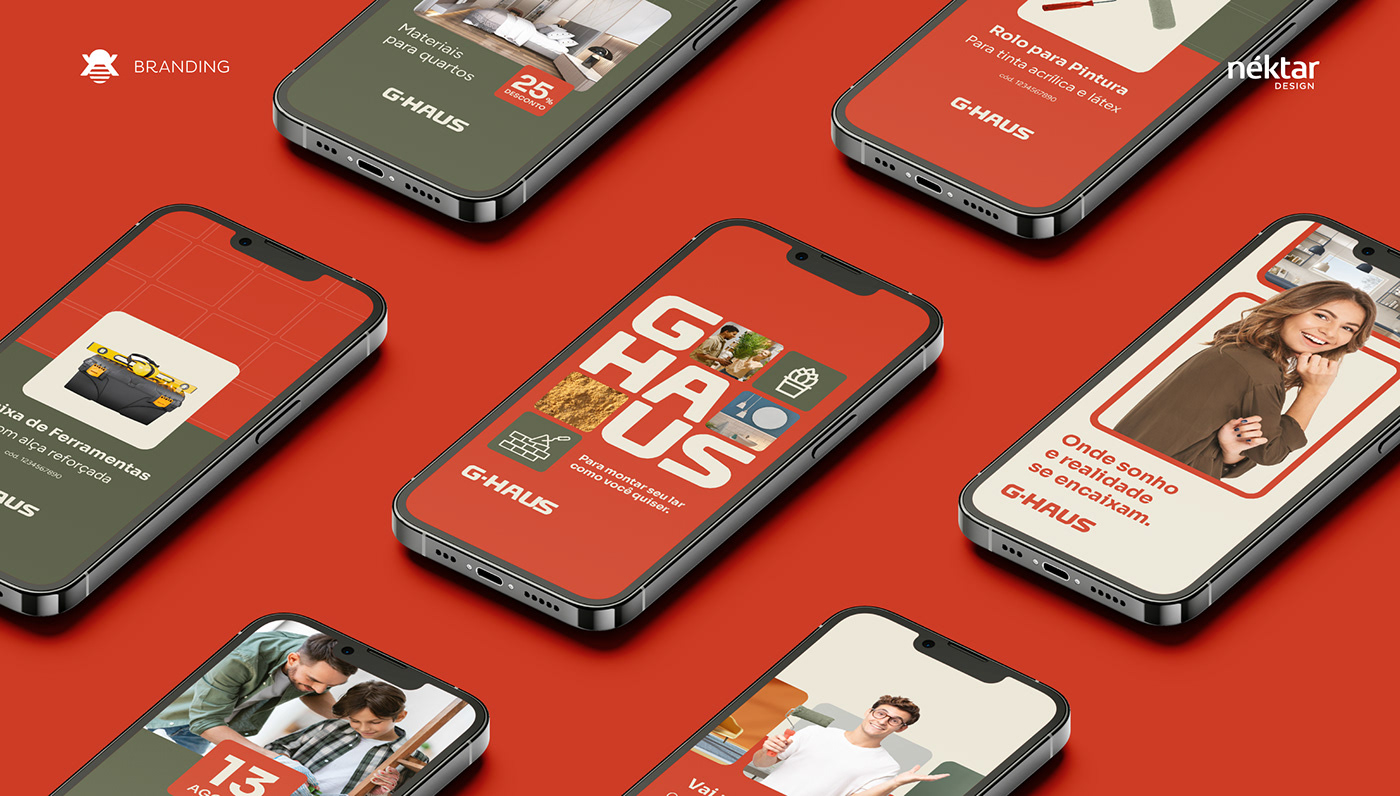
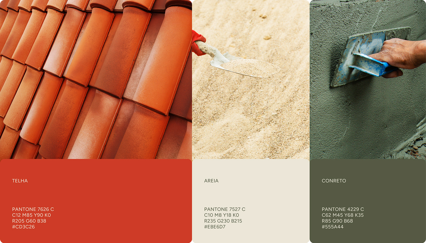
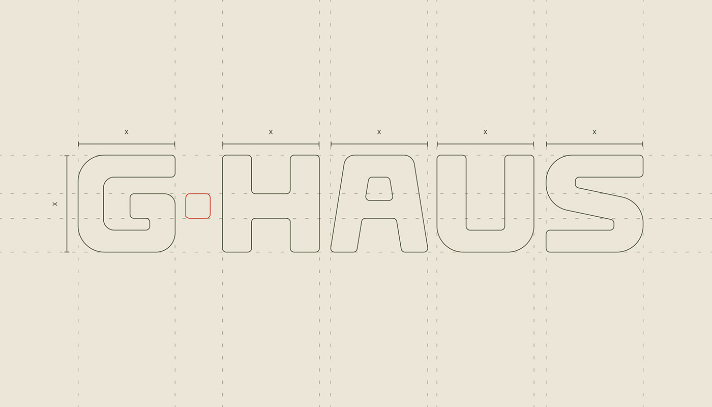
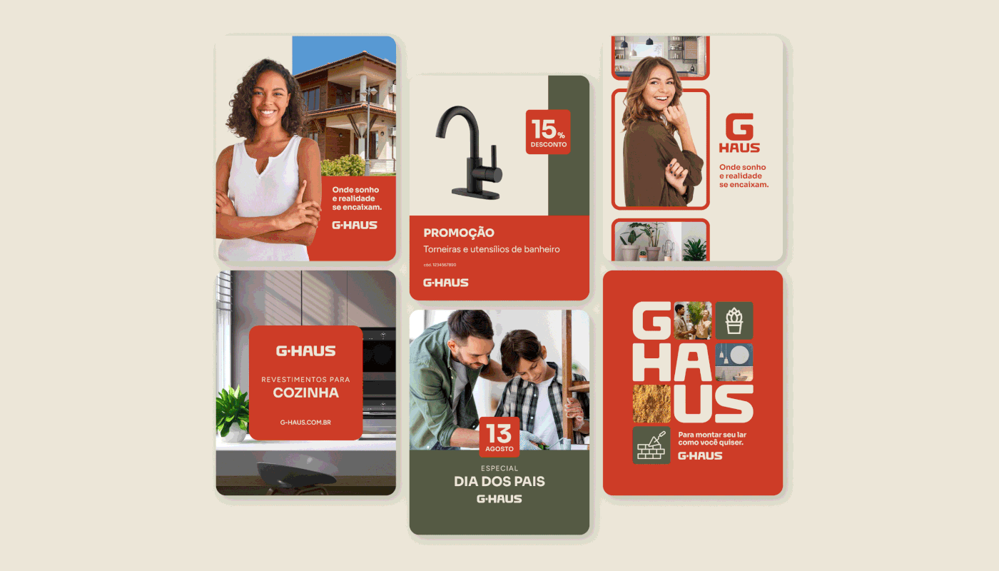
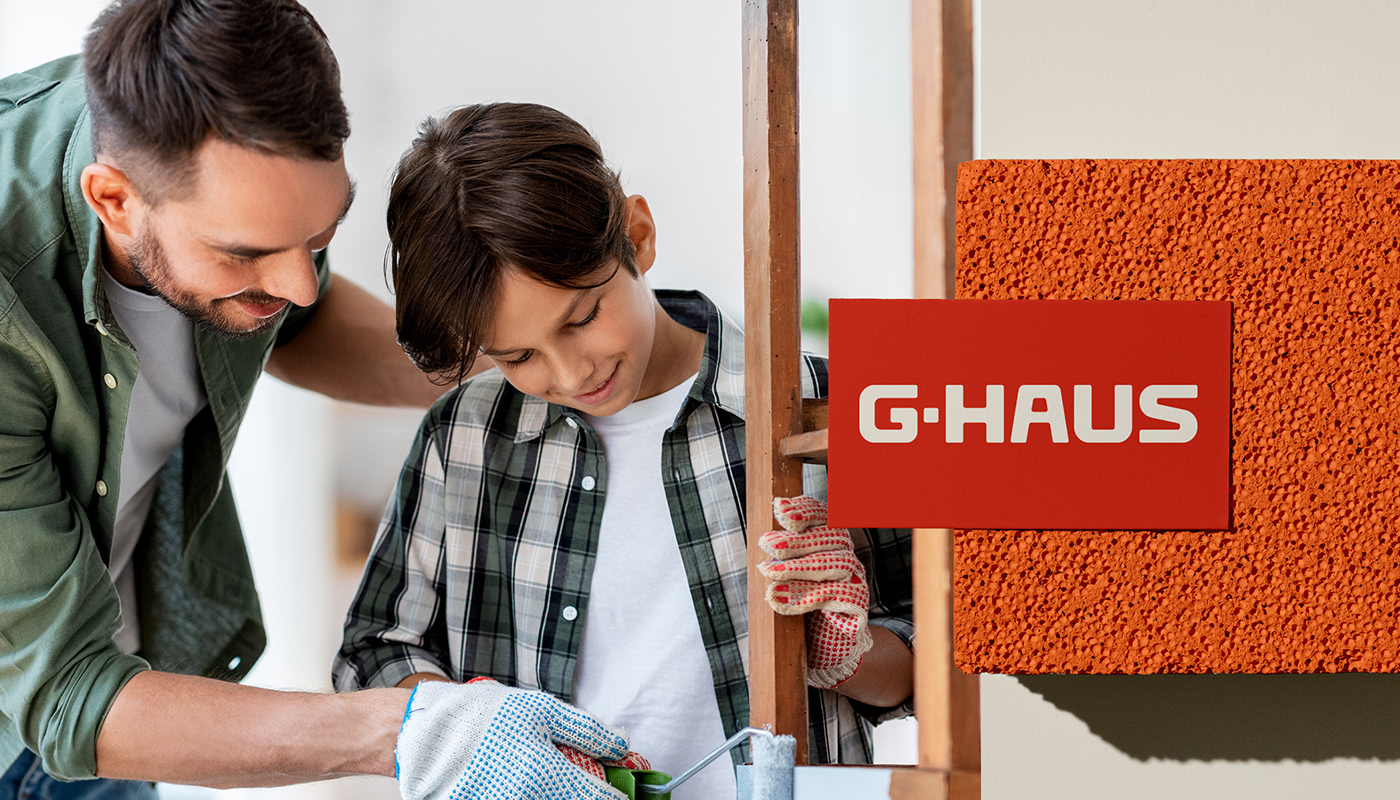
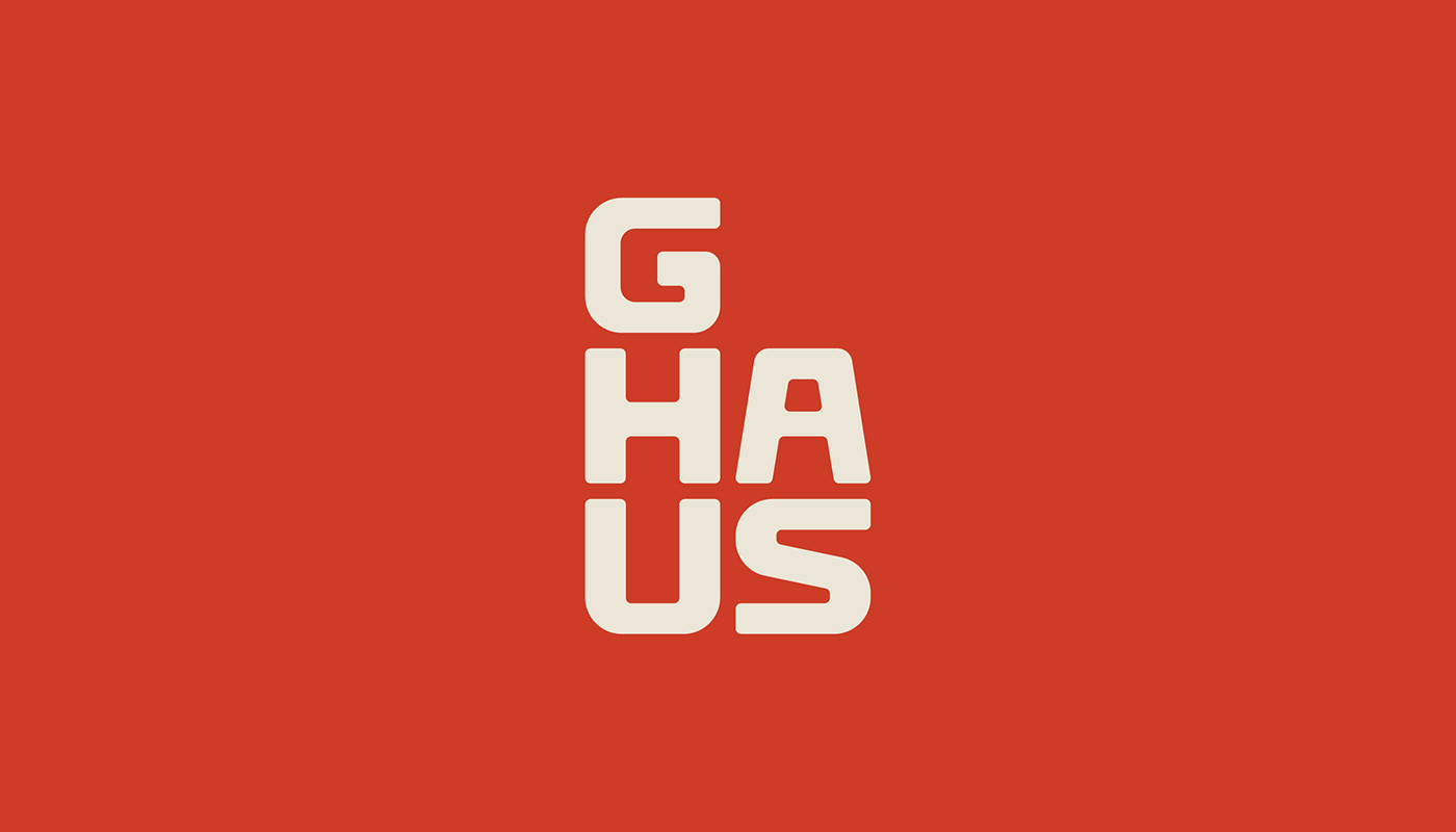
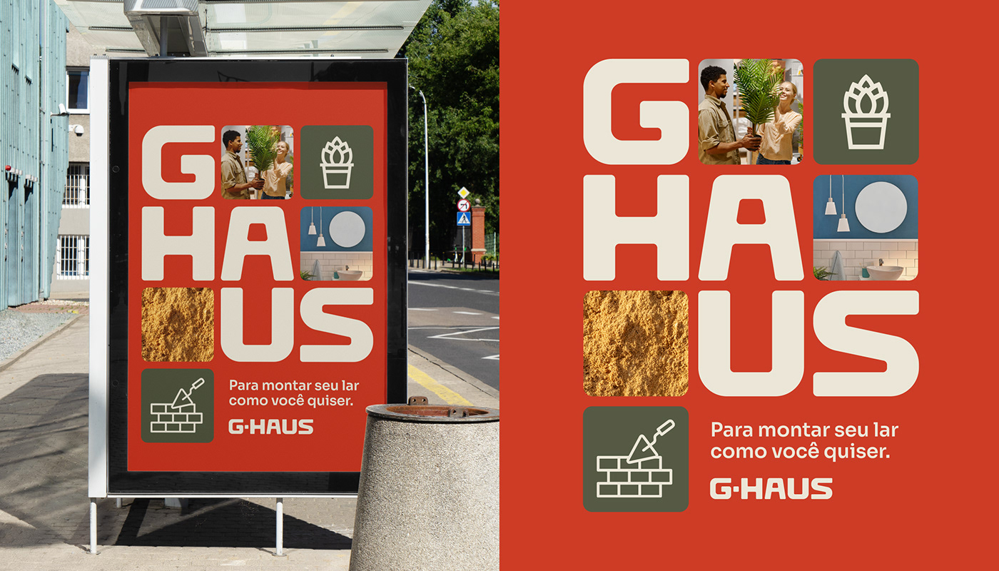
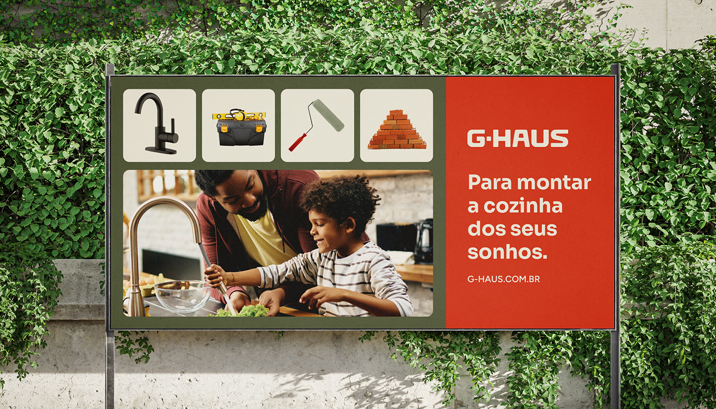
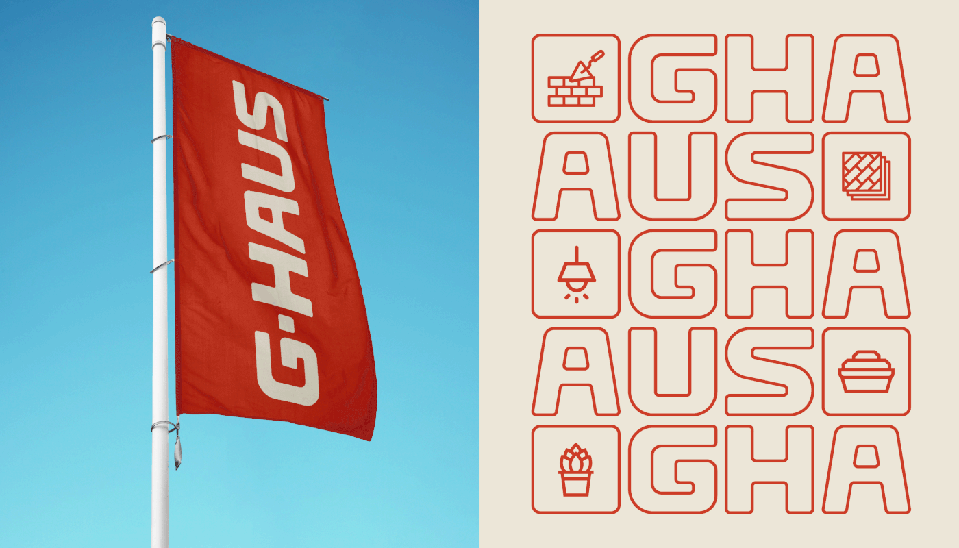
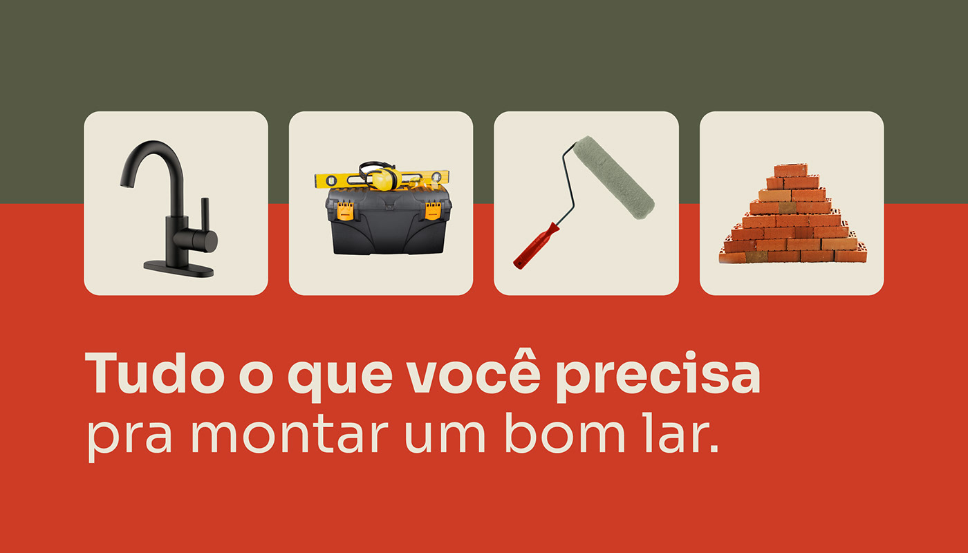
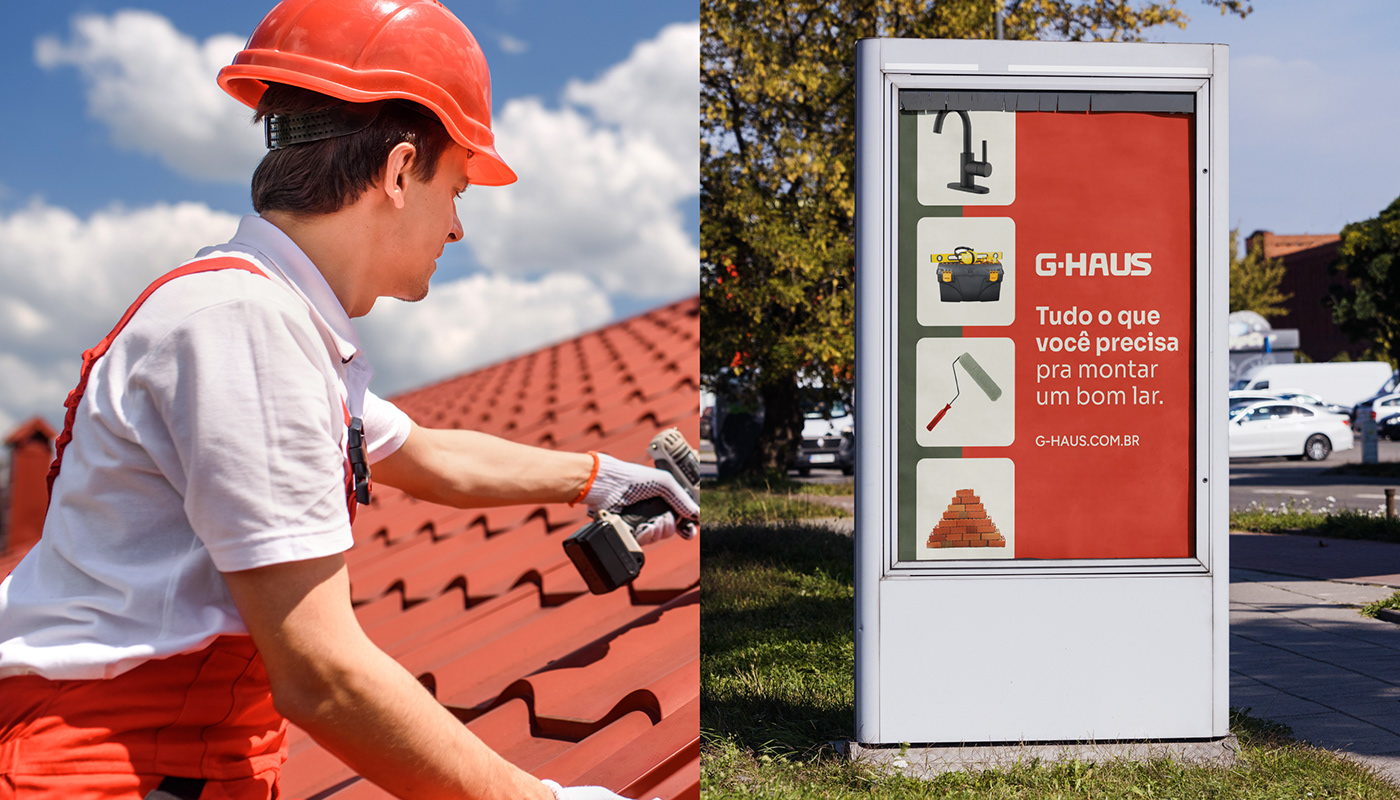
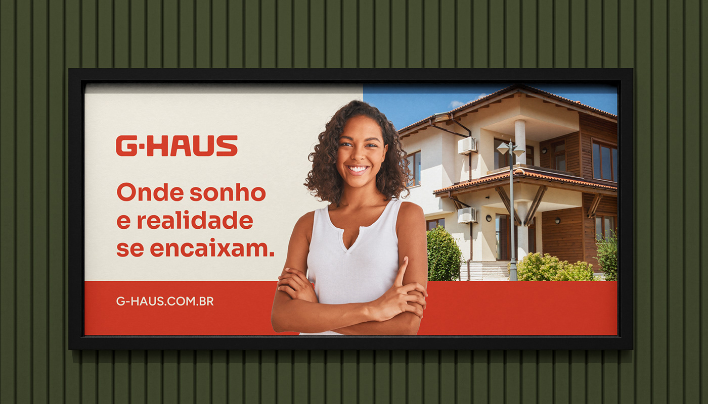
A G-Haus nasceu com o propósito de proporcionar que as pessoas realizem o sonho da casa ideal, oferecendo as peças-chaves que melhor se encaixam em cada projeto. A inspiração para o desenho da marca partiu da visão de uma obra como um grande "quebra-cabeças". Todo mundo que está construindo ou reformando uma casa, sabe que parece não ter fim. A cada nova etapa tem uma peça que faltava pra gente ir deixando o espaço como a gente quer. O encaixe da cor perfeita, a alegria de encontrar o profissional certo que apresenta a melhor solução, a descoberta de uma nova alternativa para aquele espaço que faltava no projeto, comprar e receber tudo no tempo certo. A G-Haus oferece todas essas soluções para que o consumidor não tenha que "quebrar a cabeça" na hora de construir ou reformar. A marca é simples no desenho mas original na ideia que apresenta: suas letras, em formas de módulos que se encaixam, reforçam seu propósito e sua personalidade acolhedora e confiável. A G-Haus é uma marca próxima, atualizada, eficiente, simples e ao mesmo tempo original. Compondo com o desenho do lettering, que tem as letras baseadas em módulos quadrados, a linguagem visual explora diferentes combinações modulares, onde as letras, fotos e ícones se encaixam em diferentes possibilidades, assim como nos diferentes projetos dos consumidores. Um pattern de letras e ícones é usado em embalagens e materiais de loja, e fotos de pessoas e produtos são mesclados nesses grids gráficos que foram pensados para tornar a comunicação da marca mais dinâmica nas aplicações do cliente.
G-Haus was born with the purpose of enabling people to achieve the dream of the ideal home by offering key pieces that best fit each project. The inspiration for the brand's design came from the vision of a construction as a large "puzzle." Anyone who is building or renovating a house knows that it seems never-ending. At each new stage, there's a missing piece that allows us to shape the space as we desire. The perfect color match, the joy of finding the right professional who presents the best solution, the discovery of a new alternative for that missing space in the project, buying, and receiving everything on time. G-Haus provides all these solutions so that the consumer doesn't have to "rack their brains" when building or renovating. The brand is simple in design but original in the idea it presents: its letters, in the form of modules that fit together, reinforce its purpose and its welcoming and reliable personality. G-Haus is a brand that is approachable, up-to-date, efficient, simple, and at the same time, original. Complementing the lettering design, which has letters based on square modules, the visual language explores different modular combinations, where letters, photos, and icons fit into different possibilities, just like in the various projects of consumers. A pattern of letters and icons is used on packaging and store materials, and photos of people and products are blended into these graphic grids that were designed to make the brand's communication more dynamic in customer applications.
SEDE DA EMPRESA / COMPANY HEADQUARTERS
Dois Irmãos / RS - Brasil
DATA DO LANÇAMENTO / RELEASE DATE
Novembro 2023 / November 2023


SERVIÇOS / SERVICES
Identidade visual / Brand identity
Tom de voz da marca / Brand voice
Materiais de comunicação / Communication
NÉKTAR DESIGN TEAM
Account Executives: Paula Langie, Adrienni Klering
Creative Direction: Paula Langie
Strategic Direction: Roberta Hentschke
Strategic Direction: Roberta Hentschke
Design: Gabriel Hoch Jaques, Patrícia Ugalde, Matheus Fritz
Motion: Thomas Becke Miguel
Copywriting: Letícia Monteiro
Copywriting: Letícia Monteiro
PROJECT PARTNERS
Research: Paim
Say hello: nektar@nektardesign.com.br