


frupick (2023)
Brand eXperience Design
Project Overview
“frupick” is a brand born to recognize the seriousness of discarded fruits and improve it. About 20-25% of the world’s crops are being wasted due to their ugly appearance, leading to serious resource waste. If you know how fruits are made and harvested, you can realize that there is no problem, but it is not easy to understand all the processes realistically. We aim to provide a new experience through various products using fruits, not just selling bruised fruits.

Core Value
The cultivation process for all fruits is the same. Fruits that are discarded due to aesthetic reasons, such as signs of disease or sunburn marks, are often prejudged as not tasting good because they cannot gain market value. There is no problem with taste and nutrition. They are just different in appearance, but their value is the same. We will approach in a more familiar way to improve perception. We will help you understand that it is no different from ordinary fruit. And we will work to change the perception of bruised fruits and, in doing so, change the world.

Brand Essence
The difference from existing brands is that we do not only sell fruits. Prufic provides delicious meals to consumers through products using bruised fruits, allowing them to perceive through their five senses that the taste and nutrition are no different from ordinary fruits.

Brand Name
“Pick” carries various meanings. We created the new brand name “frupick” by combining “fruits” and “pick” to embody our desire to improve perception so that consumers can choose bruised fruits without prejudice.

Brand Slogan
If perception is improved and injured fruits are chosen without prejudice, it will reduce food waste and change to a sustainable consumption form. In order to convey the ideology of a brand pursuing sustainability to consumers, we have developed a slogan using the initial consonants of the Korean brand name.
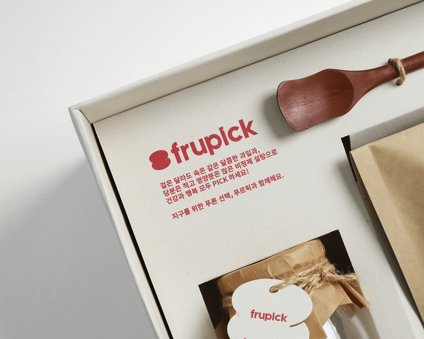
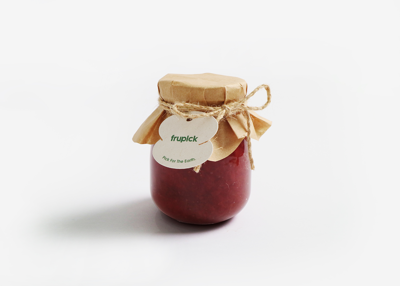
Key Visual
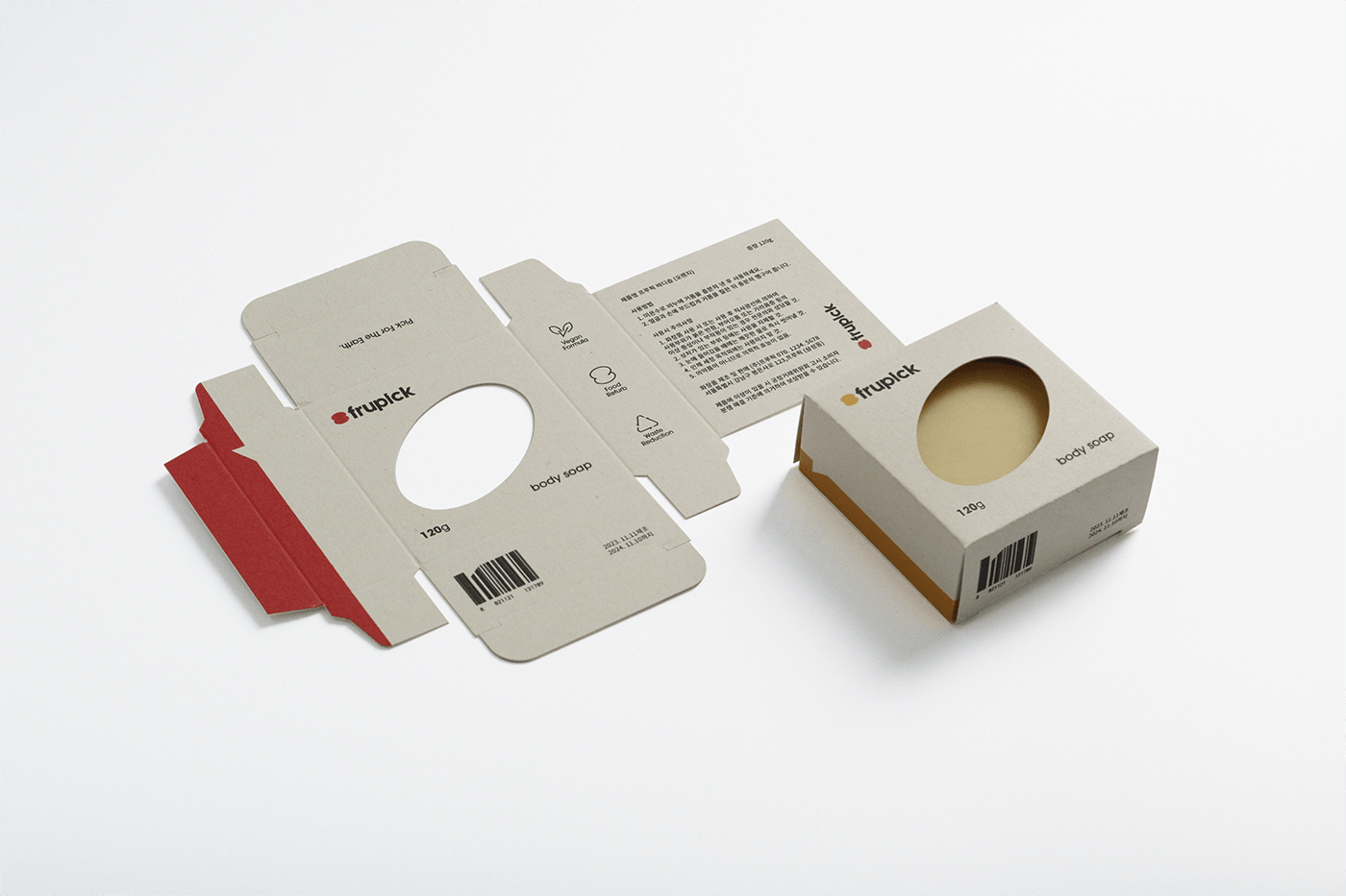
The characteristics of bruised fruits are expressed as a motif. By applying the motif to logo, packaging and MD, we convey the positive aspects of imperfections to consumers, reducing their aversion to bruised fruit.


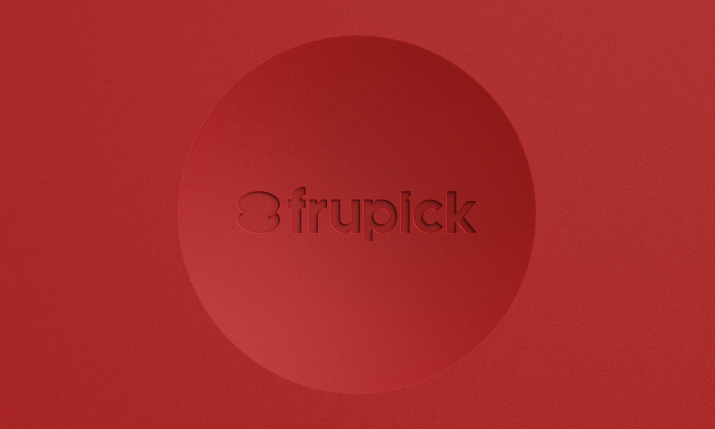
Brand Logo
The brand logo of frupick is designed to capture the main features of bruised fruits. Although they are injured, you will feel that there is no big difference from the existing typefaces when you look at them from the outside. This means that bruised fruits are only different on the outside, but the inside is the same.
The brand logo of frupick is designed to capture the main features of bruised fruits. Although they are injured, you will feel that there is no big difference from the existing typefaces when you look at them from the outside. This means that bruised fruits are only different on the outside, but the inside is the same.


Typography / Color
The typeface uses a font similar to the brand logo, implying that even if the outside of the fruit is different, the inside is the same. The main color of frupick uses a low-saturation primary color to show that it is eco-friendly, delicious, and healthy.


Iconography
The iconography reflects the formal characteristics of the logotype and the features of damaged fruits, ensuring overall brand consistency in its development.


Brand Application
The application, designed with sculpture and graphics using brand motifs, provides positive experiences.

Business Card - You can give a business card in a direction that is easy for the other person to see, through a motif.


Name Tag - Through a motif, you can intuitively verify the position and name.


Mug - You can hang a tea bag on the indented part of a mug handle.


Table Mat - Through the form swept by the motif, it prevents the liquid from flowing out.


Orange Peeler - Through a motif, it allows you to easily open the cap and provides a comfortable grip.


