Client: Evershine Foods
Year: 2020
Location: Mumbai
Discover a range of egg-based supplements meticulously crafted to address diverse fitness needs. From seamlessly blending protein powders into daily routines to introducing innovative egg-infused nutritional boosts, R.U.N. is set to redefine the approach to nutrition.
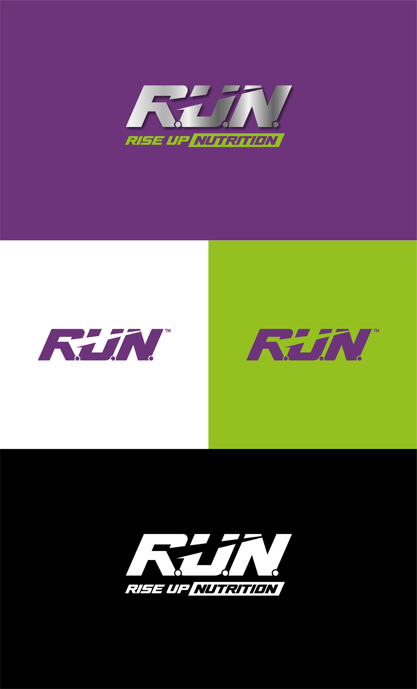
The R.U.N. Rise Up Nutrition logo is a dynamic expression of strength and energy. The bold and edgy font, tilted towards the right direction, forms the word "Run" with a distinctive touch. The letters R, U, and N are artfully incorporated, creating a seamless and cohesive shape that embodies the brand's commitment to motion, vitality, and progress. The Lightning mark cleverly integrates within the letters R, U, and N, adding a striking element that symbolizes the powerful and energetic nature of the brand.


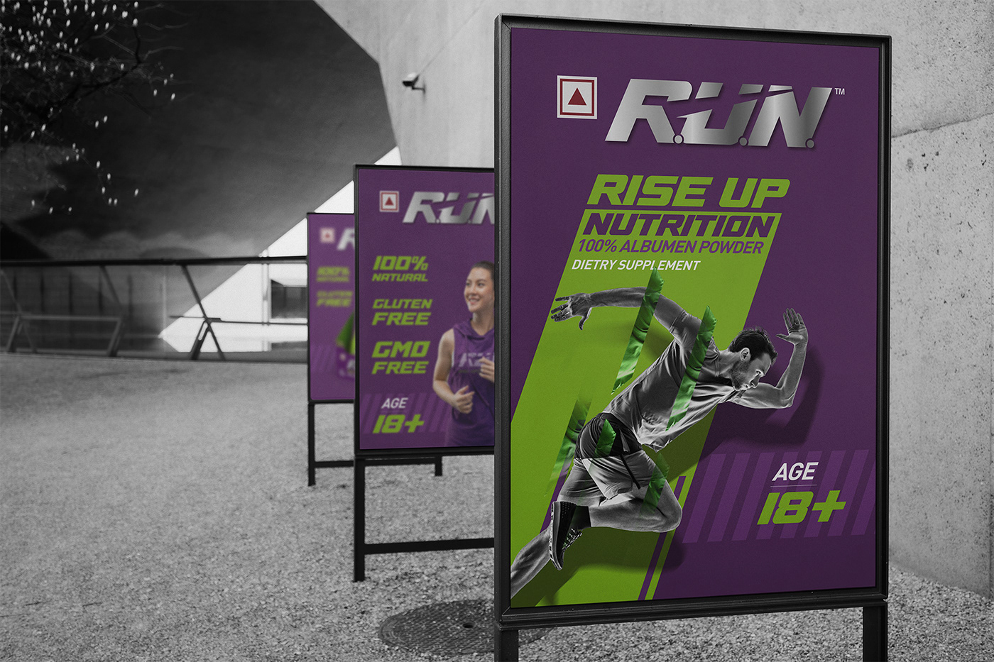
The packaging for R.U.N. Rise Up Nutrition is a testament to simplicity, functionality, and modern aesthetics. The primary colour of the packaging is a sleek matte purple and green, communicating sophistication and premium quality. The logo, prominently displayed, serves as the focal point, with the bold and tilted "Run" forming a captivating visual element. The Lightning mark within the letters adds a subtle shine, symbolizing the potency of the product.


Product information and branding details are presented in a clean and minimalist layout,
ensuring a seamless and enjoyable customer experience. The overall design reflects the brand's commitment to a forward-thinking approach to wellness, making the R.U.N. Rise Up Nutrition packaging not only a vessel for exceptional products but also a statement of empowerment and progress.


