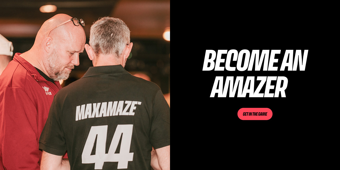
Ultimate sports experiences
When your brand identity no longer reflects who you are and what you do, it is time for a rebranding. Such was the case for MAX EQP, which until recently focused its 'equestrian productions' on the audience experience during horse sport competitions. That includes sound, lighting, timing and LED screens and boardings. As befits a pioneering company, MAX EQP wanted to continue taking steps forward. The goal: to take the technics and experiences during indoor and outdoor sports events of all types to the next level.
Strategies are nothing new to us, so we channelled everything towards a brand story that captures the soul and mission of this experience specialist. Since the 'EQP' in MAX EQP stands for 'equestrian productions', our next aim was to search and find a new and vibrant name: MaxAmaze. Where 'Max' refers to the previous MAX EQP, 'Amaze' in turn refers to the feeling they want to evoke among sports fans.
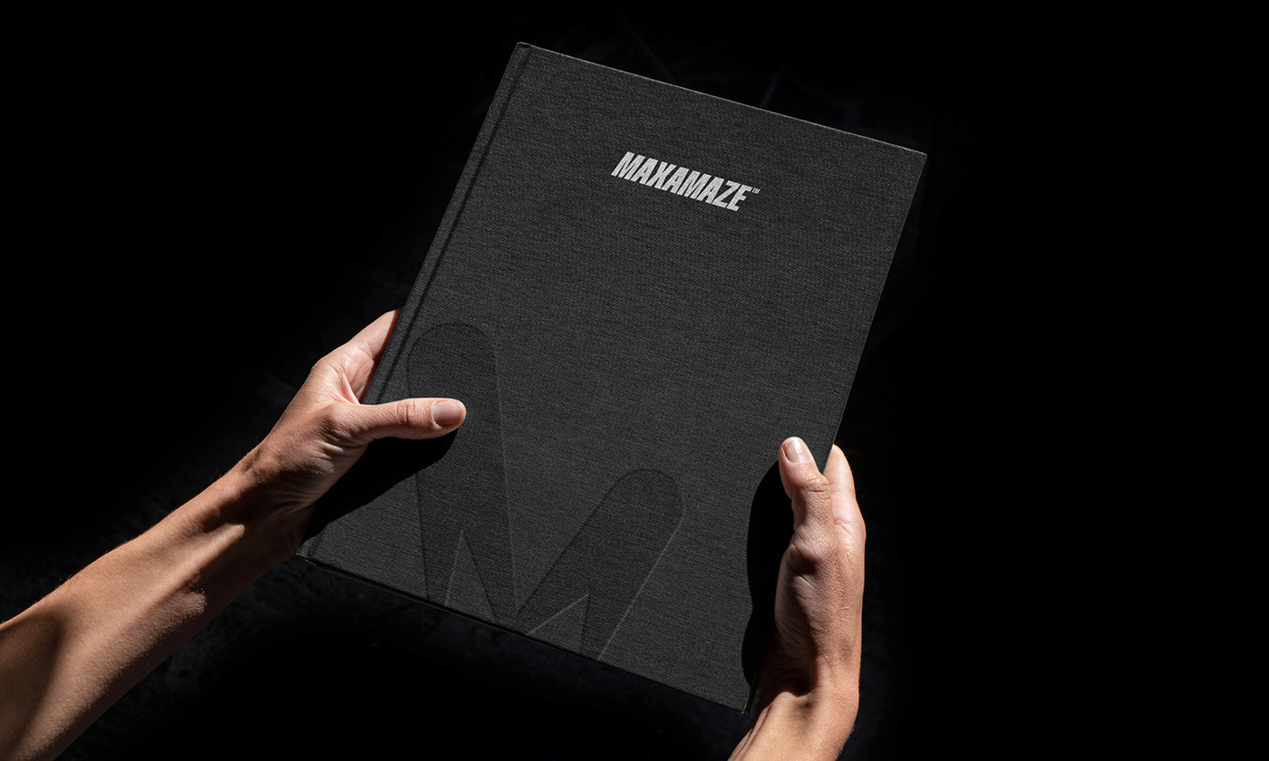
Next up: visual identity! In the words of MaxAmaze: light is key. A set of moving light beams therefore converge to form the letter 'M', also the logo symbol. Those same light beams play a role in the visual identity, where they serve as a graphic element for striking colour and image transitions. In addition, a font was chosen that exudes a powerful sports vibe. On top of that, an active sliding motion is used on digital carriers. Furthermore, every MaxAmaze expertise was given its own icon, derived from the logo.
With this rebranding in the bag, MaxAmaze can continue its progression. At MOQO, we can look back on a challenging and successful project in which we put MaxAmaze's 'Ultimate Sports Experiences' in a new light. Get in the game and be amazed!
Strategies are nothing new to us, so we channelled everything towards a brand story that captures the soul and mission of this experience specialist. Since the 'EQP' in MAX EQP stands for 'equestrian productions', our next aim was to search and find a new and vibrant name: MaxAmaze. Where 'Max' refers to the previous MAX EQP, 'Amaze' in turn refers to the feeling they want to evoke among sports fans.
Next up: visual identity! In the words of MaxAmaze: light is key. A set of moving light beams therefore converge to form the letter 'M', also the logo symbol. Those same light beams play a role in the visual identity, where they serve as a graphic element for striking colour and image transitions. In addition, a font was chosen that exudes a powerful sports vibe. On top of that, an active sliding motion is used on digital carriers. Furthermore, every MaxAmaze expertise was given its own icon, derived from the logo.
With this rebranding in the bag, MaxAmaze can continue its progression. At MOQO, we can look back on a challenging and successful project in which we put MaxAmaze's 'Ultimate Sports Experiences' in a new light. Get in the game and be amazed!