


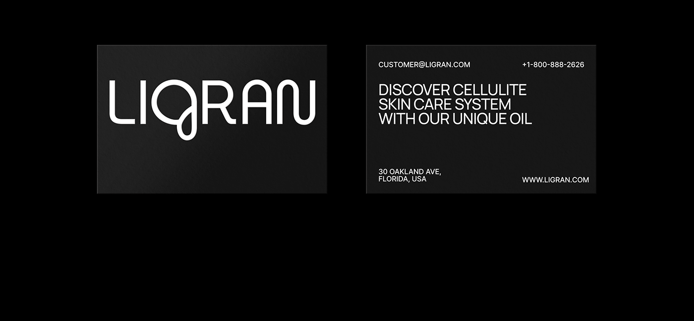

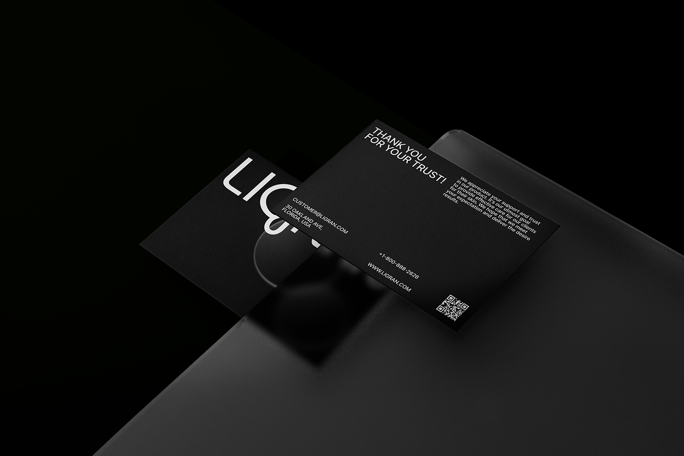


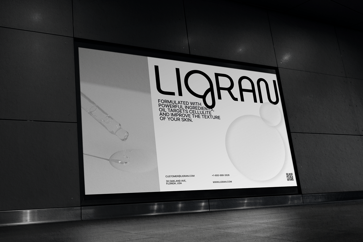


LIGRAN
LIGRAN is a brand that specializes in the development and production of anti-cellulite cosmetics, the aim of which is to enable every woman to love her body and feel comfortable.
The name LIGRAN comes from the combination of the two words "lifting" and "granneli", which reflects the idea of the brand: LIGRAN products tighten the skin particles, smoothing them, making the skin smooth.
The brand identity is based on the image of a drop, which creates associations with water, purity, naturalness, to show that when creating its products the brand uses only natural elements useful for the body, which improve skin texture and reduce the appearance of cellulite.
In the logo, the letter G resembles the flow of one drop into another, symbolizing the process of penetration
of the LIGRAN product into the skin, smoothing cellulite.
You can contact me for branding, identity and logo design. I am open to new projects.
To contact me, use the links to write messages.
To contact me, use the links to write messages.


