Rebranding NTS was a turning point in functionality and prosperity.
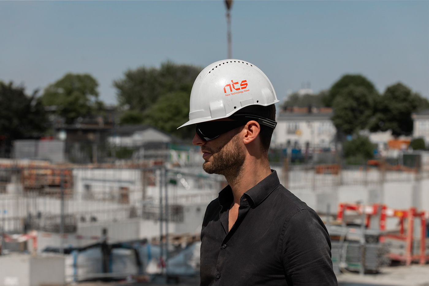
We live in an age of rapid technological advancements, and we want that to be reflected in our homes, kitchens, hotels and restaurants. Stainless steel looks "futuristic, practical and simple" representing our audience needs from chefs, interior designers, restaurateurs and businessmen that makes there stainless steel equipements their top choice.
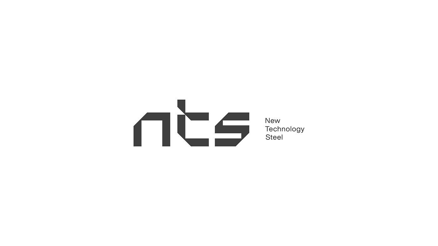
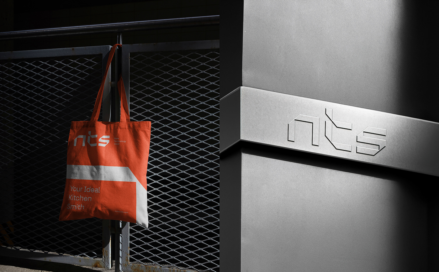
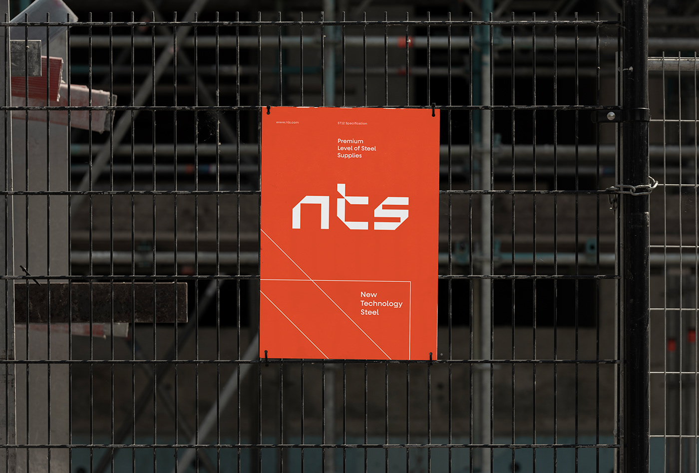
Applying the reflection of the two 45-degree lines in customizing the wordmark made it bold and modern while keeping it sophisticated and elegant enough to match the brand’s strategy and concept.
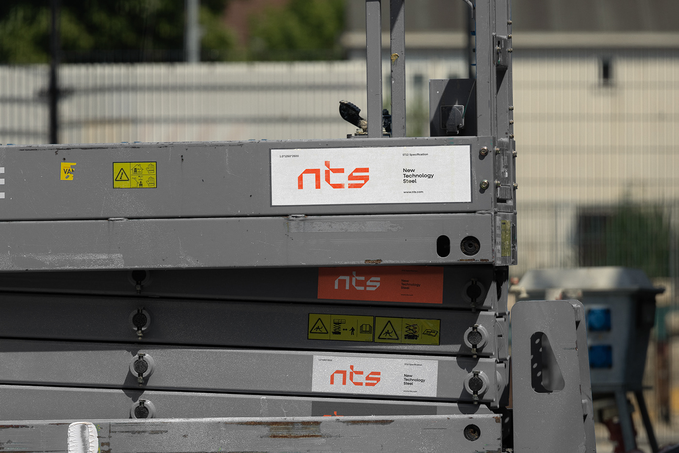
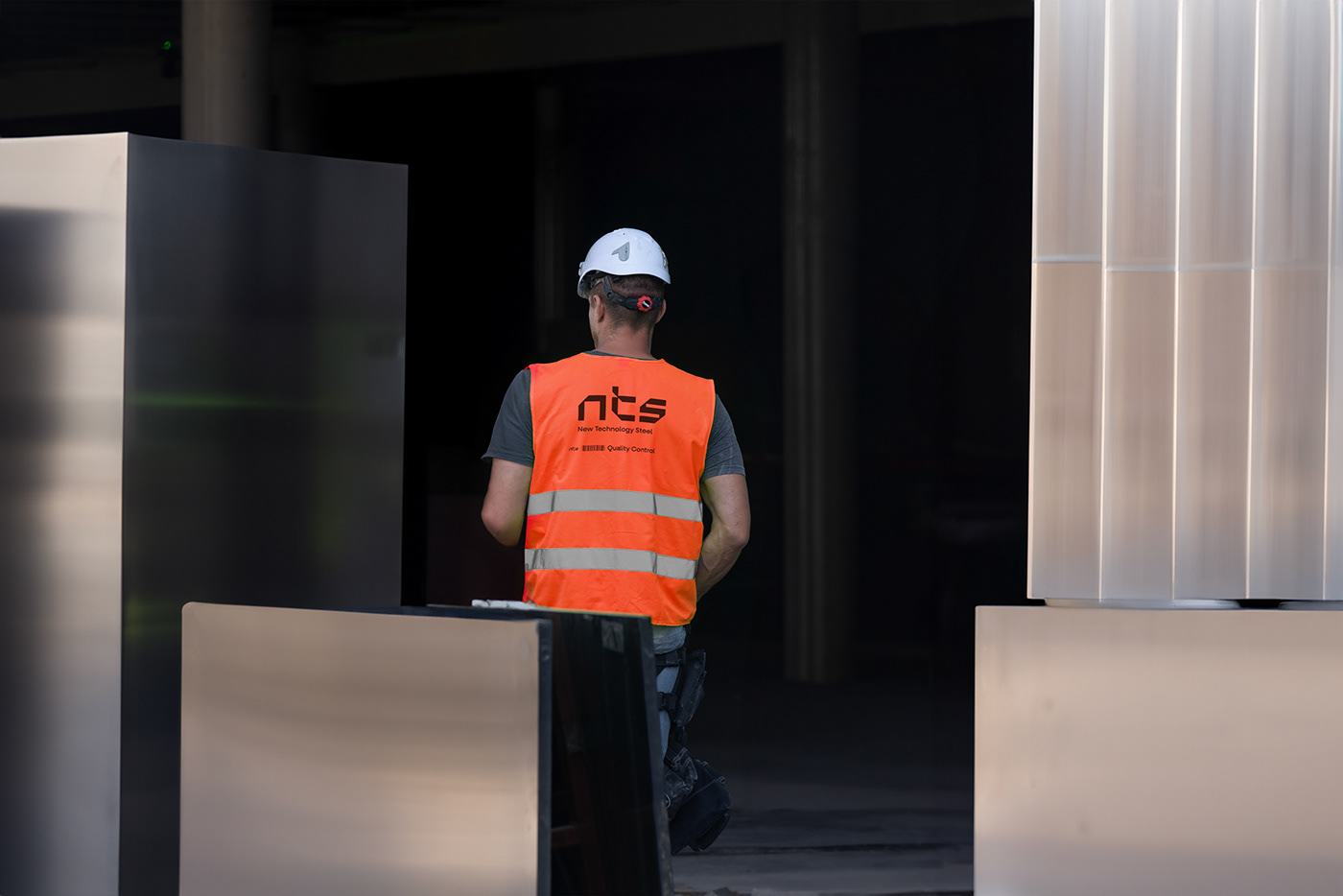
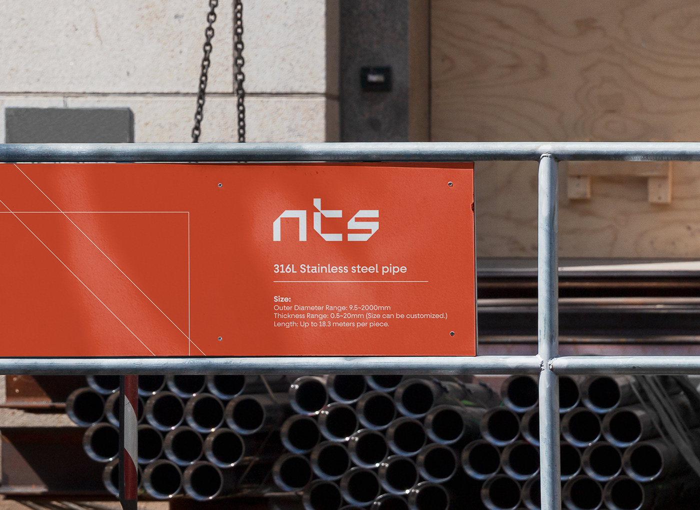
The NTS logo that we have rebranded embodies their dedication to quality. It combines sleek and modern design elements with subtle hints of strength and durability. The logo serves as a visual representation of NTS's commitment to using cutting-edge methods and high-quality materials in their manufacturing processes.
In addition to the logo, we have developed a comprehensive brand concept that encapsulates NTS's values, mission, and vision. This concept serves as a guiding
light for all their marketing and communication efforts, ensuring consistency
and clarity in their brand messaging.


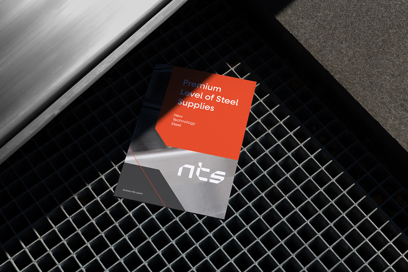
To further strengthen NTS's brand presence, we have crafted a compelling company profile that showcases their expertise, experience, and the rigorous quality standards they adhere to. This profile serves as a powerful tool for NTS to communicate their unique selling points to potential clients and stakeholders.
Furthermore, we have created brand guidelines that provide a clear framework for how NTS's brand assets should be used across various touchpoints. These guidelines ensure consistency in visual and verbal communication, reinforcing NTS's brand identity and enhancing brand recognition.


Thank you for your attention!
Want to join us? Please contact → careers@thegenerator.co