


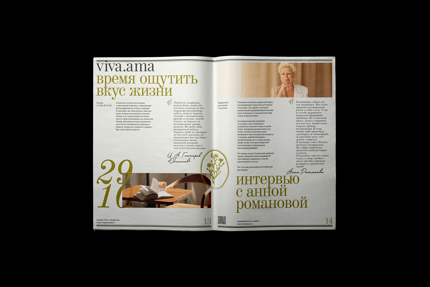


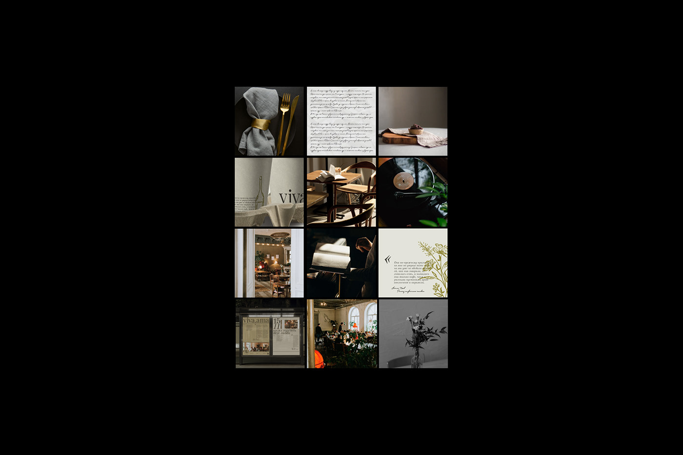
VIVA.AMA
VIVA.AMA — это уютный винтажный ресторан, где старинная мебель, фотографии на стенах, ковры и книги создают ощущение домашнего комфорта. Здесь каждый может быть собой, наслаждаться проведенным временем, красотой интерьера, изысканной посудой и вкусными блюдами.
Название ресторана viva.ama в переводе с испанского означает «живи и люби», что отражает основную идею бренда — гедонизм. Согласно этой философии, удовольствие является высшим благом, смыслом жизни, и ресторан воплощает эту идею в жизнь.
Для логотипа была подобрана антиква, чтобы передать изысканный характер бренда. А также отрисованы иллюстрации цветов, напоминая о декоре фарфора с его утонченными цветочными и плодовыми мотивами, наполненными символическим значением и глубоким сакральным смыслом.
Эта идея перенеслась в айдентику — букеты цветов с различными значениями впоследствии превратились в иллюстрации, отражающие основных посетительниц заведения — романтичных и творческих девушек, которые каждый свой день делают особенным.
Помимо этого, в айдентике были использованы цитаты из классической литературы, посвященные любви и красоте, чтобы подчеркнуть уникальность, создать особую атмосферу чувственности и эмоциональности. Обращаясь к классическим произведениям, мы словно переносимся в эпоху, когда эти чувства были особенно яркими и сильными. Проникаясь этой атмосферой, мы можем полностью проникнуться духом времени.
VIVA.AMA is a cozy vintage restaurant where old furniture, photos on the walls, carpets and books create a feeling of home comfort. Here everyone can be himself, enjoy the time spent, the beauty of the interior, exquisite tableware and delicious dishes.
The name of the restaurant viva.ama in translation from Spanish means "live and love", which reflects the main idea of the brand - hedonism. According to this philosophy, pleasure is the highest good, the meaning of life, and the restaurant embodies this idea in life.
For the logo, antiqua was chosen to convey the refined character of the brand. And also illustrations of flowers were drawn, recalling the decoration of porcelain with its delicate floral and fruit motifs, full of symbolic meaning and deep sacred significance.
This idea was transferred into the identity - bouquets of flowers with different meanings later turned into illustrations reflecting the main visitors of the institution - romantic and creative girls who make every day special.
In addition, poems and quotes from classic literature dedicated to love and beauty were used in the identity to emphasize uniqueness and create a special atmosphere of sensuality and emotionality. Turning to classical works, it is as if we are transported to the era when these feelings were especially bright and strong. By permeating this atmosphere, we can fully get into the spirit of the time.
Дизайнер: Елизавета Тарасова
Нейминг-ментор: Зара Шхалахова
Лого-ментор: Дарья Басалаева & Валерия Мазлова
Анимация: Маргарита Пляшник
Арт-директор: Татьяна Кириченко


