NOIDECS
NOIDECS is one of the emerging brands on the medical cannabis market, providing the finest quality pharmaceutical-grade cannabis to UK clients and expanding internationally. Through a range of products from medical flowers to oils, NOIDECS supports therapeutic cannabis treatments in alliance with classical medicine, promoting overall wellbeing and health benefits through natural resources.
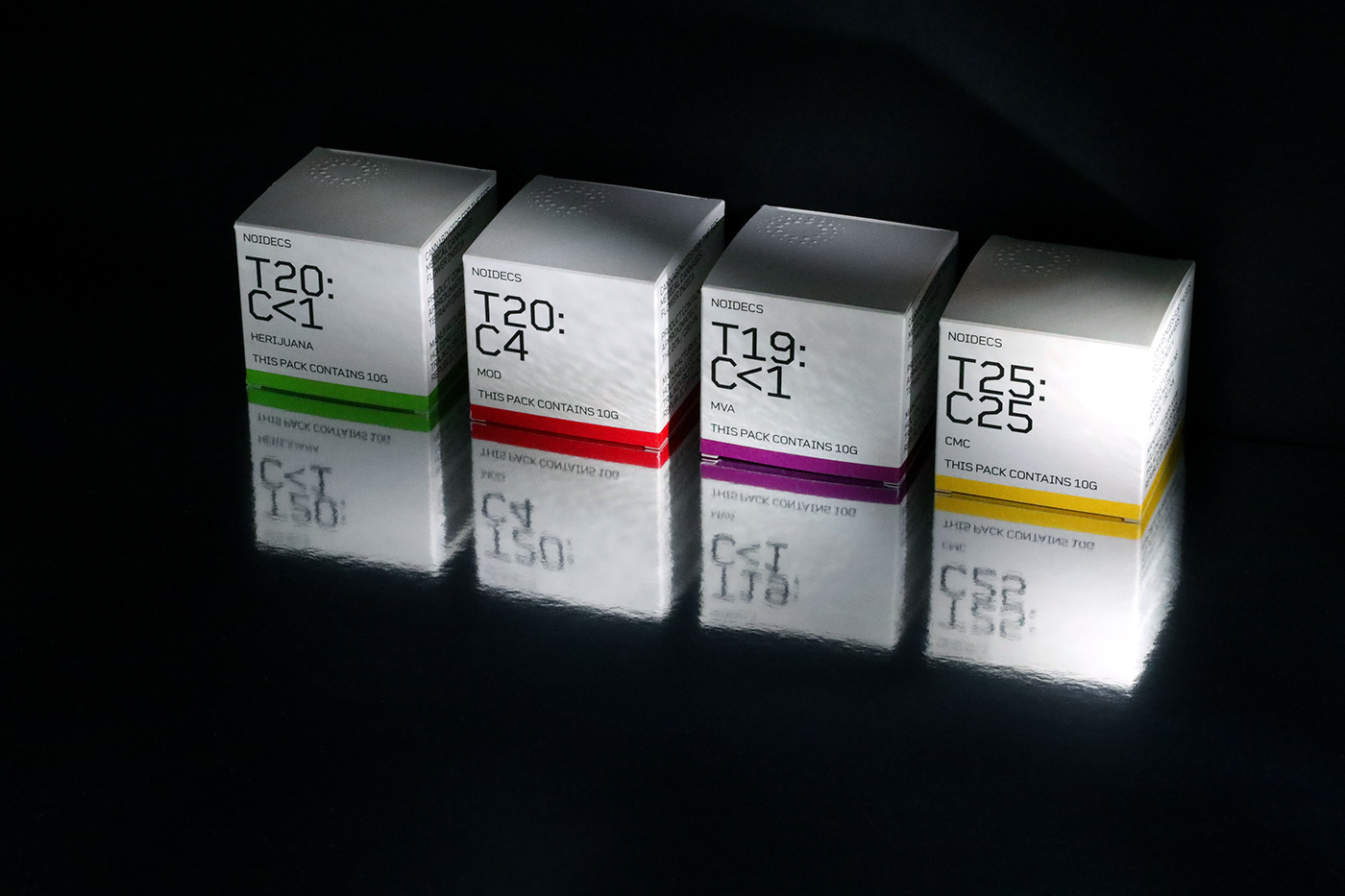
The direction of the branding was largely based on notions that reflect the heart of the product- medically tested, reliable and sophisticated, carefully extracted in high-standard laboratories and supervised by the best experts in the field.
NOIDECS is one of the emerging brands on the medical cannabis market, providing the finest quality pharmaceutical-grade cannabis to UK clients and expanding internationally. Through a range of products from medical flowers to oils, NOIDECS supports therapeutic cannabis treatments in alliance with classical medicine, promoting overall wellbeing and health benefits through natural resources.
The direction of the branding was largely based on notions that reflect the heart of the product- medically tested, reliable and sophisticated, carefully extracted in high-standard laboratories and supervised by the best experts in the field.
Client: Lyphe Group, London, UK
Services: Identity + Packaging
Creative Direction: Kosta Rakićević
Design: Nina Hadživuković
Logo Design: Christoph Ruprecht
Photography: Nataša Stamatović
Services: Identity + Packaging
Creative Direction: Kosta Rakićević
Design: Nina Hadživuković
Logo Design: Christoph Ruprecht
Photography: Nataša Stamatović


We sought to represent the attributes of each NOIDECS product in a highly transparent way, with minimalistic packaging relying on the strong and effective typeface applied on a bleached white background. Following the logic of the product, our visual cue was that of medical accuracy, clean and detached yet reassuring. Since the most important thing in cannabis treatment is finding the right balance between THC and CBD elements, the visual focus of the package points to the ratio of these values, displayed algorithmically as a formula or a code. The pharmaceutical information on the side is treated in the same way, with clear-cut text blocks containing instructions for usage and storing.
For NOIDECS, we deliberately reached for the concept that is a mixture of cold and clinical + space age, leaving out any illustrative or graphic elements. The intention was to bring to the front the essence of a powerful, refined and functional product, ahead of its time.