

Rev & Ro - Caitlyn Westrup
This gig poster project spotlights a made-up indie folk band called Rev & Ro.
Through this case study I will show the progression of the design of this poster.
I started by drawing out ideas of different compositions I felt represented to indie folk vibe.
A calm feeling,
Somewhat cozy,
Acoustic,
Natural,
Outdoorsy.

The Top Three
I had a hard time deciding which idea I wanted to continue with, so I chose to take three ideas into Adobe Illustrator. After getting a basic design out for each of the ideas, I preferred the flower and fox design and concept. I also received feedback from other creatives who felt the same. So I continued with that concept.

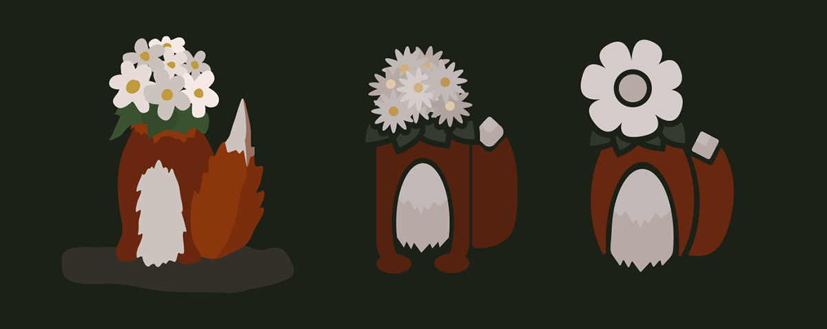
From left to right you can see the transformation of my fox design. I began with a more complex and detailed fox. However, I realized that for the type of music and vibe I was trying to represent, a more simplistic design could be effective.
Rev & Ro
After I had created a fox design I felt represented an indie folk band, I began creating the rest of the poster. I chose colors that were less saturated to create a more calm and forrest looking scene. The paper airplane is something I've seen representing this genre of music. So I chose to incorporate that as well and have it interact with the band name. I also chose to do a highlight section of sorts that from the flower to the band name to create a flow between the two.


