The purpose of this project was for me to challenge my creative mind and push my design aesthetic. I love illustrations, cards, and vodka, so why not try and put the two together?
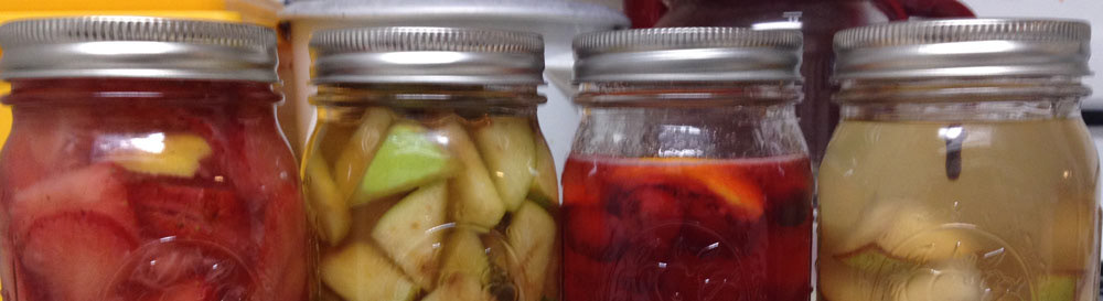
I made everything in this project from scratch, from building, sanding, and staining a wooden box, and making the actual product itself by using various techniques that I had learned along the way. It was a joy to create and something that I want to continue to improve on in the future.
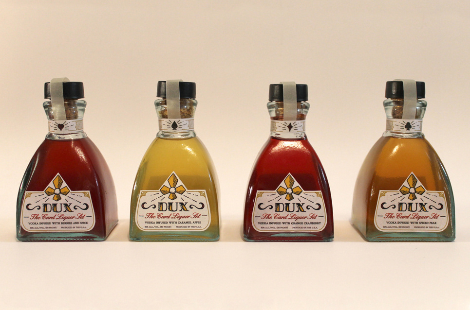
About the Logo and Design Elements
'Dux' in Latin is 'to lead' and from the Roman times 'Duke' as in the rank. I looked into how a Duke was represented by their symbols, and they have eight strawberry leaves around their crowns. I symbolized it and used that to influence the lettering to a serif to match the 'royal' undertones. I was inspired by card designs and Durer. I looked through his illustrations and woodblock carvings and noted how he used shading and flourishes. Later, people mentioned that it looked like tarot cards, which I was totally ok with.
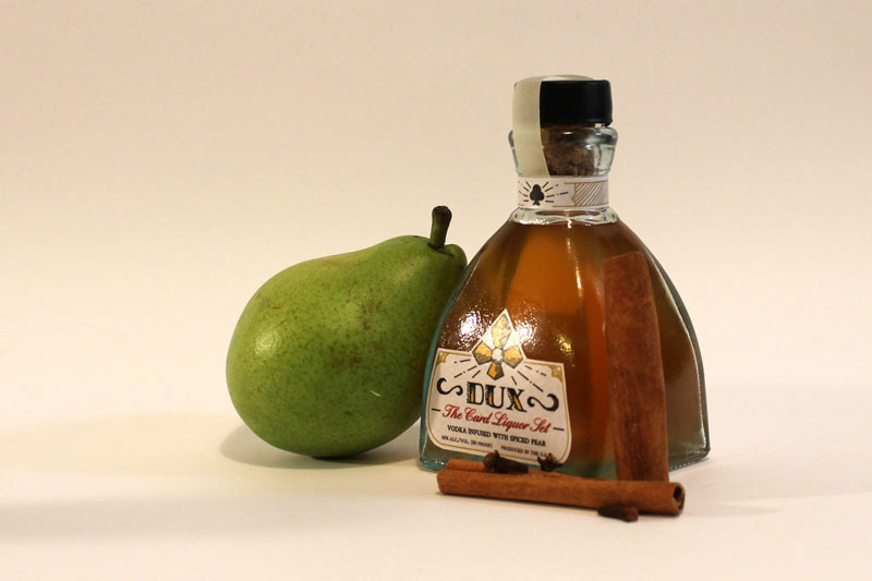
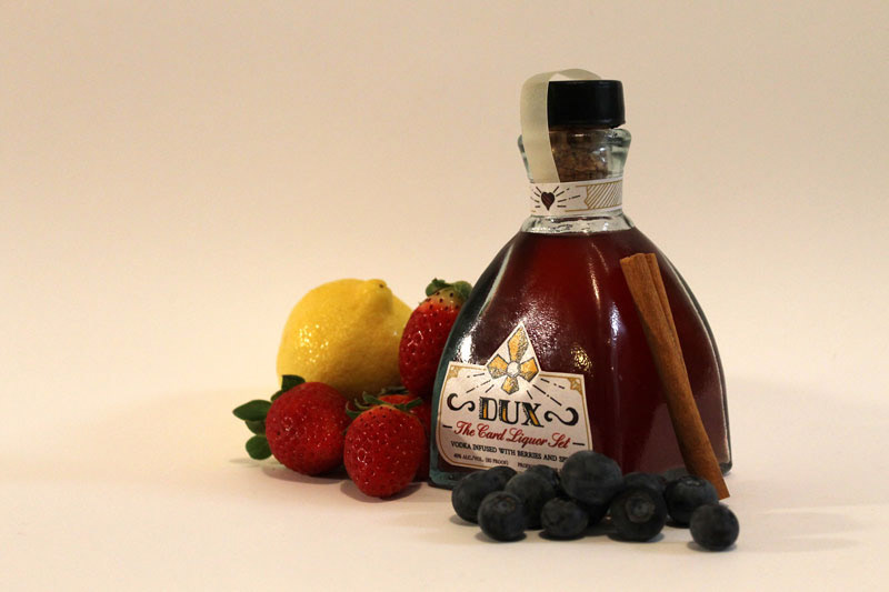
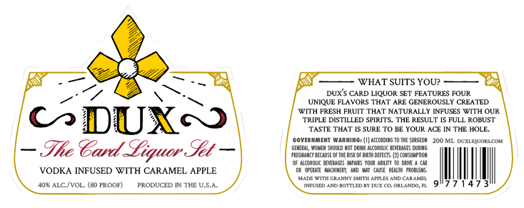
About the Label Design
The bottle design I thought was most appropriate for a card game were actually diffuser bottles used for liquid fragrance. So I worked with the form of the bottle to shape the label by following the lines and curves to match the shape. The logo is more prominent in the front to help frame the liquor inside and to have that one of the first things a person sees. The hardest challenge was how to fit all the information at the size that it was at. Luckily, Futura Condensed worked wonders with the government warning and made it possible to have the description of the product more visible.