Brand identity for a software development company
CHALLENGE
BinarLab is a company that specializes in custom software development and IT outsourcing services. Their focus is on providing solutions for individuals, startups, and small businesses to ensure their rapid growth and development.
APPROACH
To highlight the results of BinarLab's work, we aimed to create a bold identity that is mathematically accurate and meaningful. Our strategy was to impress potential clients with the idea that BinarLab can help them achieve success faster than they expect.
IDEA&DESIGN
The company's approach is based on agile development of custom software solutions. By understanding the needs of their clients, BinarLab finds the key to solving their problems. They provide a turnkey software solution for small businesses.
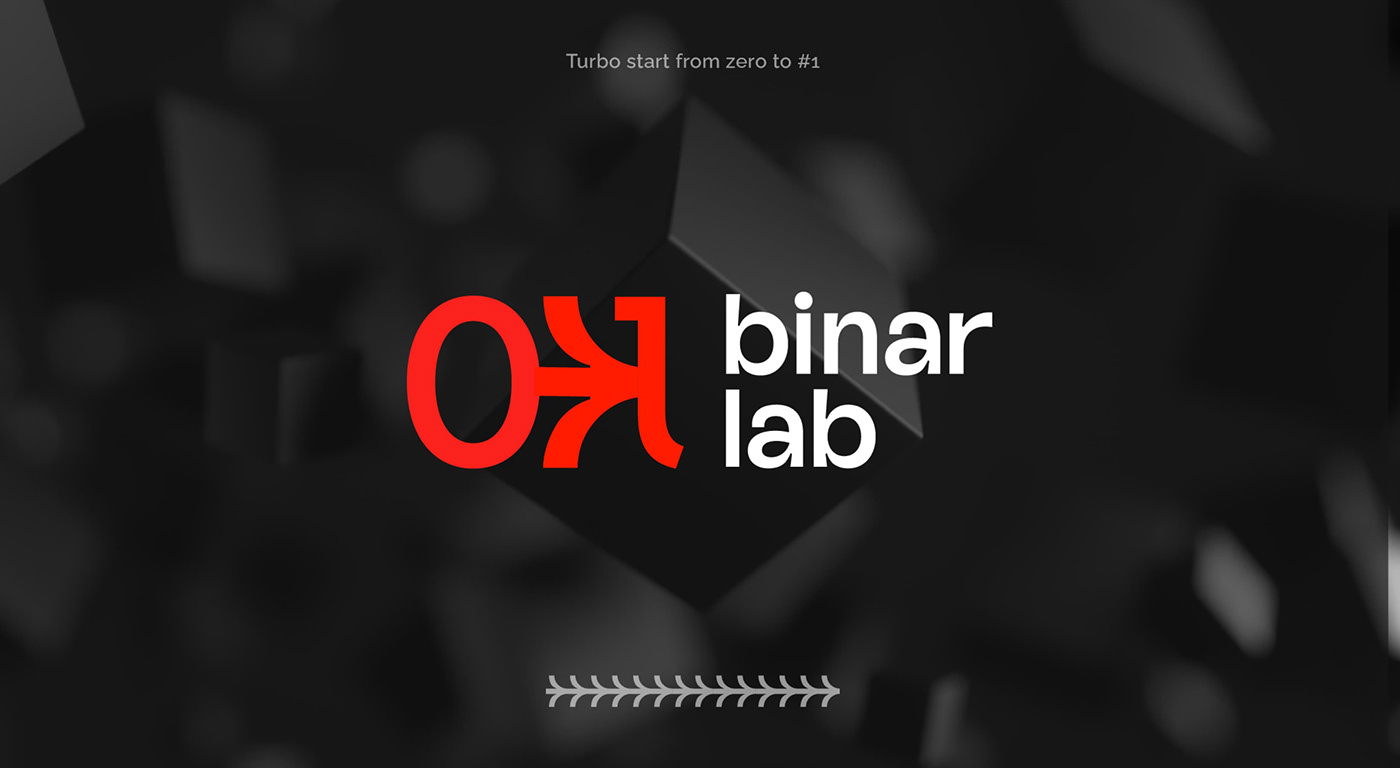
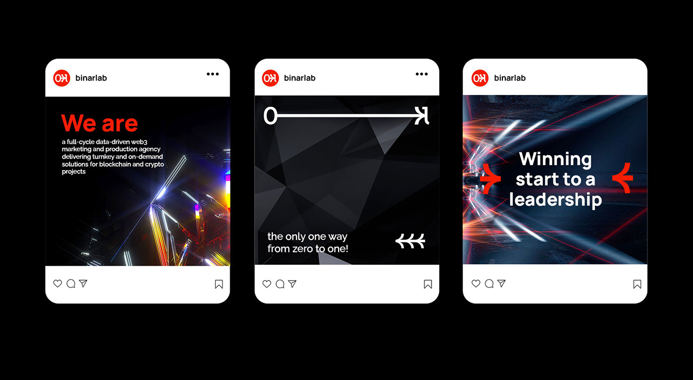
To represent the IT industry, we used 0&1 binary code symbols in the logo. The 0, 1, and the arrow between them symbolize the process of transformation from starting to leading position. This reflects the idea that BinarLab can help businesses achieve success faster than they expect. We call it "Turbo start from zero to #1".
We developed an original font that repeats the smooth curves and shapes of the key symbol to create maximum visual unity with the symbol. The triad of red, black, and white colors perfectly structures the identity. We supported the identity with two variable sets of graphics: a complex crystalline mechanism or a simple cube shape for which you need to pick up the key.