


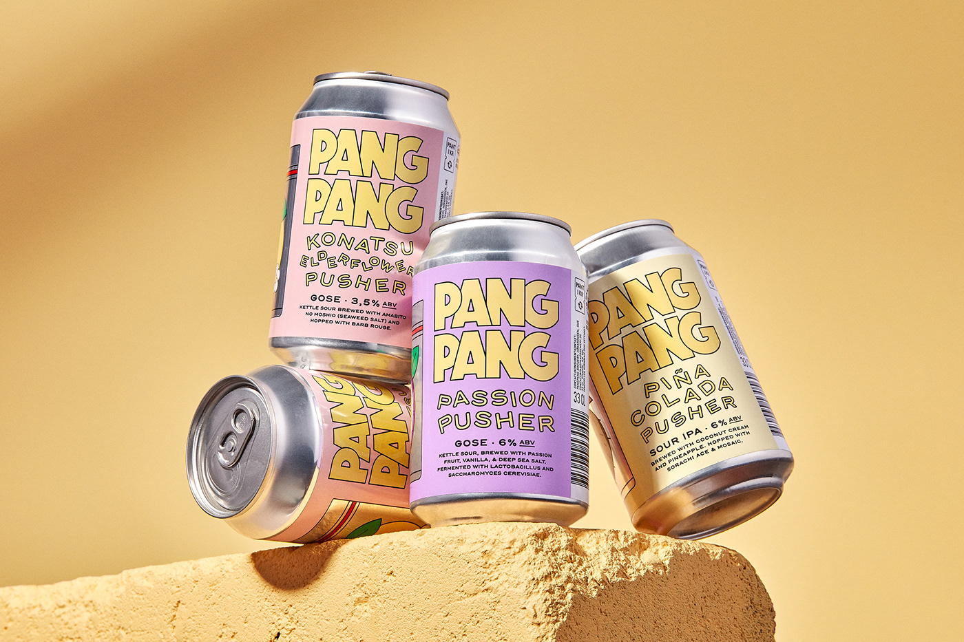


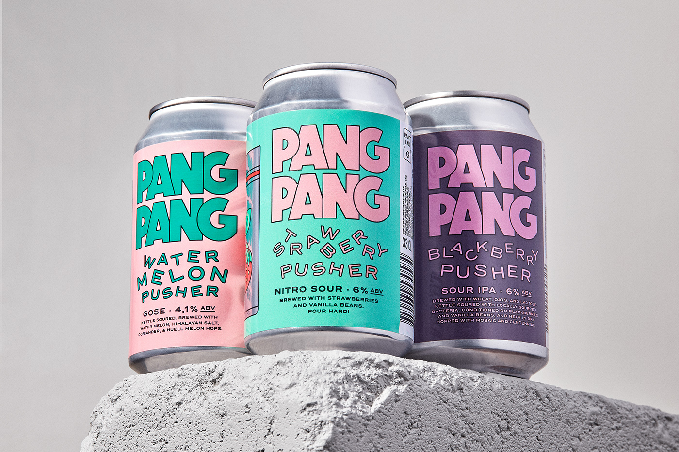
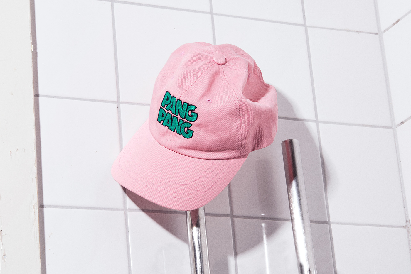
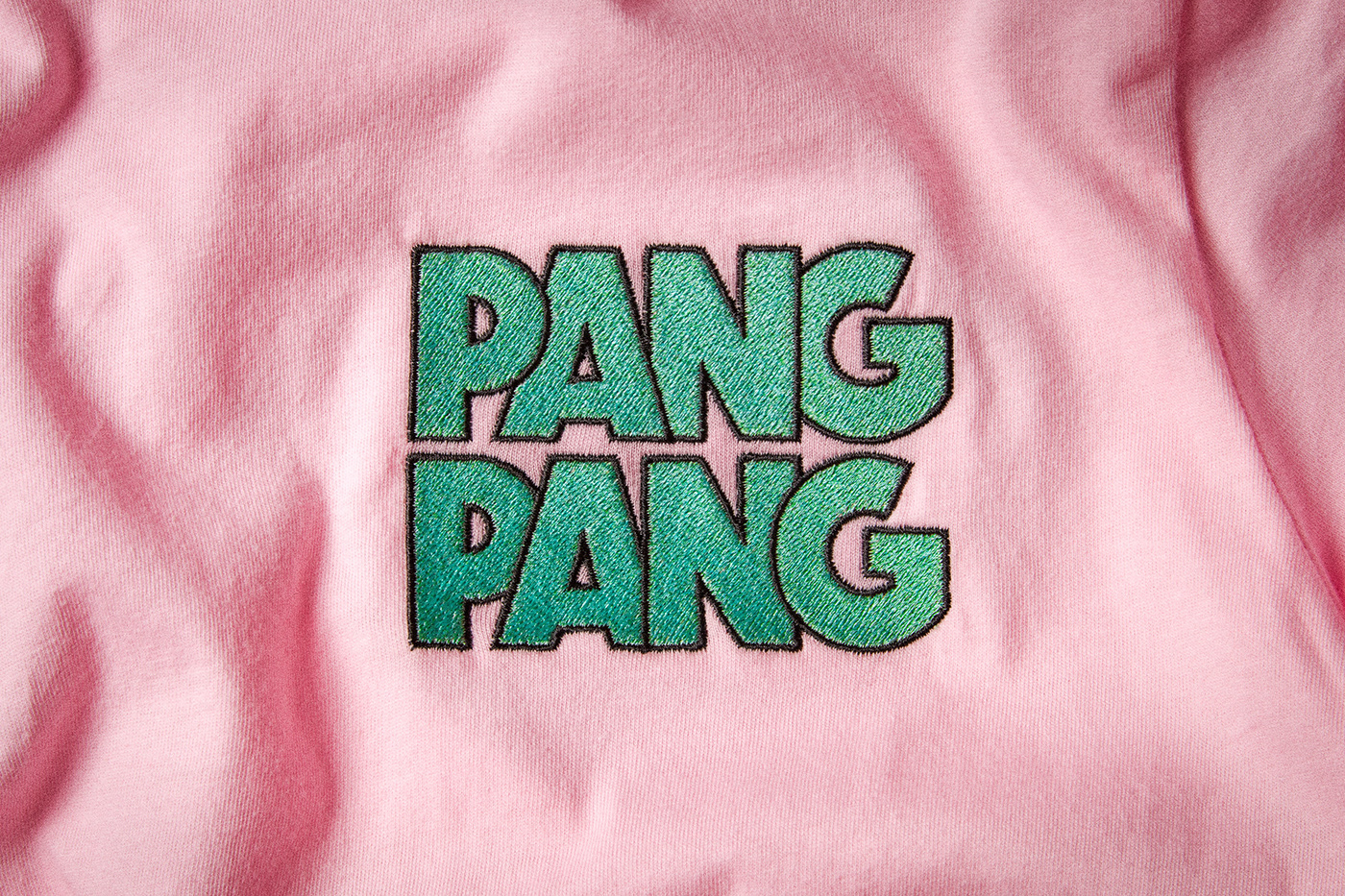

PangPang Pusher: Sour beers for the non-beerded.
Art Direction, Illustration & Design: Jens Nilsson
Creative Direction & Concept: Fredrik Tunedal, PangPang Brewery
Photography: Jens Nilsson
Animation: Brikk Studios
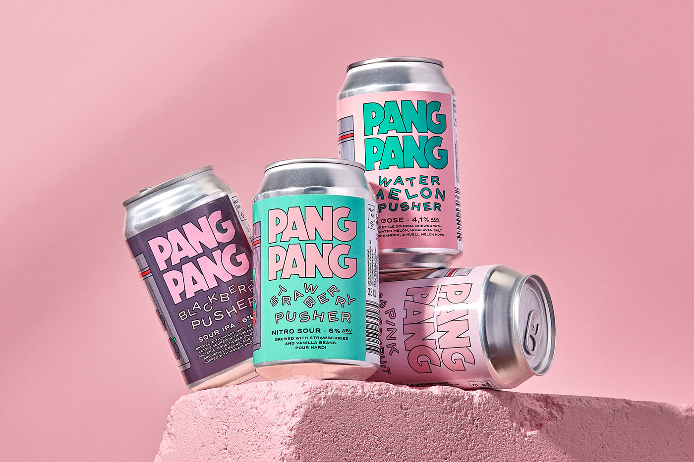
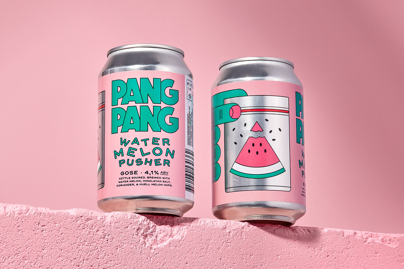
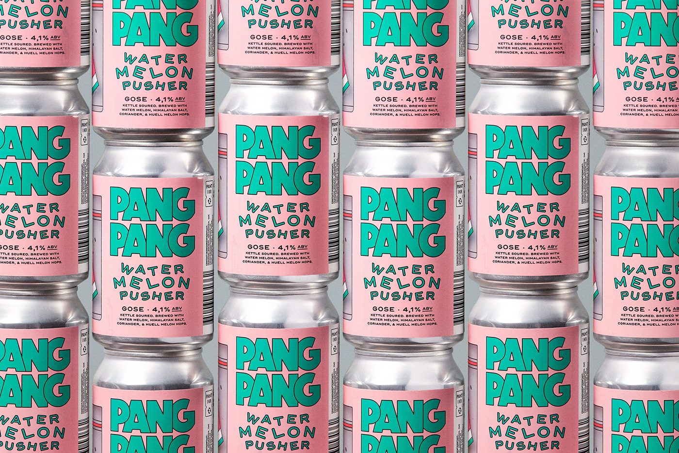
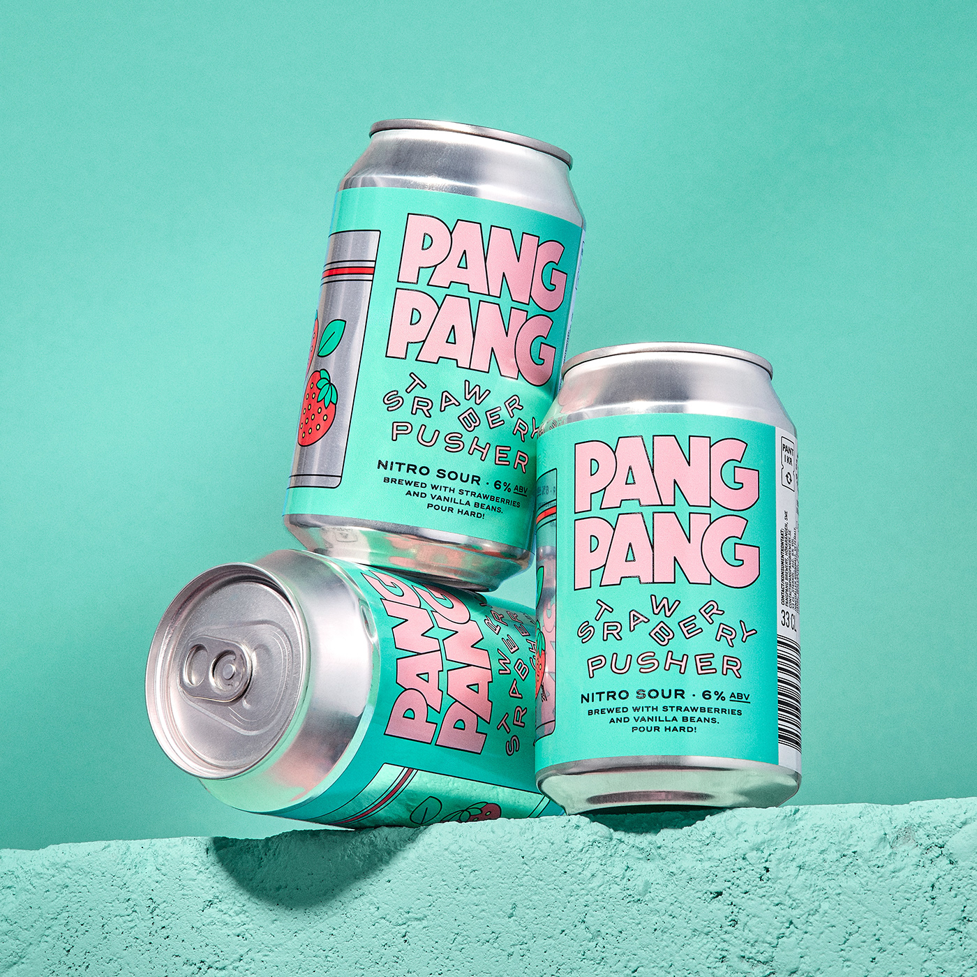
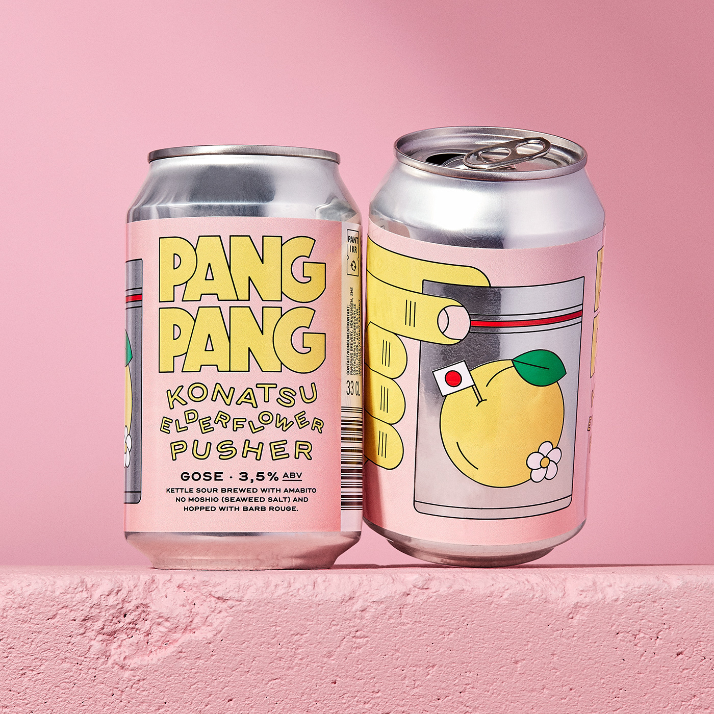
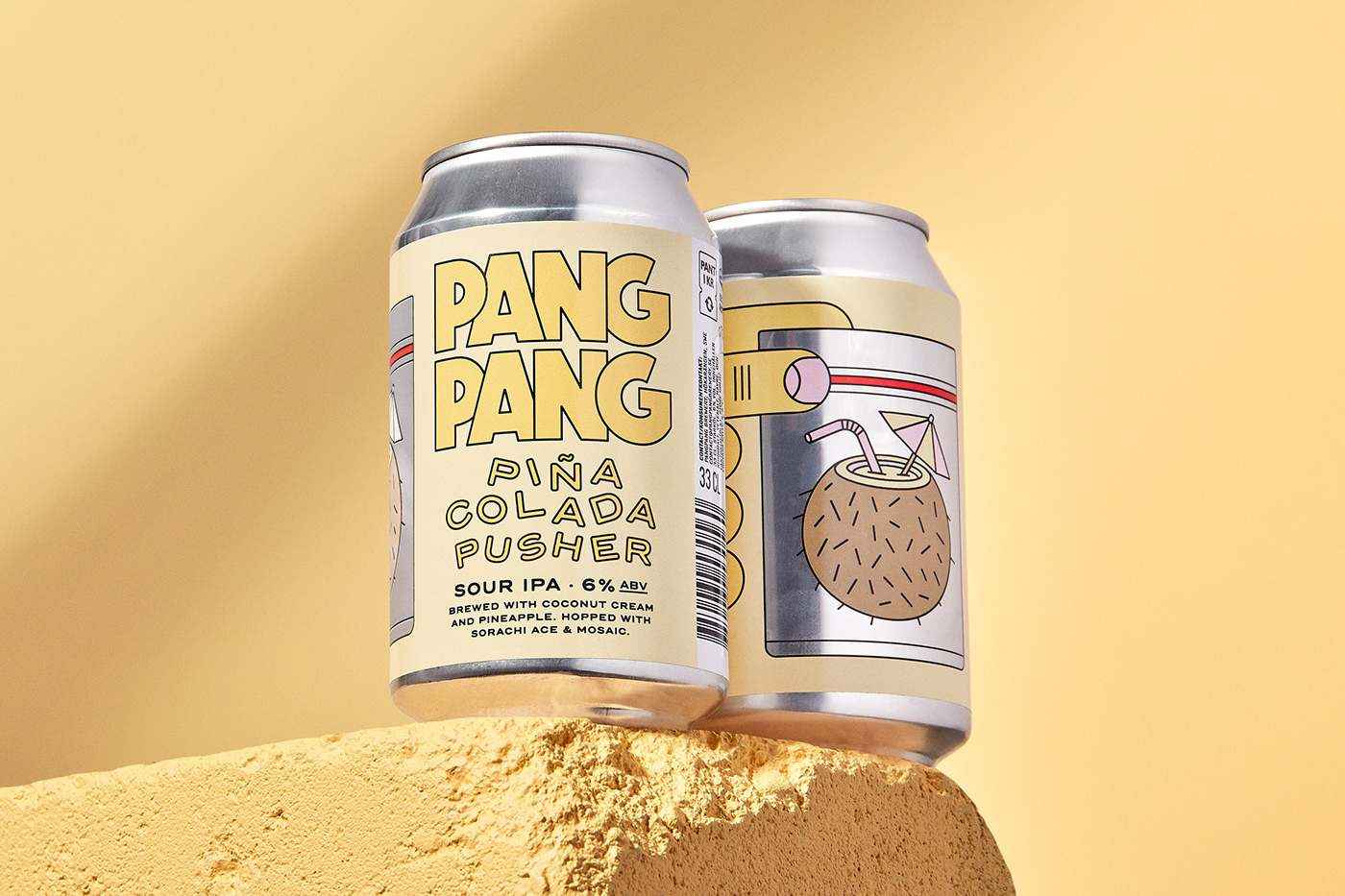
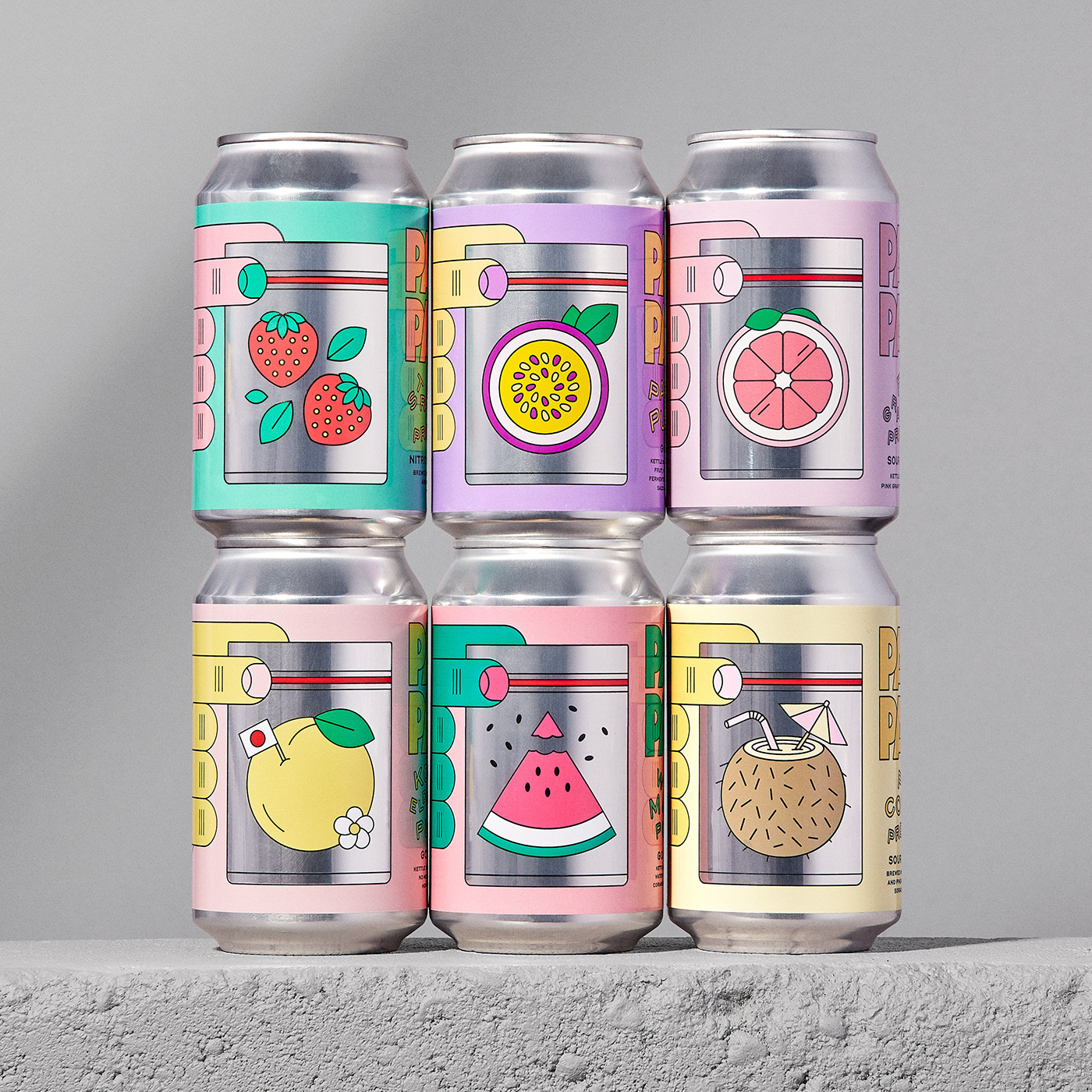
PangPang Pusher is a fruity sour beer series made for the Swedish microbrewery PangPang. The first flavour, Peach Pusher, was released back in 2018 and since then the people of Sweden (and other tastemakers around the globe) has been able to enjoy a bunch of more Pushers like Strawberry, Pina Colada, Mango Habanero, Pink Grapefruit, Passion fruit, Blackberry, Konatsu Elderflower and my personal favorite, Watermelon.
PangPang Pusher is a fruity sour beer series made for the Swedish microbrewery PangPang. The first flavour, Peach Pusher, was released back in 2018 and since then the people of Sweden (and other tastemakers around the globe) has been able to enjoy a bunch of more Pushers like Strawberry, Pina Colada, Mango Habanero, Pink Grapefruit, Passion fruit, Blackberry, Konatsu Elderflower and my personal favorite, Watermelon.
I was recently asked about the idea behind the success of this particular design, and I'd like to highlight a few details and strategic choices that I think contributed to its appeal.
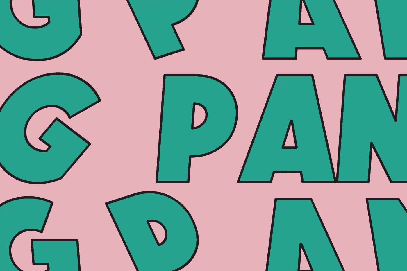
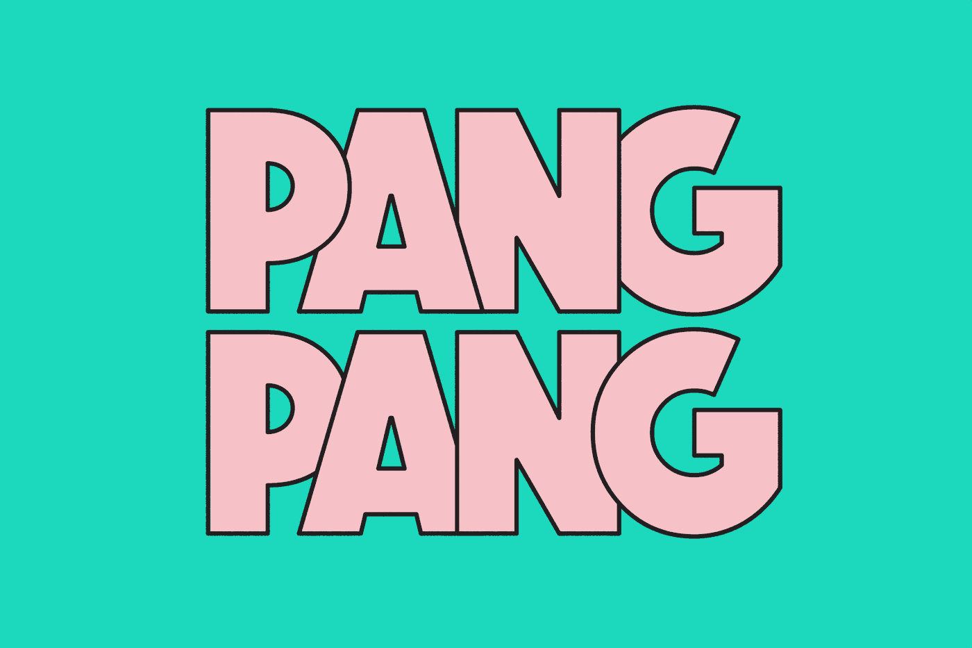
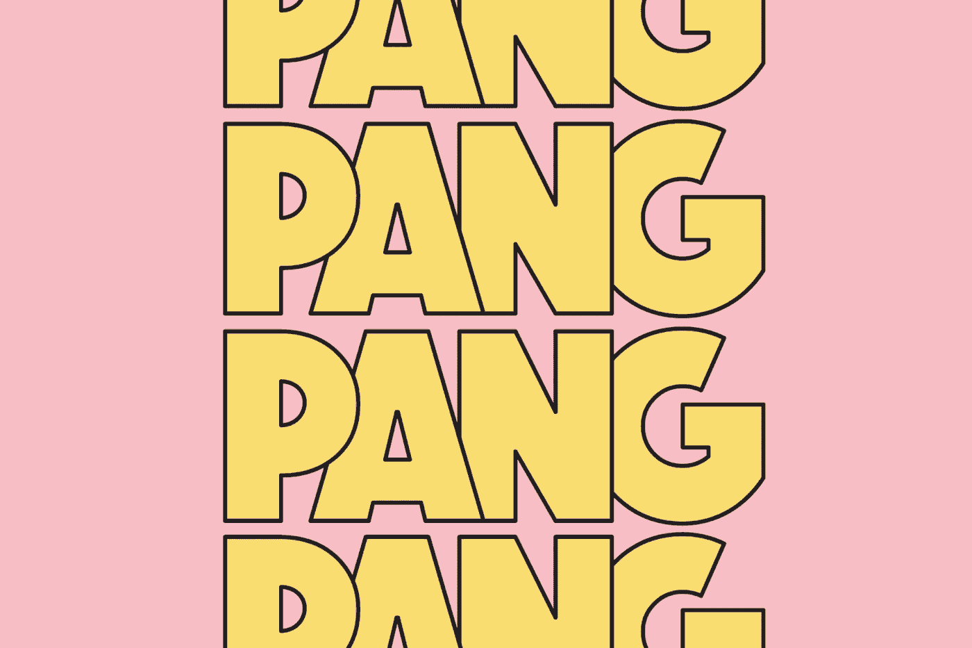
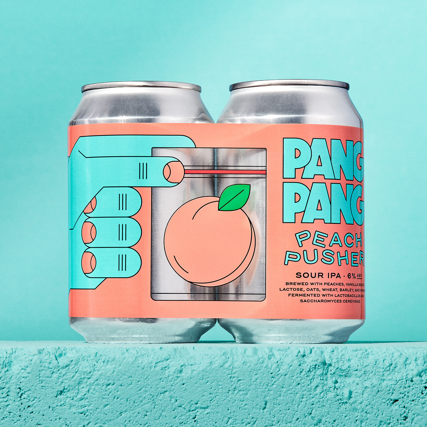
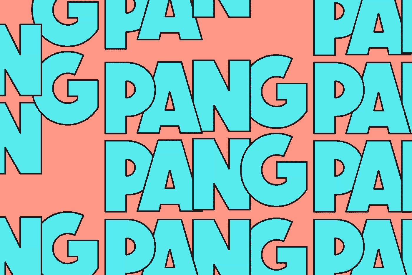
Firstly, the illustrations in the style of simple outlined objects, allows us the flexibility to experiment with a wide range of vibrant colors while maintaining readability, even when using similar colors tones. This thing is crucial in maintaining the functionality of the design.
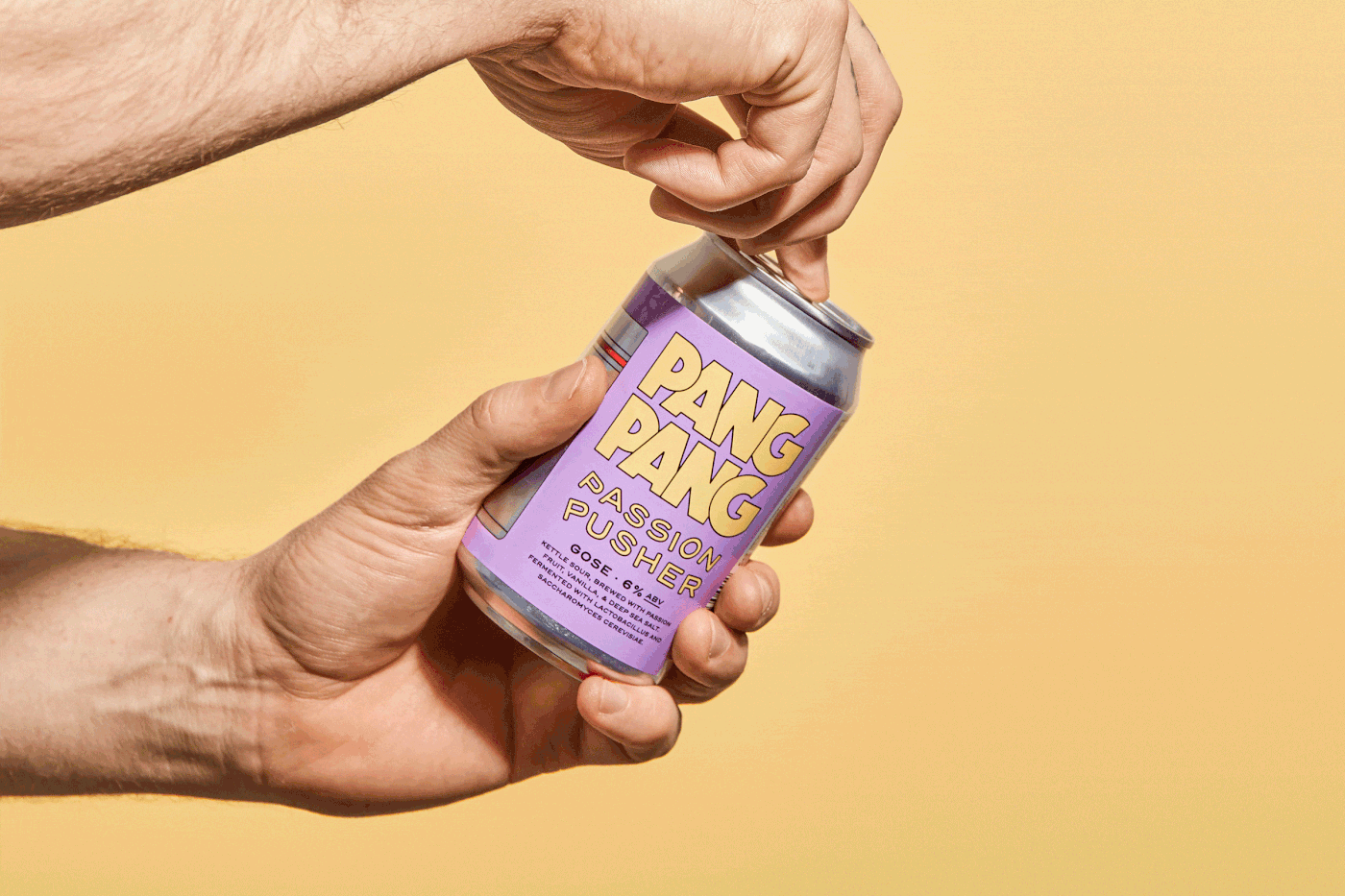
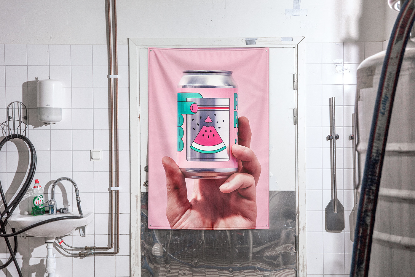
Secondly, compared to a classic "one front beer" look, this design and label has a more full covering and complex three-part appearance. It starts with the hand and the fingers holding the plastic bag and then extends to the golden ratio-esque text layout front side. This creates a more visually engaging composition.
Lastly, the transparent section on the middle of the label not only represents the plastic bag's see-through look, but also adds depth and the texture from the metallic can itself. This detail enhances the overall visual appeal, and creates a better between the can and the label itself.


