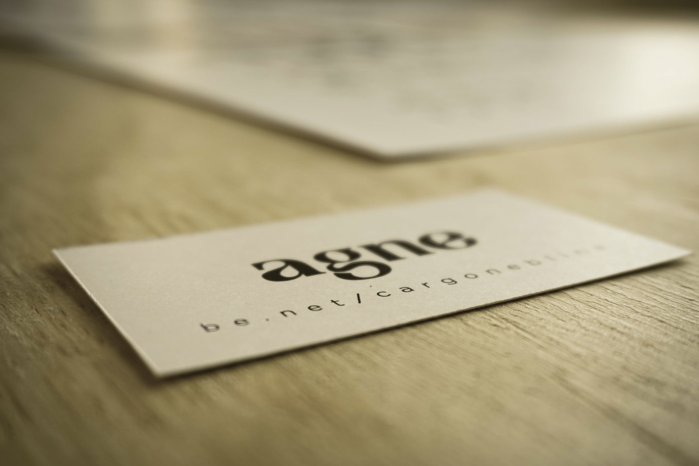
Ahoy, welcome to AGNE's official page! I'm glad you found me.
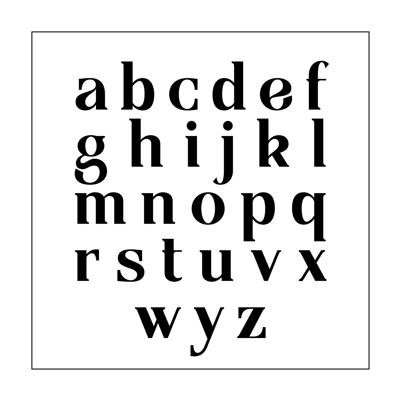
Here you will find a brief presentation about this font, which tries to combine modern with the old-fashion.
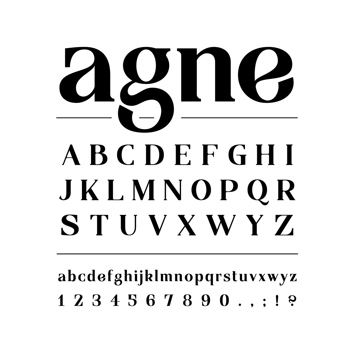
Although some might consider it a very bold and heavy font, if well utilized, ought even be seen as a gracious light-weight typeface, due to its beautiful massive contrast between stems.
AGNE is the result of my first attempt utilizing Glyphs, a very powerful font design software, although not widely spread. It allowed me to develop a whole set of typefaces with only a few sketches, but a lot in mind.
Has been worked on since October '13, and started as a project, supervised by the high-skilled typographer Marc Schütz, during my second semester as guest student at HfG Offenbach, Germany.
To him, I owe my many thanks!
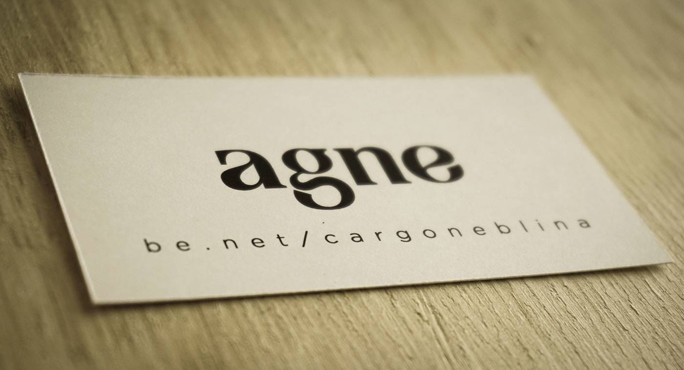
You will be first introduced to images illustrating the font's practical use, interlaced with a few formal applications. Later, a bit about the creative process and a little bonus!
On the very bottom of the page, you will be able to access a link for downloading AGNE's first public version, even though still under development. I hope you enjoy it. Any type of feedback would be very welcome!

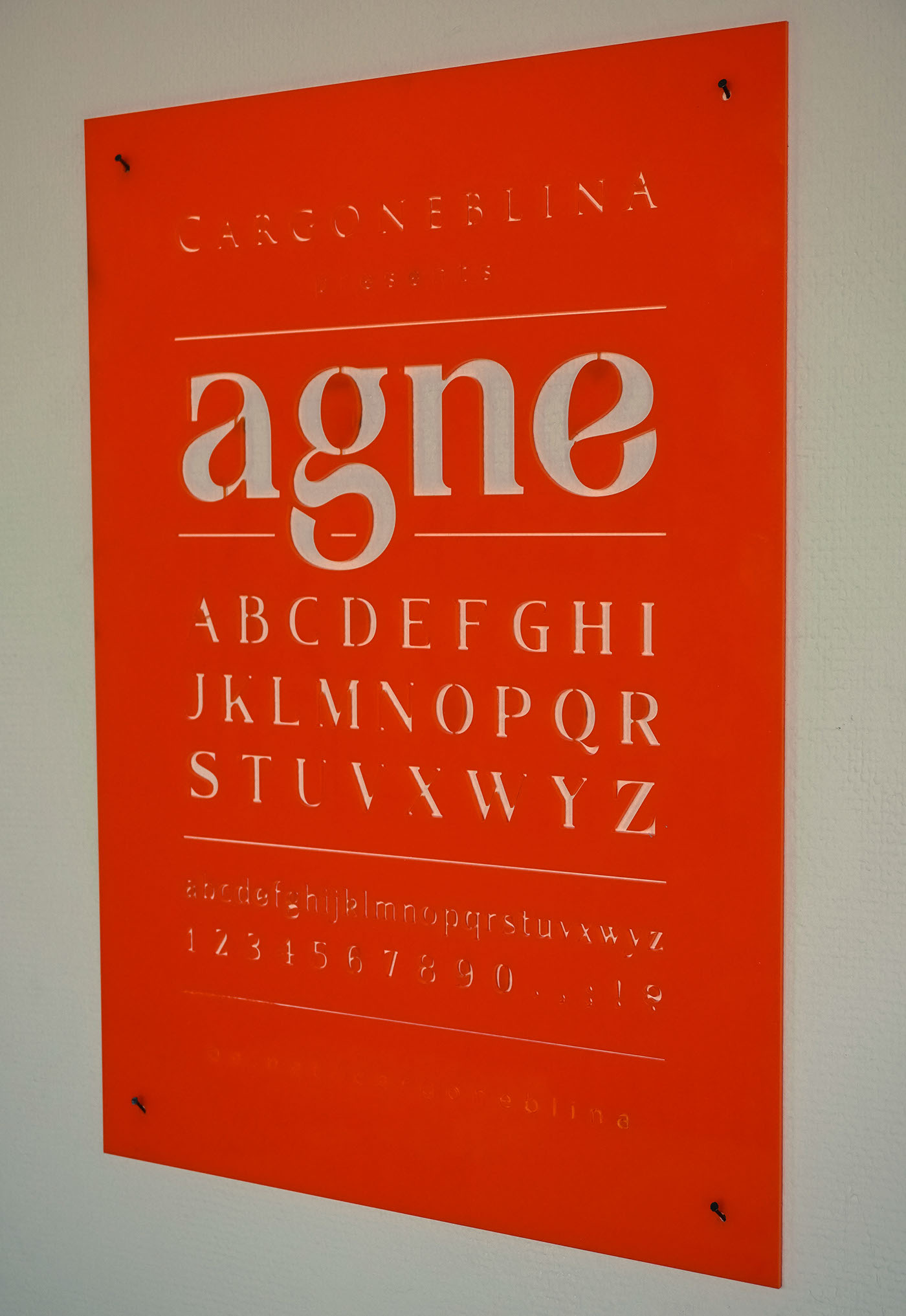
Laser-cut acrylic poster.
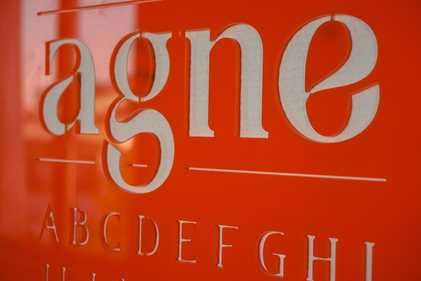
Laser-cut acrylic poster in detail.

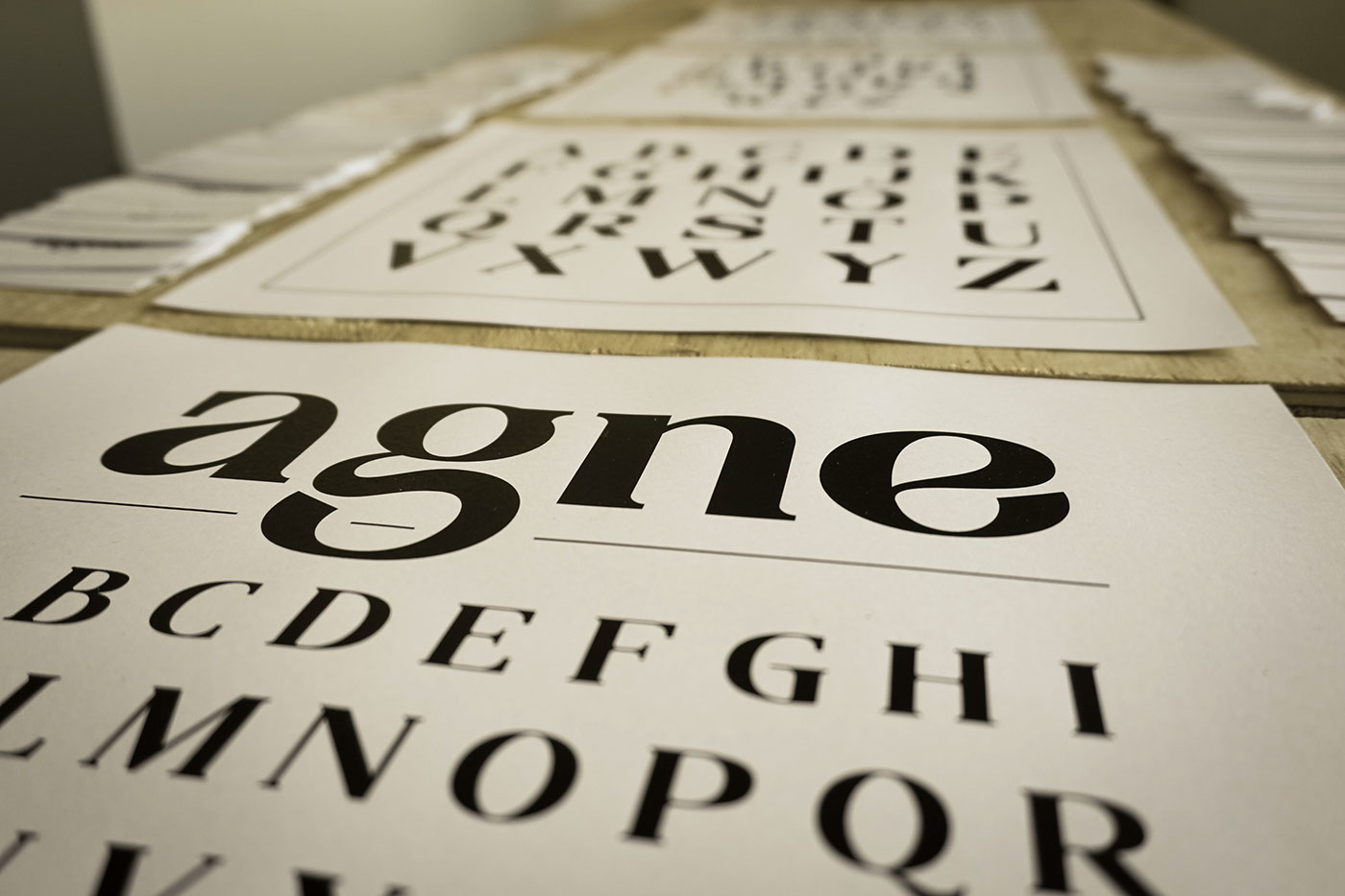
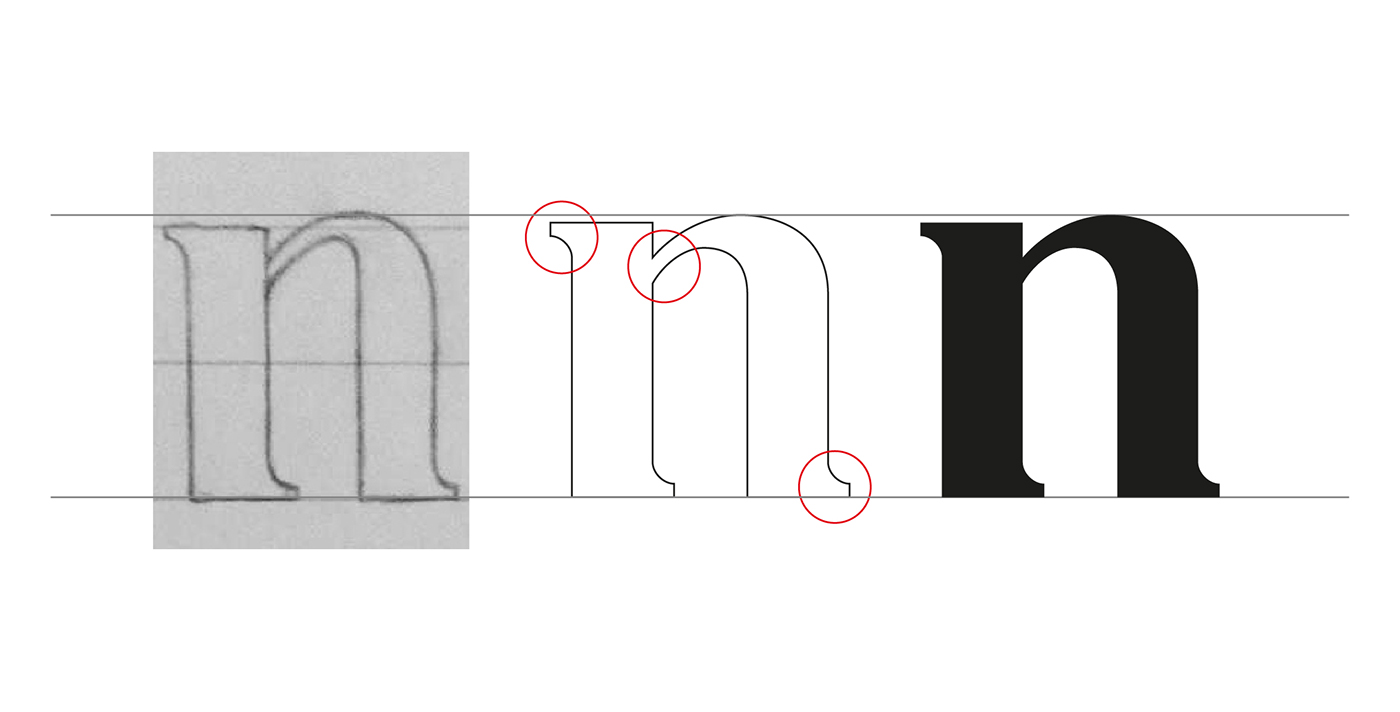
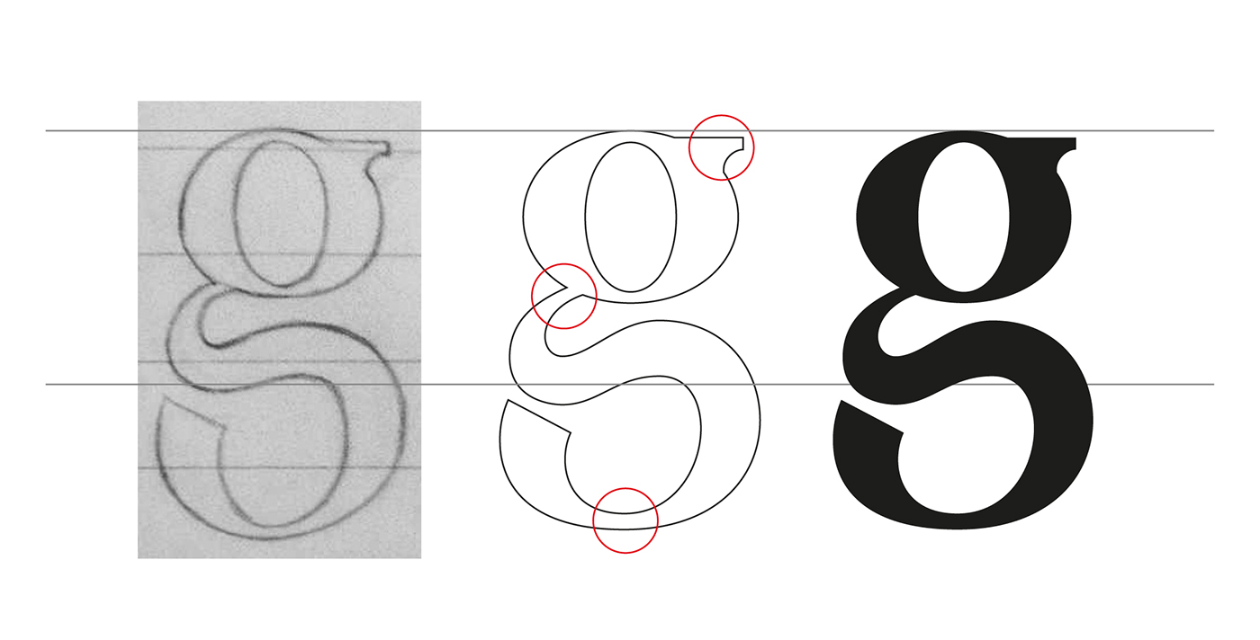
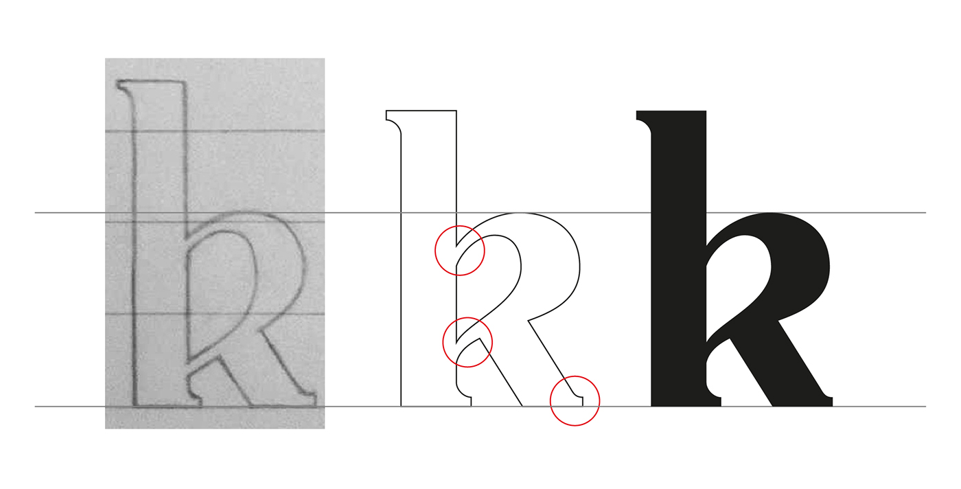
Here are some of the original scans, from Agne's very first sketch. The font's consistency and personality can still be observed through few details, even though after a long development.
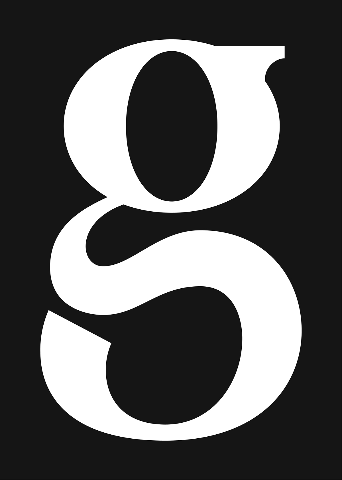
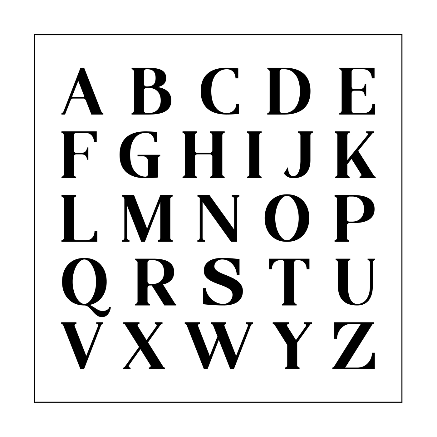
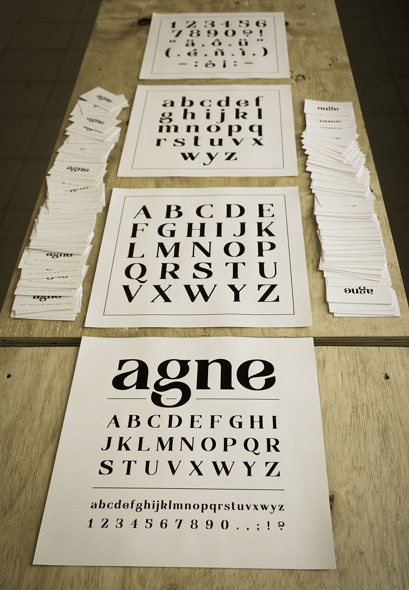
Little bonus for you: some HUGE letters.