
Spilt Milk© A Podcast dedicated to new moms balancing work-from-home with the little ones! The duo behind Spilt Milk Podcast, Zara and Ayan are building a dynamic platform for new moms navigating the intricate balance of of work and life, approached me with a vision: to create a brand identity that speaks to the raw, unfiltered experiences of motherhood.
Following our brand strategy call, we got to brainstorming. We envisioned a brand that not only captures the spontaneity of motherhood but also fosters a sense of connection. The discovered brand values were: approachability, vulnerability and fun!
The result is a brand that not only captures attention but also creates a visual and emotional anchor for a community of empowered moms.
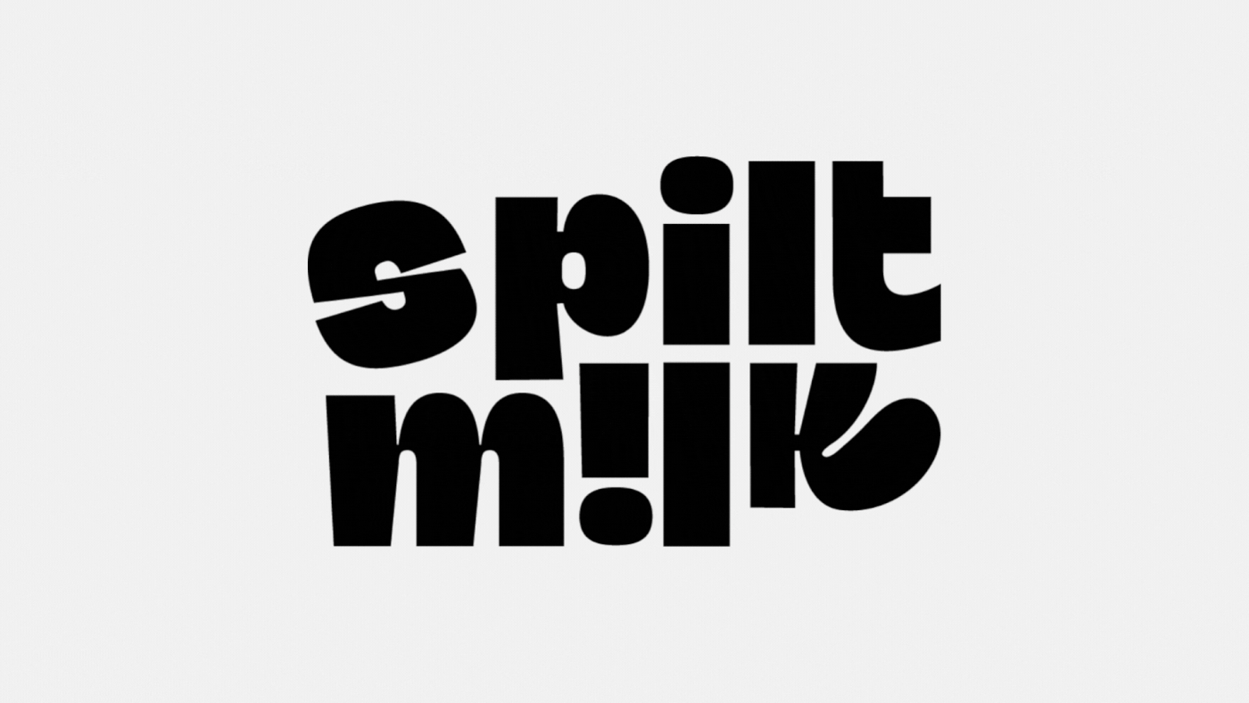
Logotype
The logotype creation went through a tedious process since it needed to serve multiple purposes. Countless rough sketches based off of the brand values and a collaborative effort between me and the client.
Boldness emphasises resilience, qualities essential for new moms managing diverse responsibilities. Quirkiness in the 'k' for that sense of relatability, making the brand look approachable. Fun typography aligns with the podcast's lighthearted yet honest approach to storytelling.
The logomark itself is a visual representation of a mother's journey – dynamic, unpredictable, and full of surprises. The interplay of bold typography and vibrant colors communicates the brand's energy, while subtle curves and playful elements add a touch
of friendliness.

Colors
The choice of vibrant fuchsia, black, and turquoise is intentional. Fuchsia represents energy, passion, and the vibrant nature of motherhood. Black adds a touch of sophistication and timelessness, balancing the lively fuchsia. Turquoise is calming and reassuring, symbolising the calm amidst the chaos. Together, they create a dynamic and visually striking palette that captures the multifaceted experiences of the target audience.


Every design element is a strategic choice aligned with the brand's goal of connecting with new moms. The boldness captures attention in a crowded podcast landscape, while the vibrant colors and fun typography foster a enjoyable brand experience.


The Spilt Milk Podcast brand design is a strategic fusion of bold aesthetics, thoughtful psychology, and design principles. It doesn't just capture attention; it creates an emotional connection, establishing Spilt Milk as a visual and supportive anchor for the vibrant community of new moms navigating the beautiful chaos of motherhood and career.


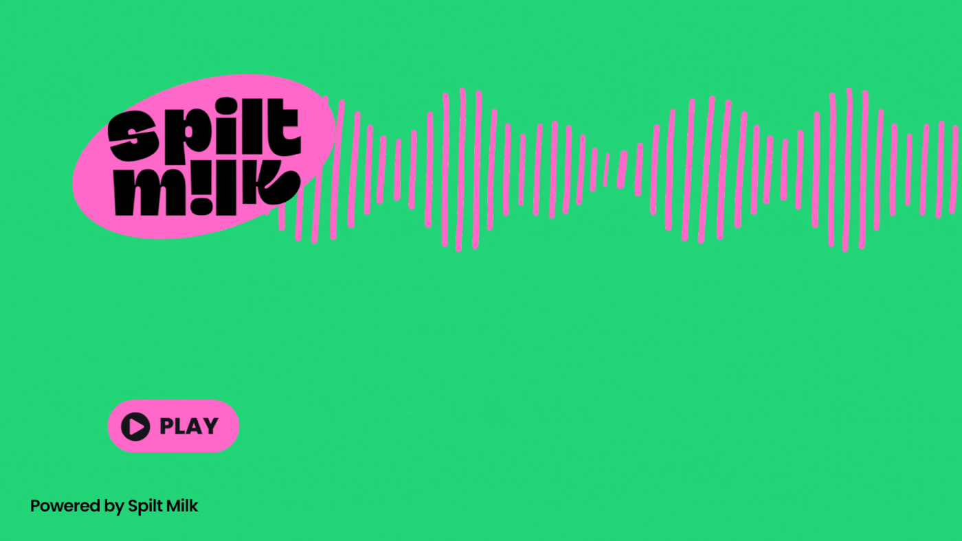
The landing page design had to be minimal yet enticing! An animated glowing gradient was added behind the logotype to give it emphasis and make viewers curious - and want to listen to the first episode of the podcast.
Conclusion
Overall, the brand identity design aided in getting a considerable amount of traction and engagement, making the episodes a hit among it's target audience - moms struggling to find answers! This was made possible with responsiveness by the client to my consistent reminders for feedback. I thoroughly ended up enjoying the entire process - from start to finish, and from ideation to execution.
Thank you for viewing!
(Follow me on Instagram for more.)


