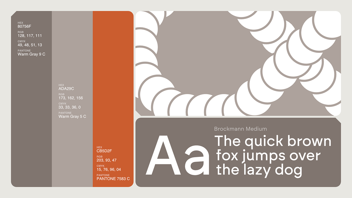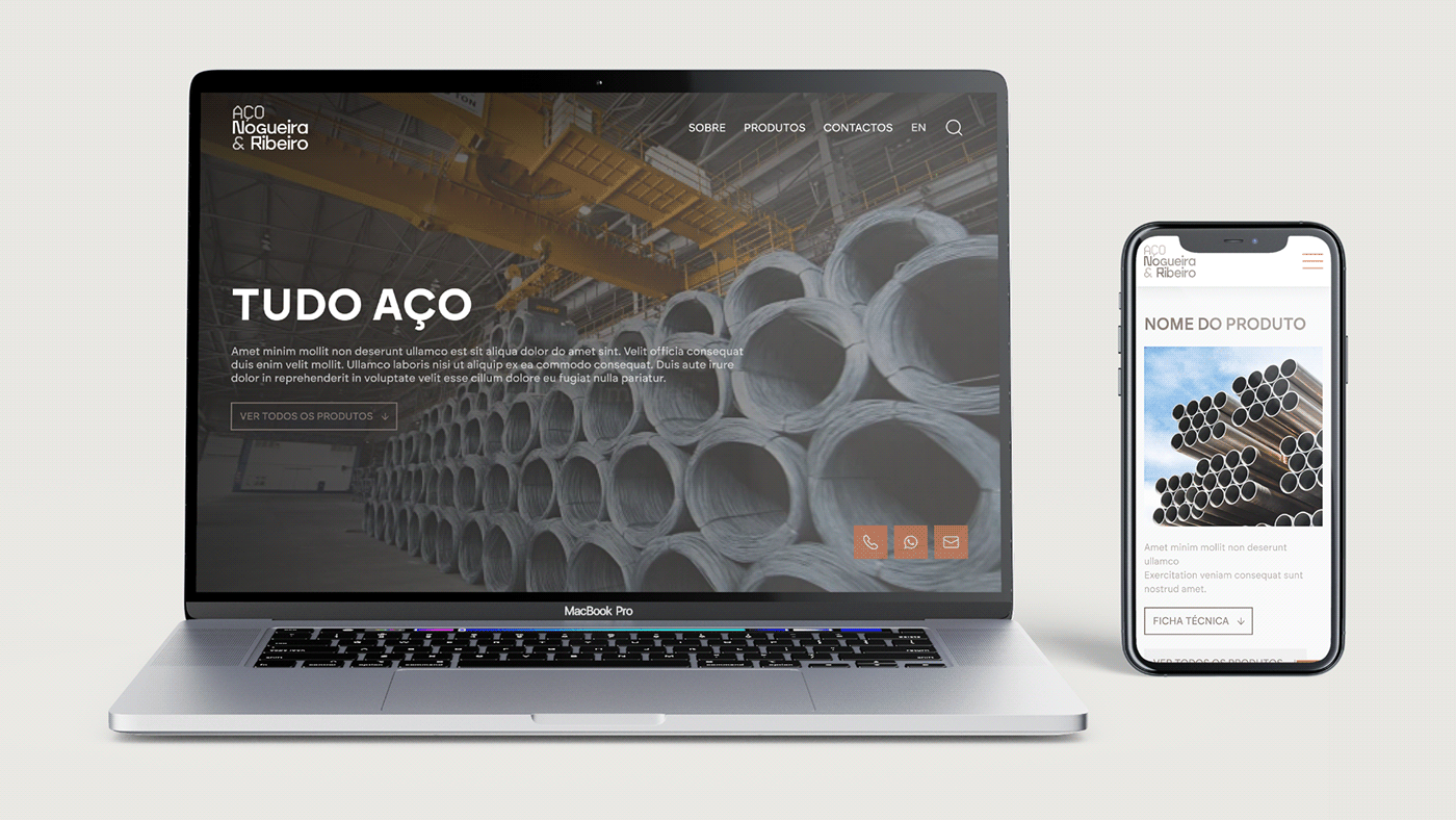
The Nogueira & Ribeiro visual redesign is characterized by 03 core visual principles: resistance (robust geometric shapes and stable structures), versatility (flexible and adaptable shapes) and precision (linear elements, precise alignments and the use of a geometric typeface).
Our main concept — “profile” — identifies both the company's product (steel bars, referred to as “profiles”) and the graphic motif. Using the side cut of the steel bars, it’s possible to identify geometric shapes that are then used in the brand’s communication.
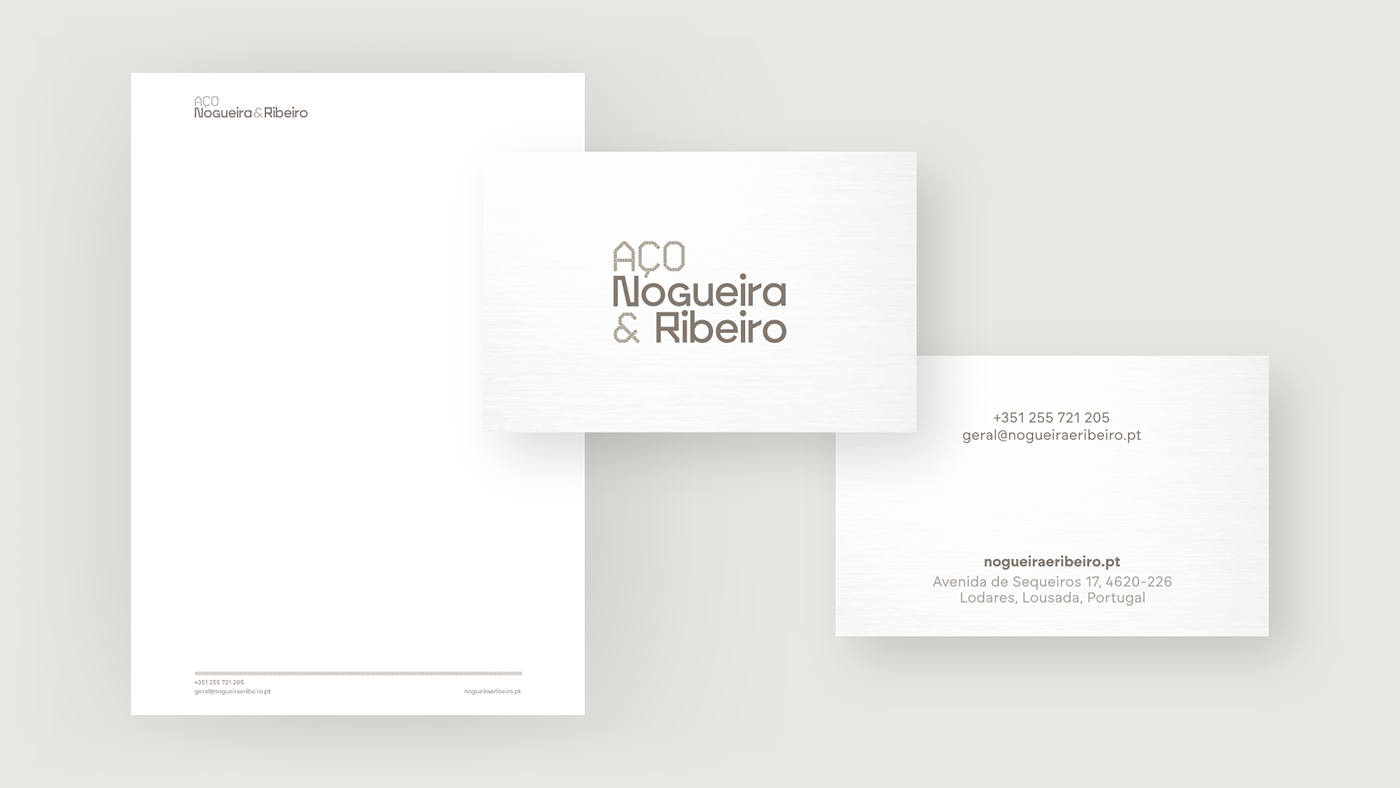
Another important reference is the punching technique, through which one can engrave letters and numbers on steel pieces. This is used to develop graphic assets and a custom secondary typeface which is used in both the logo and the communication.


