The history of pizza originates in ancient times. Initially, it was a simple focacho flatbread in which the leftovers from the previous table were collected and baked. Simple and hearty food for the poor. In the 18th century, a local genius from Naples came up with the idea to add tomatoes to the mixture and so our favorite dish appeared. In the middle of the 20th century, American soldiers who were visiting Italy got acquainted with pizza, and after that the victorious march of this dish across the planet began.
In our country, pizza gained popularity with the collapse of the Soviet Union and became an obligatory companion of children's parties, birthdays and mini-corporate work parties. Margarita, Four cheeses, Mexicana, Fish, Vegetarian, there are infinitely many types of pizza, sauces and additives, a lot of drinks. There is a culture, target audiences, a consumption situation. Famous chefs and restaurant chains have grown up on pizza. But, in fact, it's still the same simple and satisfying food for the "poor" from Italy.

Discussing the project with the brand management, we understood that we did not want to move in traditional directions: "Romance of Italy" or "Elite pizza from the best restaurants" and it was suggested to focus on the simplicity of the product. Here we came up with a brilliant "Idea of Three O's", a Trio – Prosto (Simple), Vkusno (Tasty), Sitno (Satisfying), which is consonant with the Trio, the name of our brand.
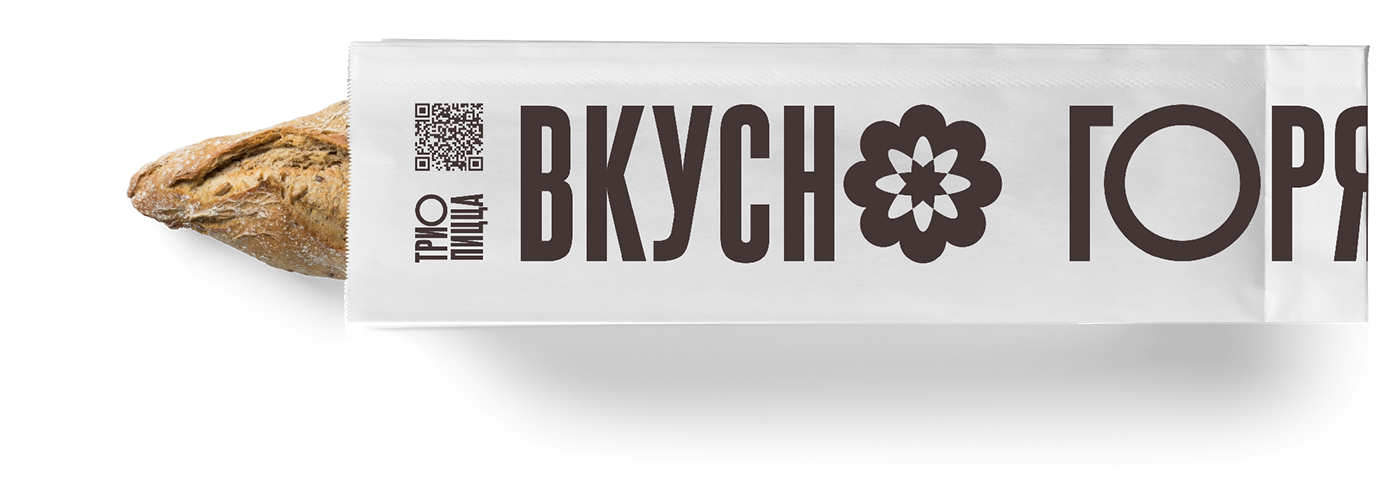
The "idea of Three O's" is variable, it is always possible to distinguish different advantages of the product. It can be Simple, Delicious, Fragrant, Spicy, Sweet, Fast, Hot and so on. The branding of products takes place simply using the appropriate inscriptions about the dignity of this yummy.


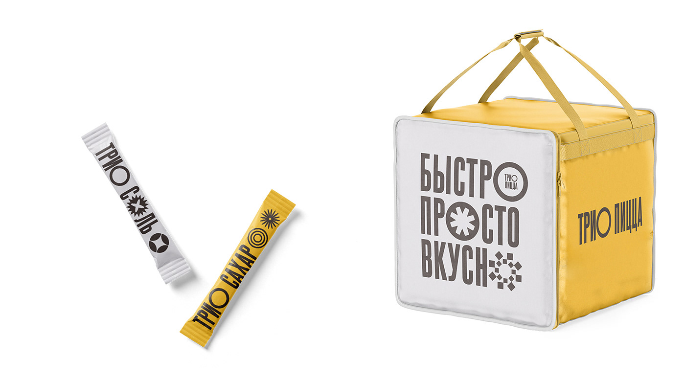


The basis of the identity of the brand of the Trio pizzeria is accidental inscriptions with modified letters “O”. On each carrier, we select three letters, leave one ordinary, and change the other two to the state of an ornament, which at the perception level emphasizes the advantages of the product. The logo design also allows us to use different versions of it, horizontal, vertical, square or with different descriptors, decoding inscriptions. By the way, most of our goodies look like the letters O, whether it's pizza, donuts, a glass of coffee, a glass of beer or a plate of soup.
Brand colors are warm: orange, gray and brown-black. Minimalism in identity design is designed to emphasize, first of all, the simplicity of the product, and then the variety of recipes and advantages of pizzeria products.