
UE 永艺
Sector: Manufacturing, Retail
Practice area: Brand Refresh, User Research, Brand Strategy, Product Strategy, Copywriting, Visual Identity System, Art Direction, E-commerce Planning, E-commerce System
Designed by Pocca
Founded in 2001, UE is a world-renowned high-tech enterprise integrating innovative research and development, intelligent manufacturing, and global sales. It is also the first listed company in the Chinese chair industry. It has 5 major production bases internationally, with more than 5,000 employees. Its products are exported to 82 countries and regions around the world, and it has ranked first in global sales for three consecutive years.
Pocca was commissioned by UE to develop a new retail market based on its 22 years of B-end industry accumulation. We completed multi-sections from user and consumer research, brand and product strategy, to visual identity system design, art direction, and e-commerce system planning and design.
UE永艺成立于2001年,是全球著名的集创新研发、智能制造、全球销售为一体的国家高新技术企业,也是中国椅业首家上市公司。在国内外拥有5大生产基地,员工5000余名,产品出口全球82个国家与地区,并连续3年全球销量第一。
Pocca受到UE永艺的委托,基于其22年的B端行业积淀,为其开拓全新的零售市场完成了从用户与消费者研究、品牌和产品策略,到视觉识别系统设计、艺术指导、电商媒介规划与设计等多版块在内的品牌唤新工作。
After sorting out the history and accumulation of the brand, summarizing its manufacturing technology, and interviewing and insights into its users and consumers, we found that using technology as the carrier and user experience as the core is the key to product claims, so the core user value of the brand is positioned as "support". We condensed the new brand value of UE "Master the Core Supporting Technology". On the one hand, it highlights the uniqueness of the brand's own strength and value; on the other hand, it also uses the concept of "Supporting Chair" to further differentiate UE's products from similar products on the market.
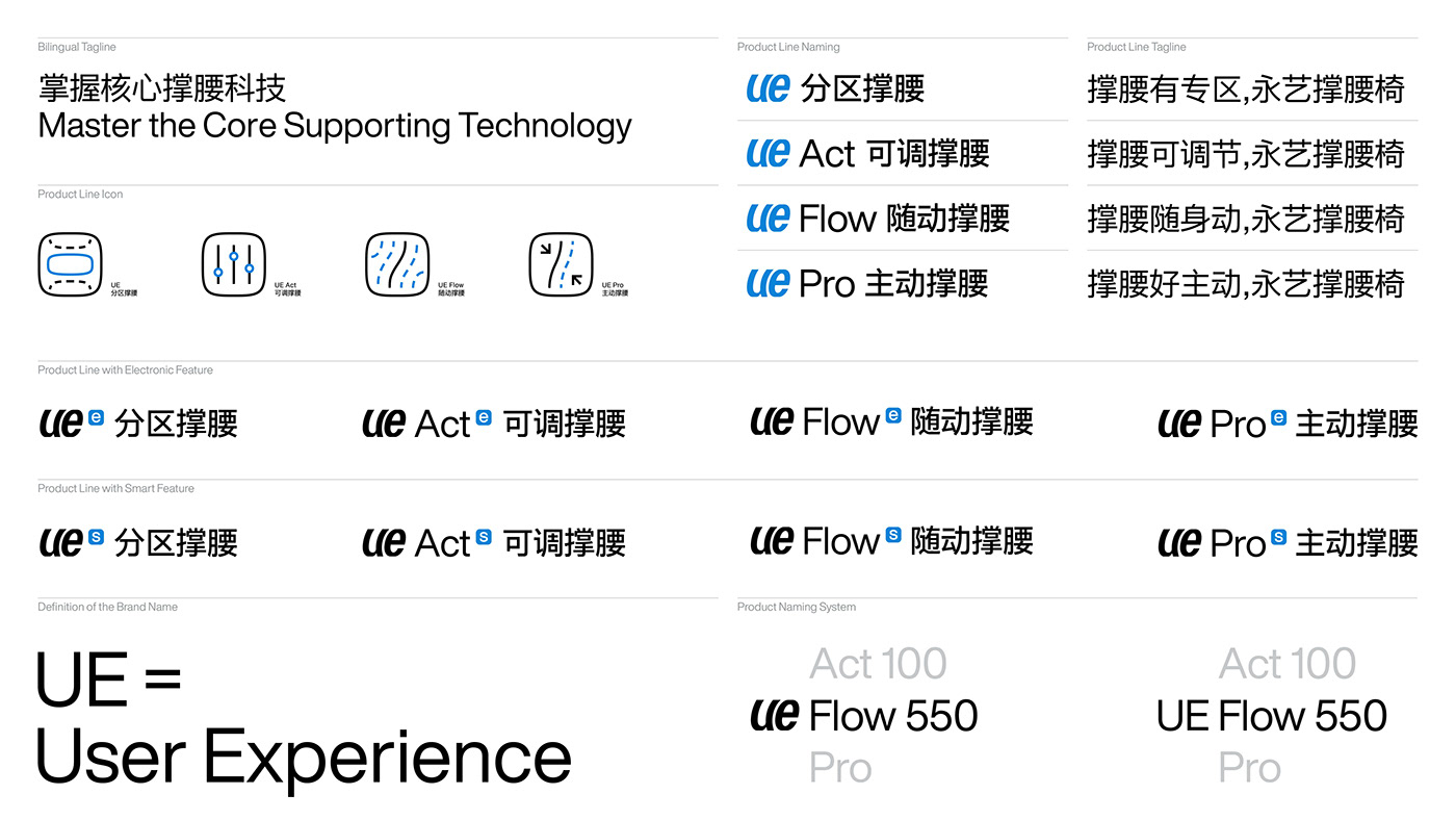
Based on the new definition of brand value, we have reorganized and planned the product line classification for the brand and consumers, so that the user's consumption decision-making can change from choosing a chair to the support required for choosing, allowing the support to further pass product lines convey a unified brand narrative:UE, UE Act, UE Flow, and UE Pro. Help enterprises form a coherent and unified concept and effective output of value from brand to product. At the same time, through product slogan creation, product naming system, copywriting, from brand to product lines and from product lines to products, complex information content is deleted and simplified, effective information is refined, and efficient understanding is promoted.
经过对UE永艺品牌历程与积淀的梳理、对其制造技术的归纳、以及对其用户与消费者的访谈与洞察,我们发现以技术为承载以用户体验为核心是产品宣称的关键,所以将品牌的核心用户价值定位在了“撑腰”。我们为 UE 永艺凝练的全新的品牌价值“掌握核心撑腰科技,永艺撑腰椅”。一方面突出强调了品牌自身实力与价值的独特之处;另一方面,亦通过“撑腰椅”的概念将UE永艺的产品与市场上同类产品做出进一步的区分。
基于对品牌价值的全新定义,我们为品牌重新梳理和规划了对品牌和对消费者均更加明确产品线分类,让用户的消费决策从选椅子变为选择所需的撑腰力,让撑腰进一步通过产品线传递统一的品牌叙事:UE 分区撑腰、UE Act 可调撑腰、UE Flow 随动撑腰、UE Pro 主动撑腰。帮助企业从品牌到产品形成连贯且统一的概念与价值的有效输出。同时,也通过从品牌到产品线和从产品线到产品的产品口号创作、命名系统、文案创作等,对复杂的信息内容删繁就简,提炼有效信息,促成高效理解。
The new visual identity system of UE aims to be based on the brand value and product characteristics of "Master the Core Supporting Technology" as its core, injecting a younger and distinctive brand personality and feelings into the brand, and subtly establishing a clear and lasting relationship with its consumers with the emotional identification and conceptual connection of “support”.
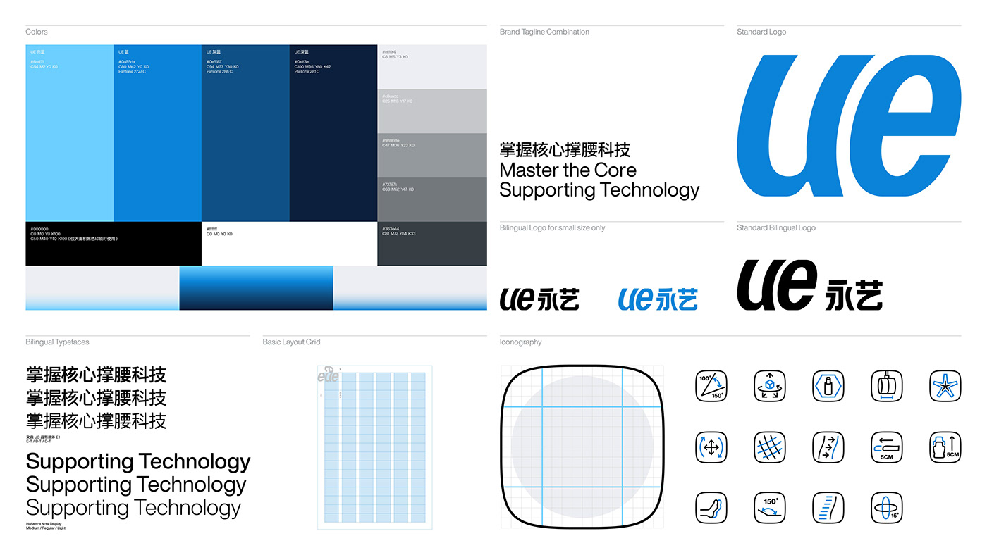
Based on the rare simplicity of the brand's English name UE itself and the shape of the letterforms, we made a subversive change to the brand's original Chinese and English logotype with strong attributes of a manufacturing enterprise: the original all-capital UE was transformed into All lowercase, through the letterforms of the character, it can instantly put a fashionable and friendly communication attitude in front of consumers; and then through the tilt processing of the ue character, it creates a stronger uniqueness for “ue” to be both a mark and a logotype, and also makes it a visual translation of the feeling of "support" by balancing abstraction and concreteness.
全新的 UE 永艺品牌视觉形象旨在基于“掌握核心撑腰科技”的品牌价值与产品特性为核心,为品牌注 入年轻化且鲜明的品牌个性与感受,潜移默化中与消费者建立明确且持久的对于“撑腰”的情感认同与概念连接。
基于品牌英文名称UE本身不可多得的极简与字母本身造型优势,我们首先将品牌原有的具有浓重制造业企业属性的中英文标识进行了颠覆性的改变:将原本全大写的UE转变为全小写,通过字符本身的笔画造型即能够瞬间将时尚和友善的沟通态度置于消费者面前;继而通过ue 字符的倾斜处理,即为标识创建了更强的独特性,也平衡了抽象与具象之间的界线,成为对“撑腰”感的视觉转译。


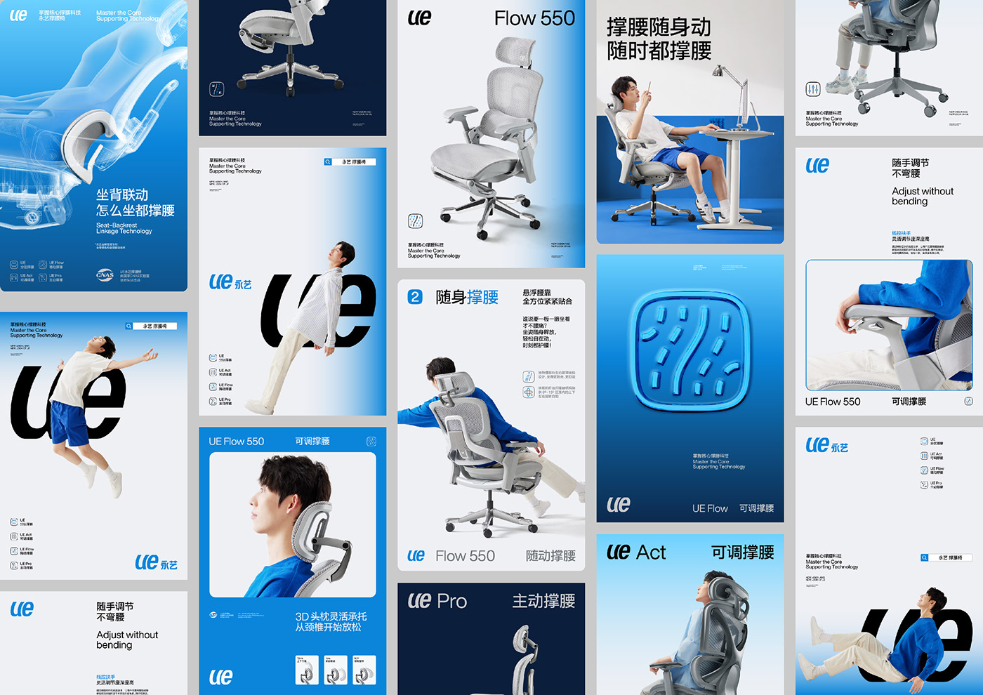


We also redefined the photography and image style used to present products and core brand style output based on the new brand value and visual identity system for UE. It aims to eliminate unnecessary exaggeration and excessive decorative elements, and instead present in the current retail market environment with abundant information through images that are appealing, realistic, focused on products and the interaction between people and products, rigorous and concise.
In the construction of each section of the visual system: Based on the brand's long-standing brand color recognition accumulation of blue tones, we created a new brand color palette for UE to help the brand establish a new vibe that is both trustworthy and full of vitality; Tough, concise and neutral Chinese and English fonts can help the brand communicate more appropriately; standardized iconography system can help the brand unify auxiliary icons with different styles to form a coherent and unified visual style and reduce unnecessary reading Interference; and the responsive grid system suitable for different layout ratios and media can finally arrange all visual elements and information in a unified style and clear information hierarchy, helping brands to output information efficiently and more powerfully, while also allowing consumers and users can be more involved in the brand's vibe and easily focus on the information composed of images and text.
我们也为UE永艺基于全新的品牌价值定义与视觉形象系统,重新定义了用于呈现产品与核心风格输出的摄影与图像风格。旨在剔除不必要的夸张和过度的装饰元素,转而通过具有感召力、具备真实感、聚焦产品以及人与产品互动、严谨且简洁的图像,来呈现面对当下信息纷繁的零售市场环境。
在视觉系统各个版块的构建中:基于品牌一直以来的蓝色色调的品牌色彩认知积淀,我们为UE永艺塑造了全新的品牌色板,帮助品牌建立既具有信任感又充满活力的气息;硬朗、简洁、中性的中英文应用字体能够更恰如其分的帮助品牌进行沟通;规范化的图形系统能够帮助品牌将原本风格迥异的辅助性图形进行统一,形成连贯统一的视觉风格,减少不必要的阅读干扰;而适用于不同版面比例与媒介的响应式网格系统能够最终将所有的视觉元素与信息进行风格统一且信息层级清晰的编排,帮助品牌高效且更有力的输出信息的同时,也让消费者和用户能够更走入品牌的氛围之中并将注意力轻松的放在图像与文字所组成的信息之中。


