


When you think of cement, a construction site may come to mind. LAVA LAVA redefines the way we view this industrial material and shows off its versatile potential with their upscale interior pieces that can elevate any space. Tired of dull names, like World of Kitchens, and glitzy European titles dominating the industry, the creators of the company came to us for an exciting brand that pushes market conventions, evokes emotions, and fits their evolving production line.
Naming
When it comes to cement, there are no perfect copies — and that's the beauty of it. Each piece is poured into molds and solidifies in its own way, creating a unique variation that preserves the warmth of its handmade production. This warmth and organic-like nature of the material made us think of the heat and raw power of volcanic eruptions, which produce a red-hot liquid mass that turns into stone as it cools. And that’s how LAVA LAVA got its name.
Brand Identity
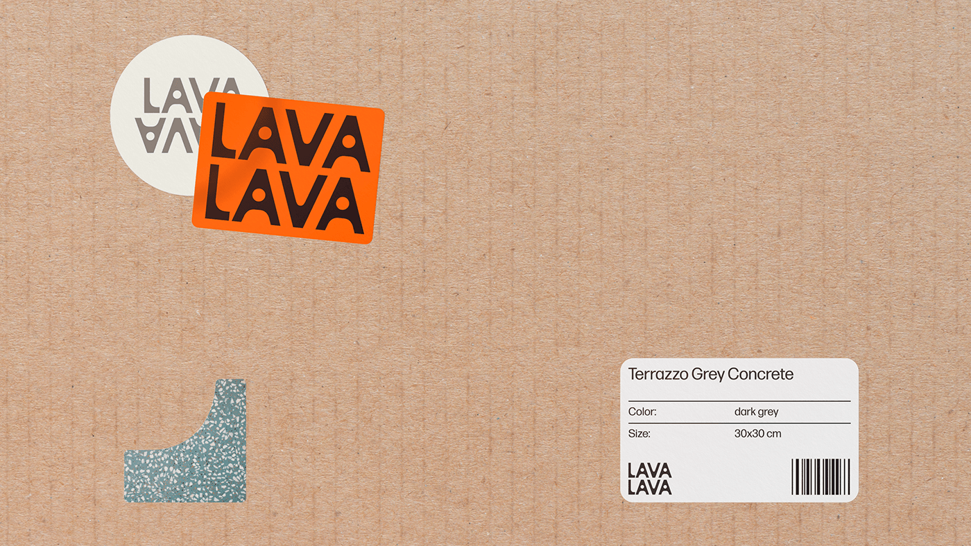
To reinforce the idea of liquid turning into stone in the brand’s visual identity, we blended rigid geometry and rounded shapes in the logo that can be imprinted directly on the products. Depending on the context, the logo can be arranged in two lines or in one.
We used fragments of the logo letters as branded graphics to make the identity even more cohesive. The brand's signature palette also takes inspiration from lava in all its states, from glowing molten rock to solidified stone.


Art-director: Phillip Tretyakov
Designers: Anna Kolysheva, Polina Syrvatka
Logo design: Ekaterina Daugel-Dauge
Animation: Anna Kolysheva, Kate Molchanova
Secret adviser: Stefan Lashko
Project-manager: Ivan Matskevich
3D: Valeria Yaremenko, Badri
Typeface: Forma DJR Text
Year: 2023


