


“Sitch,” short for “Situation,” is a hair care brand that delivers fuss-free, no nonsense hair care regimes to liberate everyone. For everyone with hair.
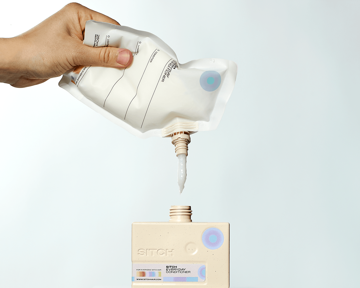
Our disruptive packaging design focuses on sustainability, with refillable vessels designed to be both functional and so desirable you'll want to keep them forever! A big feature is that all the bottles tessellate together due to their semi cylindrical body and sizing ratios. This satisfying tessellation optimises space in the bathroom and creates impactful brand blocking retail displays. Finally each bottle is finished off with a product label that slots into the emboss provided. Graphically we used the bullseye gradients on each label to represent the core properties of each product
The materials are chosen for sustainability, with PCR plastic used in the main vessel and recyclable PE for the recyclable pouches. With this Sitch can successfully say they're achieving an 82%-89% reduction in plastic waste. With an exclusively refillable range, Sitch are setting a new standard for eco-conscious hair care brands in the US.
Just like the packaging, the brand ID centres on functionality and minimalism. The logo is stripped back to a simple utilitarian san serif but still with some character in its full bodied form. We paired this up with pops of colour gradient to liven things up