


La Marine — Brand Identity & Strategy & Packaging Design
Client: La Marine Skincare
Services: Product Strategy, Brand Strategy, Positioning, Naming, Brand Identity, Packaging Design, Web Design
Sphere: BeautyLa Marine is a brand of natural, anti-aging cosmetics with ocean ingredients, founded by two business partners from the Ukrainian city — Odesa. They approached us with the goal of creating a natural cosmetics brand for women aged 35+, which would be sold on international platforms in the United States and Europe.
Close cooperation between our strategists and the client led to the key idea of the product - to develop a chemical formula based on ocean ingredients: jellyfish extract, glass sponge spores/micro-needles, and pearl powder. Each of the ingredients has its own effect on the skin and helps to preserve youthfulness. The first product line included “Brightening Pearl Serum” and “Moisturizing Cream”, with plans to expand and add new products in the future.
The unique chemical formula based on ocean ingredients became the basis for further development of the brand strategy, positioning, and name. The ocean is the least explored part of our planet, which was the beginning of life on Earth and holds many more secrets. “La Marine” reveals the beauty secrets of the ocean to women.
Our goal
The design team was tasked with creating a visual identity and packaging design for the first products in the line. The brand strategists set clear goals for the design team to achieve.
- Show the hero ingredients of the line. Because they are the main USP of the product and an advantage over competitors.
- Create a sense of a premium brand, "great value for money".
- To convey the essence of the brand, the atmosphere of the ocean, and the naturalness of rare cosmetics ingredients.
- Create a flexible visual system that can be easily adapted to new products.

Concept
We reveal the ocean's beauty secrets to you
While searching for a visual idea, we came across the concept of the "flower of eternal youth". In legends, fairy tales, and myths, the image of a magic flower is associated with better health, good luck, eternal youth, and beauty. So, we found a visual metaphor for our products — "we are like an ocean flower".
La Marine explores the depths to discover the secrets of beauty, just as scientists explore the ocean in search of new species. Our products are like new species of ocean flowers that we discover and bring to women as a treasure. These flowers are a magical symbol of their beauty and femininity.
They "grow" in the unexplored depths of the ocean, which emphasizes their naturalness, natural origin, and unique formula of ingredients that only our products have.
Design
All design elements are intended to convey the metaphor of an ocean flower and create the feeling that our products have come from the depths of the ocean. For the packaging design, we opted for the mono-design concept, which facilitates the development of future products and lines.
Illustrations
Illustration is the main visual component of the identity and packaging. This is our ocean flower, which consists of the hero ingredients of the line. We realized that a jellyfish is visually similar to a bud, a sponge to a stem, and pearls to flower stamens, so by combining all three ingredients together, we created an image of a non-existent flower. As if it was a rare flower that no one had ever seen before, and we had just found it in the depths of the ocean and offered to use its magical properties. Such an illustration is both an interesting visual image that helps to stand out from the competition and a metaphor for the product.
With the help of the illustration, we fulfill the main task - to show the hero ingredients of the line.


Logo
The “La Marine” font logo is based on a modern antique. The wavy horizontal elements refer to the waves in the ocean,
and the soft, graceful shapes emphasize the elegant character of the brand.
The mark is a monogram that combines the letters L, A and M, which are placed symmetrically in a circle and form the
silhouette of a flower. In addition to the letters and the flower image, the mark also features drop and pearl shapes,
which also refer to the ocean.


Color palette
It consists of two gradients. The light gradient is inspired by pearls, and the dark gradient is inspired by the change in water colors from the surface to the bottom. In addition, the dark scheme imitates the lighting in the depths of the ocean.
Typography
The typography is based on a combination of elegant grotesque and wavy elements that convey the naturalness and premium nature of the brand and go well with the logo. And a simple minimalist grotesque for the micro typography.


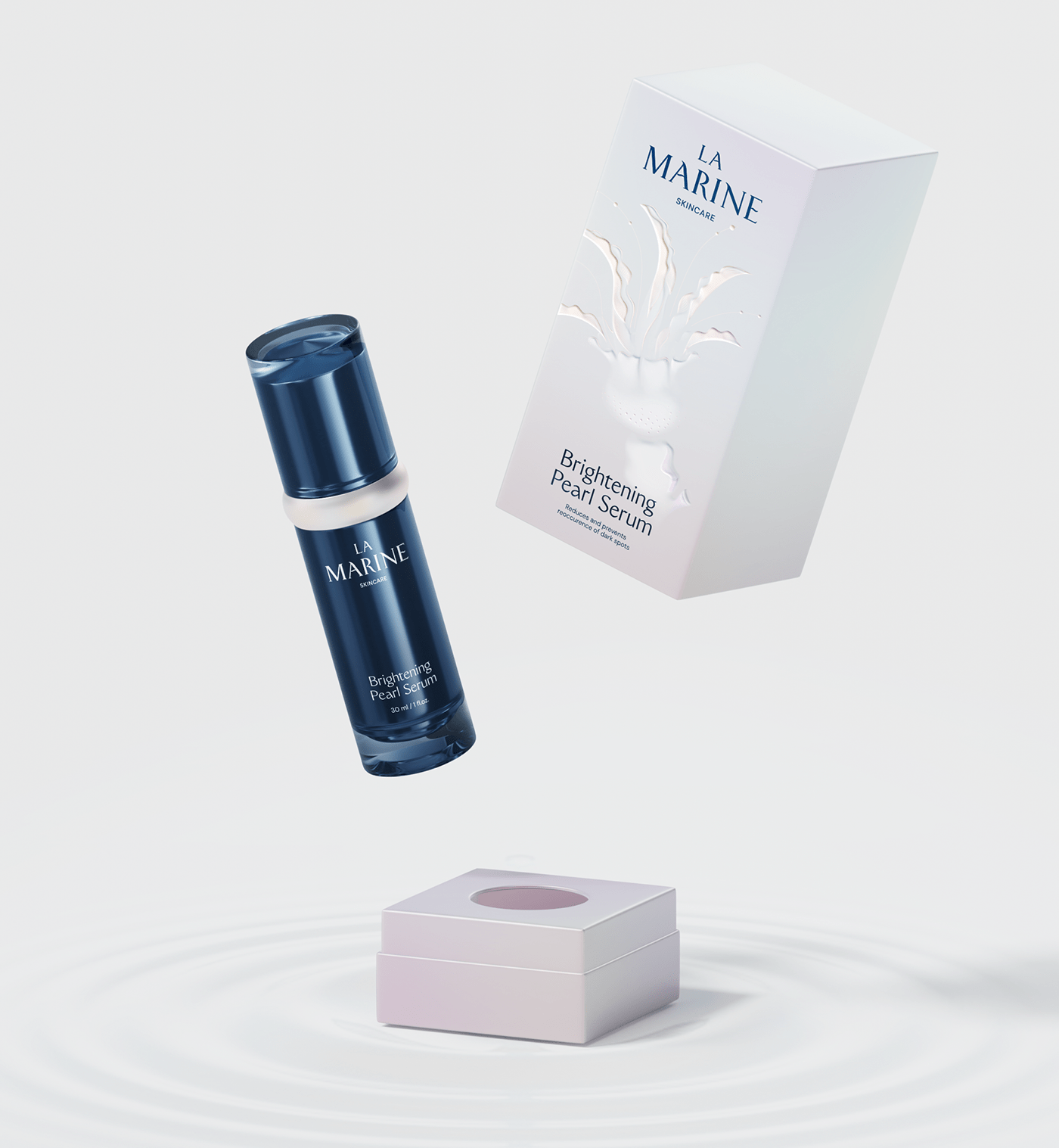
3D product visualization
We developed realistic 3D visualizations of the product separately and together with the hero ingredients, which will distinguish LaMarine on various platforms (Amazon, iHerb...), create a recognizable image in advertising media, and emphasize the premium positioning of the product.
Details
We designed the packaging to consist of three layers (sleeve, main box, and bottle), which allowed us to accommodate all the necessary content and at the same time keep the packaging visually appealing and minimalistic. We use a variety of printing techniques, such as foil stamping and foil embossing, to make the packaging tactile and highlight the illustration with relief.


Result
As a result, our team helped to find a unique component of the product, develop a brand strategy and unique market positioning, develop a product name, and create a visual identity and packaging.
We found an apt visual metaphor and implemented it in the design. With the help of identity and packaging design, we created the feeling of a premium product for reasonable money. We visualized the hero ingredients of the line and created a flexible design system that will make it easy to design new products and lines in the future.

Powered by League Design Technology
Design Director: Mike Samovarov
Team Leader: Julia Zamiatina
Graphic Designer: Kateryna Ishchenko
Creative Project Managers: Marina Blyznyuk, Julia Lysenko
Case Design: Anna Fedorovych, Anton Bukoros, Alina Kovalenko
3D Designer: Nikita Bukoros
Design Director: Mike Samovarov
Team Leader: Julia Zamiatina
Graphic Designer: Kateryna Ishchenko
Creative Project Managers: Marina Blyznyuk, Julia Lysenko
Case Design: Anna Fedorovych, Anton Bukoros, Alina Kovalenko
3D Designer: Nikita Bukoros
Strategist: Olena Kirienko
Important!
If you want to support Ukrainian designers and the entire Ukrainian people in the war for world independence from russian terrorism, please, follow the links below:
savelife.in.ua (charity fund)
u24.gov.ua (an initiative of the President of Ukraine)
If you want to support Ukrainian designers and the entire Ukrainian people in the war for world independence from russian terrorism, please, follow the links below:
savelife.in.ua (charity fund)
u24.gov.ua (an initiative of the President of Ukraine)


