/packaging
Galvanina
Indulge in the timeless charm with every sip.
CLIENT
Galvanina has an ancient and fascinating history. Situated on the slopes of Colle Paradiso, where ancient Roman baths once stood, Galvanina takes its name from the eponymous mineral water spring. It is here that a centuries-long journey began through the territory of Rimini.
ASSIGNMENT
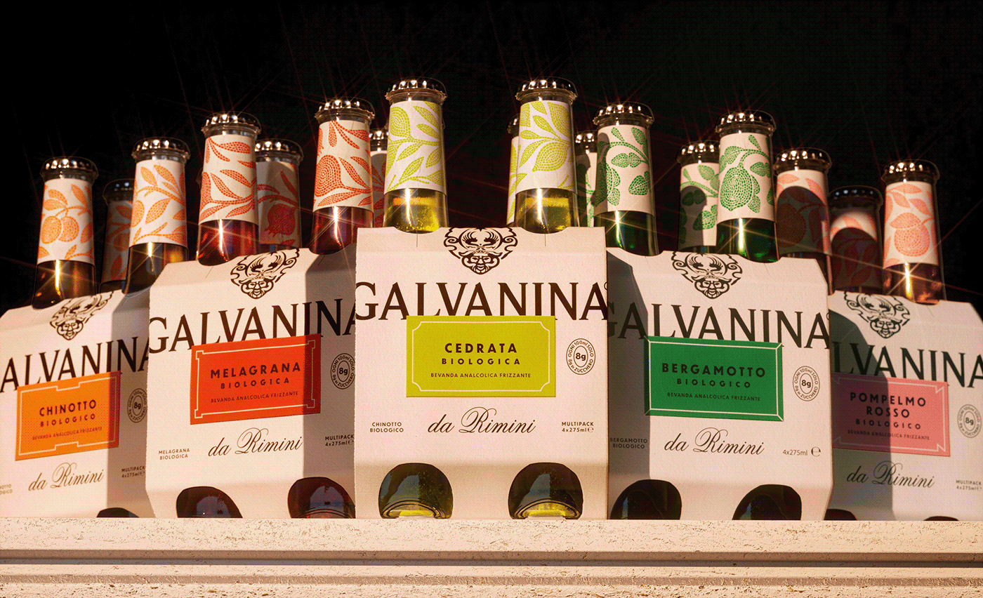
The task at hand was to craft a packaging concept for Galvanina GDO, a soft drinks line boasting five skus: Chinotto, Bergamot, Lemonade, Pomegranate, Pink Grapefruit and Cedrata. Our objective was clear – to create a design that not only distinguishes these beverages on the crowded shelves but also issues a robust and distinctive identity befitting the history of this Italian brand.
SOLUTION & PROCESS
At the core of our design lies a vibrant Roman plaque, prominently featured on both the cluster and the label. For each flavor, we've crafted a distinct frame and an artful depiction of the corresponding fruit using the mosaic technique, adorning the bottle's neck. The result is a packaging solution that gracefully carries the brand's rich history while exuding an air of sophistication and freshness.
Executive Creative Director: Davide Mosconi
Designer: Nadia Parentini
Illustrations: Carmi Grau
YEAR / 2023