


Sobaka magazine is the first local glossy magazine in St. Petersburg, published since 1999. One of the largest federal networks of urban lifestyle glossy magazines. Published once a month.
The updated sign now lacks the black outline and small graphic elements (black dots that form images of the dog's eyes and triangles on the dog's back and lower body).
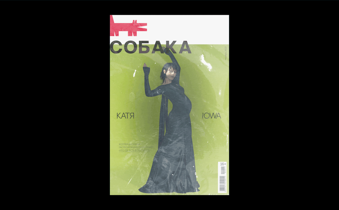
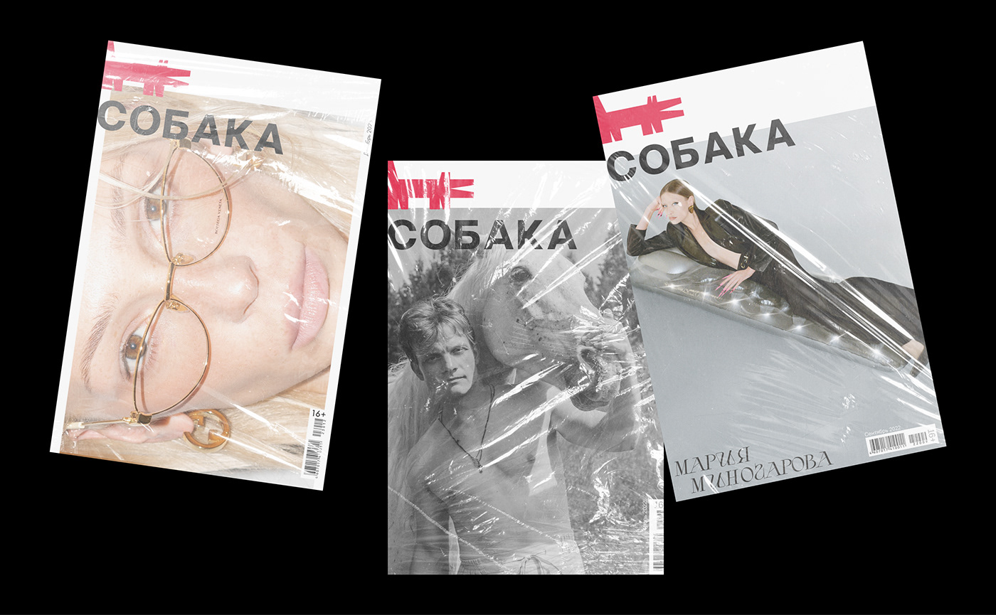
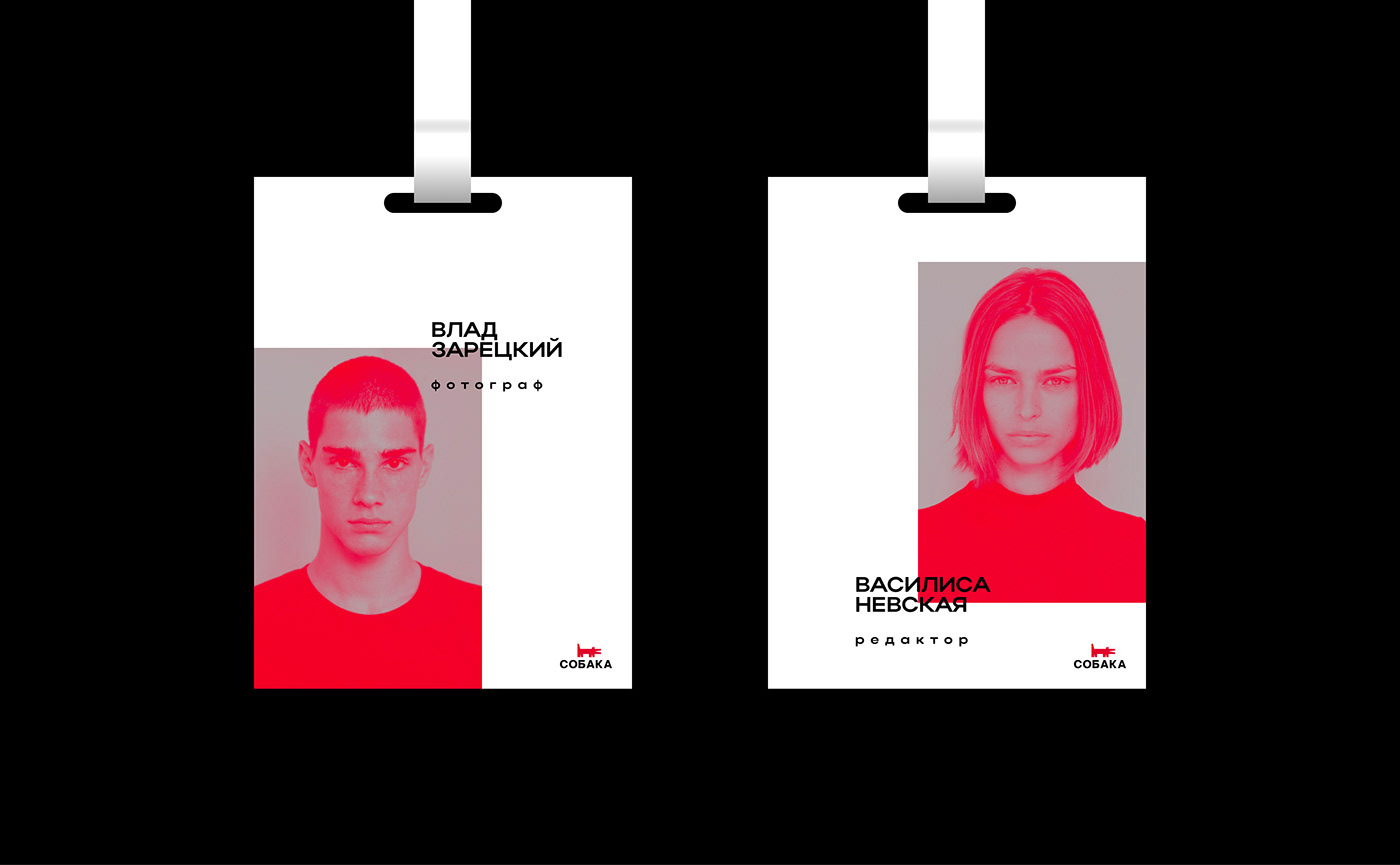
In addition to the branding, the font of the magazine's name was updated. The postscript "RU" disappeared from the name, additional postscripts to the name: St. Petersburg, KZN, SMR and other cities) found their new and logical place. The display font has been updated to a much simpler and visually pleasing look.
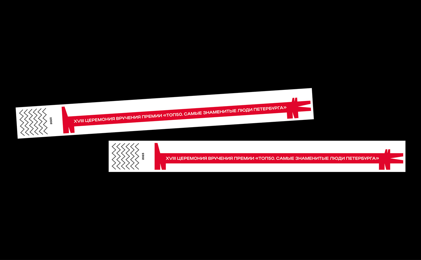
The updated logo of the magazine has become geometric, minimalistic and modern. The sign consists of five lines — 0°; 8.5°; 75°; 90°). Also, the proportions of the brand name correspond to the golden ratio, which makes the thin sign more visually aesthetic.


designer → ivan polysaev
@2023


