Your money your way
In 2016, Nequi stood out as one of the pioneers in the rise of neobanks in Colombia. This project was born from the hand of Bancolombia, configured as a completely digital platform, with a clear objective: to improve your relationship with money and help you achieve your financial goals.
Seven years later, digitalisation has become the norm, neobanks have evolved and the context in which Nequi operates has undergone a radical change. It was imperative for this mobile app to adjust to the new reality and renew its brand identity to remain relevant.


Everything starts with a dot.
At Nequi, our main goal is to minimise problems and maximise solutions. And we wanted our visual identity to clearly reflect this. We chose to use the dot as a symbol of communication, for its simplicity and power. From this dot, our brand renovates itself and establishes a new connection with our customers. Nequi becomes the first step towards a world of infinite possibilities.


Synthesis as the centre of attention.
The dot is not only present in our logo, but also acts as the core that shapes our visual identity. In our designs, the dot is combined with overlapping geometric shapes, becoming the point of union. The illustrations are also inspired by the dot, and in our icons, the vertices are eliminated, thus highlighting the importance of this element.
Three levels of expressiveness were defined based on the different situations in which they were to be used. Thus, illustrations composed of strokes were created to explain complex processes, others with colourful shapes, designed to complement articles and blog posts, and the last ones with a higher level of detail, created to represent scenes or situations.


Colours we identify ourselves with.
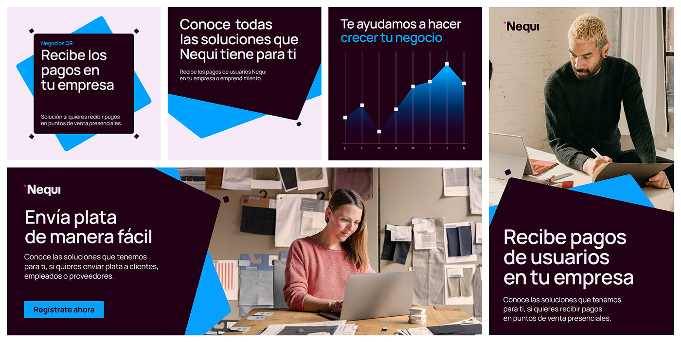
Our colour palette remains the same, with a magenta called Orchid and a lilac called Grape as our main colours. The Guanábana is used for the backgrounds, while the Caribbean blue distinguishes our B2B communications. We complement all this with a touch of orange that enriches our palette and is reflected in our illustrations and graphics.

Totally digital.
The new identity we have developed is composed of various elements that are integrated into a highly adaptable system, designed to interact effectively in the various digital channels that are part of our brand's life. From this moment on, Nequi's communication will become an emblem of our continuous innovation process, aimed at meeting the changing needs of our consumers and, above all, helping them to achieve all their financial goals with ease and success.


