


__________________________________________________________________
BRANDING, IDENTIDADE VISUAL
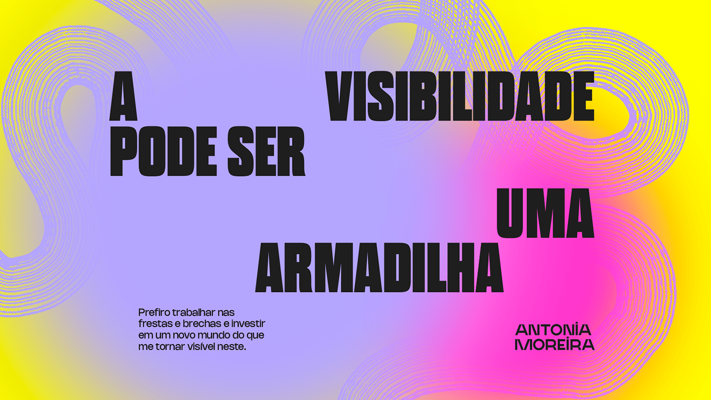
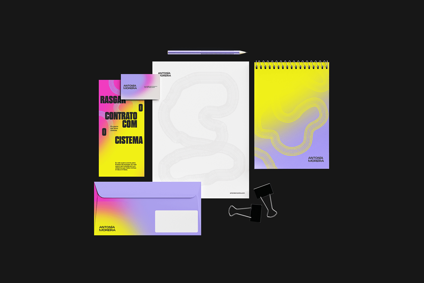
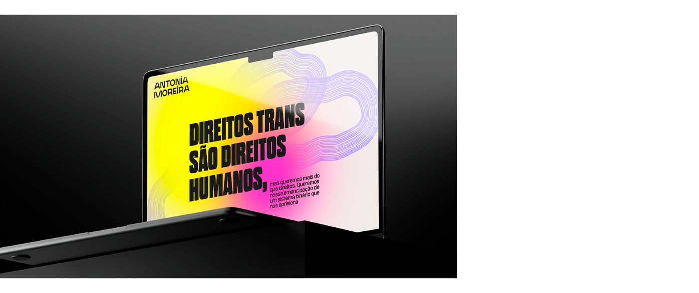
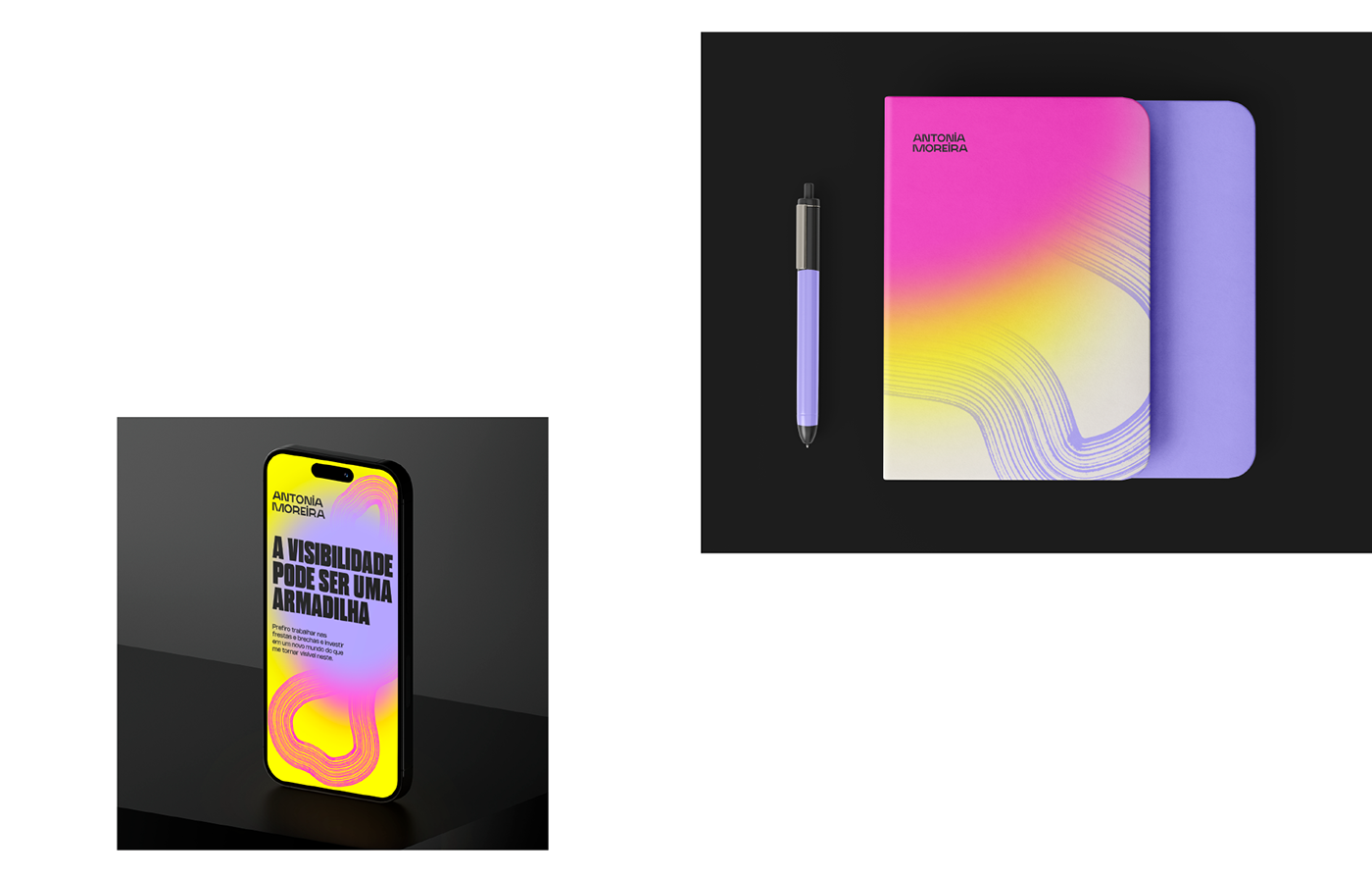
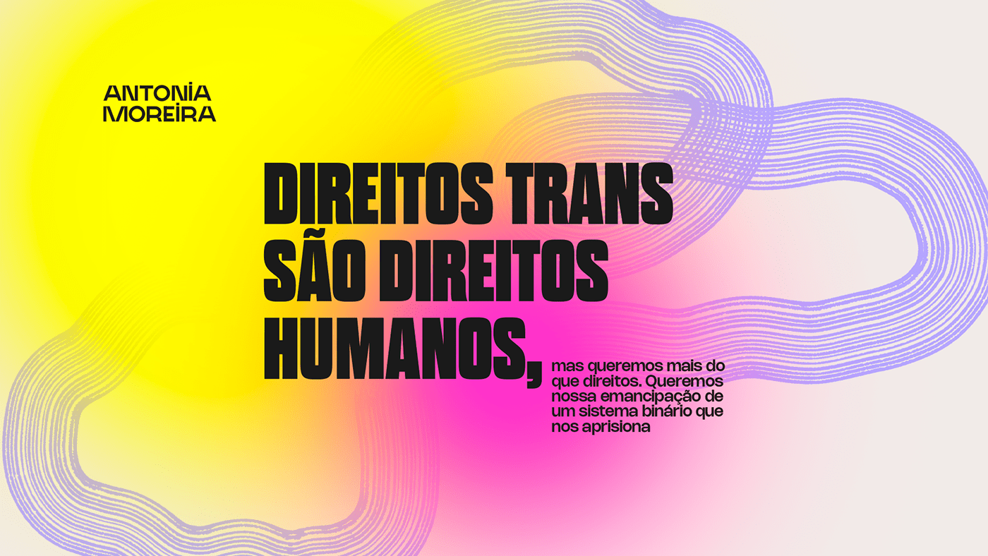
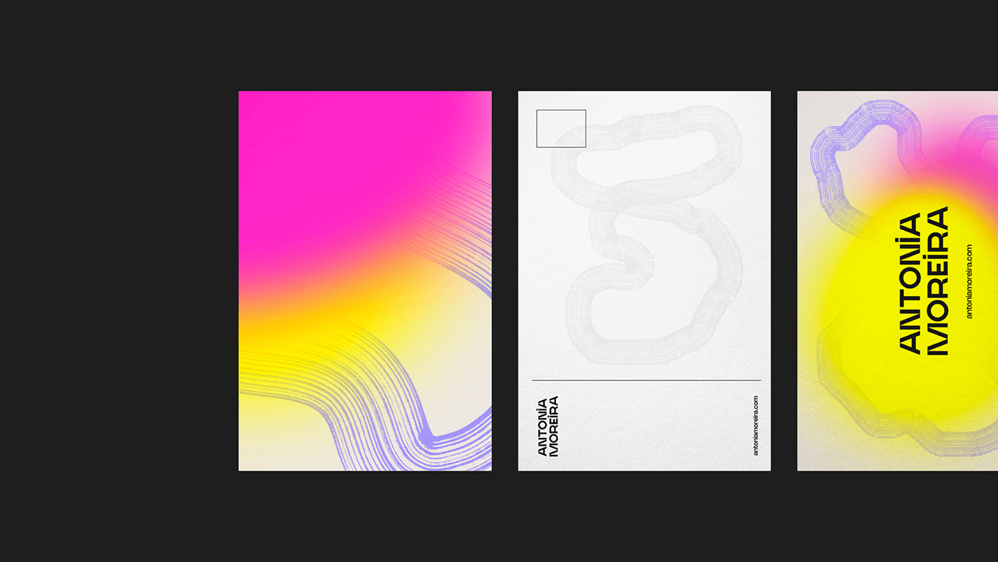
Antonia é uma travesti que usa suas vivências para provocar mudanças sociais significativas no mundo. Eloquente e com uma carreira voltada aos direitos humanos, acredita que seu diferencial esteja no acesso que tem à raiz dos discursos marginalizados, e as habilidades que desenvolveu ao longo do tempo para lidar com os desafios do mundo. O objetivo desse trabalho foi transpor toda essa potência em uma identidade gráfica que representasse a complexidade de Antonia. Navegando por entre o mundo corporativo e do ativismo, o desafio aqui foi criar a ponte que os unisse e sustentasse o que Antonia defende enquanto os permeia.
A escolha por uma tipografia clara e legível buscou trazer consistência, alcance e profundidade ao discurso que ela traz. Os grafismos orgânicos, inspirados nos círculos de idade das árvores, fazem alusão ao modo rizomático com que Antonia percorre os mais diversos contextos, de forma fluída e adaptável, sem perder suas raízes. A composição entre os elementos se deu intencionalmente de forma mais limpa para dar espaço à própria voz da marca e à legibilidade dos conteúdos. Já as cores, intensas e expansíveis, refletiram a força, intensidade e busca por renovação trazida por uma travesti que almeja por mudanças significativas da realidade.
EN
Antonia is a travesti who uses her experiences to provoke significant social changes in the world. Eloquent and with a career focused on human rights, she believes that her uniqueness lies in her access to marginalized discourses and the skills she has developed over time to address the challenges of the world. The goal of this work was to convey all this power into a visual identity that represents Antonia's complexity. Navigating between the corporate world and activism, the challenge here was to create a bridge that would connect them and support what Antonia advocates as she permeates both.
The choice of clear and legible typography sought to bring consistency, reach, and depth to the message she conveys. The organic graphics, inspired by tree age rings, allude to the rhizomatic way in which Antonia navigates various contexts, fluidly and adaptably, without losing her roots. The composition between the elements was intentionally kept clean to give space to the brand's own voice and the legibility of its content. As for the colors, intense and expandable, they reflected the strength, intensity, and pursuit of renewal brought by a transgender person aiming for significant changes in reality.


CRÉDITOS
__________________
PLANEJAMENTO E PRODUÇÃO: MARINA BIGARDI & raissa caramanico
DIREÇÃO DE ARTE E CRIAÇÃO: FELIPE AUGUSTO
DESIGN: MANOELA CARDOSO & FELIPE AUGUSTO


