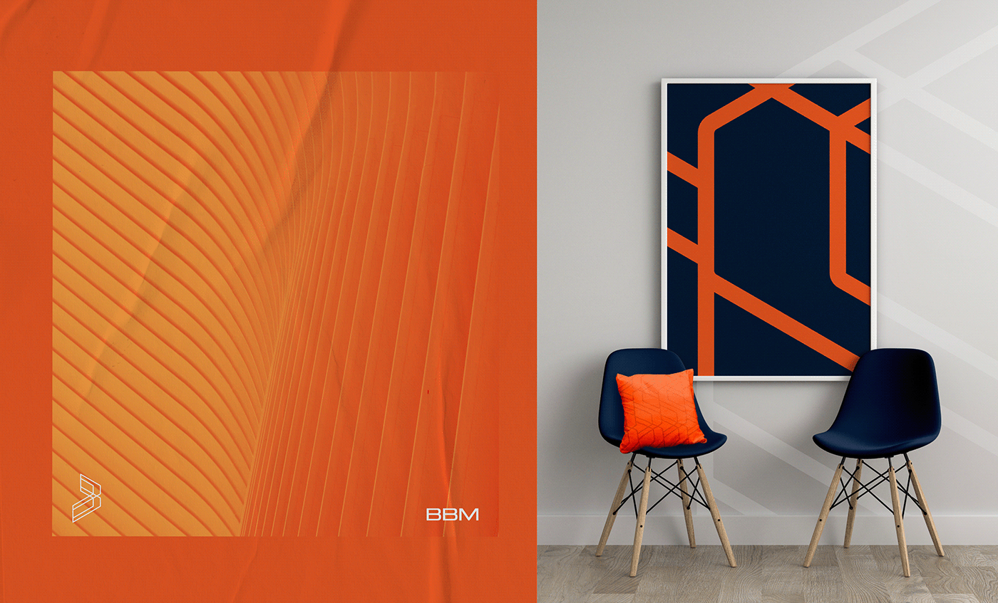
BBM | 2022 | Brand Identity
Sector: Civil Construction
Scope: Project Management with BIM
Objective: To convey a professional image that adds value to the services provided, setting us apart from the competition and gaining prominence in the national market with a unique, modern, and technological identity.
Creation: For the symbol, we drew inspiration from the grids formed by 3D drawings, constructions, and scaffolding. When a construction project is underway, we also encounter various metal frameworks that support it before completion. Therefore, we used construction lines to create a stylized letter B. The letters were designed to convey solidity, strength, and technology, with large and expressive forms. The colors were chosen to inspire confidence, security, and tradition. Despite being innovative and ahead of their time, the goal is to communicate with traditional companies in the construction industry. One particular color will be reserved for internal use, creating a warmer and more friendly environment. Finally, we added textures and patterns that enrich your visual identity, making it even more distinctive.


Internal Communication with a warmerand friendlier atmosphere
-
The color orange, which symbolizes communication, will be used exclusively for internal communication within the company to create a more inviting, cheerful, and friendly environment.