
Structured Daily Planner Case Study
Structured is a popular daily planner app. Its integration with Apple’s Reminder app and its functional features make it a preferred app.
I redesigned Structured and made changes to the user interface and experience based on the data from usability testing. In this article, I’ll explain the differences between my design and Structured’s current design and the reasons for these differences, along with some screenshots.
Onboarding
In line with the design system I created, I prepared the onboarding screens without making any changes.

Home Screen Daily Plans List
This screen with the daily plans is the welcome screen of the app. In usability testing, I found users had some difficulties with this screen.

current design
In the current design, there is no dedicated “jump to day” button after switching to any day in the calendar at the top. So users have a hard time getting back to today. They have to tap the month and year at the top to do so. However, I discovered this function randomly and there is no notice telling you this.
Also, to go to a very distant date, you have to tap the calendar button at the top and confirm it by selecting a date from the calendar window that pops up.
In Welldone's design, when switching to a different day in the calendar, I added an indicator that shows which side today is on, and tapping on it switches to that day.

The indicator in the date section at the top of the screen (left & right)
I gave up using a pop-up calendar to go to a date too far away. Instead, I switched to a monthly view where the weeks of the month are at the top, stacked one below the other, and you can switch between months by swiping left and right as you swipe down the list of plans.

I changed the appearance of the daily tasks. In the current design, completed tasks were colored, and incomplete ones were uncolored. I did the opposite, because completed tasks should no longer get attention, and tasks that have not yet been completed should stand out. Let me show you a comparative example from the Light mode screen design.

Current design (Left) | My design (Right) — Light mode
Also, in the current design, the islands with the icons of the tasks are rounded, so that the clocks on the left are far away. According to the Gestalt grouping principle, the eye finds it difficult to align the clocks horizontally, so it groups them vertically with other clocks. This is why users find it difficult to make sense of the clocks on the left side. So I removed the clock indicators showing the start and end times of tasks.
I added a search button at the top. Users can find a task they want to search for by searching for it in this section.
Focus on Task
A task that is due has a “Focus Now” button. When the user taps this button, the task goes to full screen and the time allocated to the task starts counting down. This is a great feature to help users focus on a task.
In the current design, the full-screen task starts to color from the top of the screen as time passes. The description and subtasks, if any, are in a small part of the screen.


In my design, like the task list on the main screen, the full-screen task display starts with the task in color and gradually fades to colorless. There is plenty of space for the task description and subtasks. If the user doesn’t want to see these sections, they can collapse the description or the list of subtasks to make the screen look simpler.
I added a prominent CTA button to direct users directly to the button they need to press. In the current design, the two buttons next to each other are the same.
Create a Task
We start task creation by tapping the “+” button on the main screen. In this section, I got a lot of insights from usability tests and user suggestions. I tried to incorporate all my compilations into the design appropriately, making the experience simpler.
In the current design, after clicking on the “+” button, suggestions for old tasks are displayed. After typing the task name, the user goes to the task settings by tapping the “create task” button again. If he wants to add descriptions or subtasks to the task, he has to scroll down.
If you have a recurring task, you cannot enter an end date. Also, if you want to create an all-day task, it is difficult to set a separate section.

I reorganized the task creation sections in order of interest, importance, and impact in my version. I tried to enhance the experience with micro-interactions. I placed the task name, description, and sub-task creation sections at the top.
Clicking the “+” button on the main screen takes the user directly to the task creation screen. When typing the task, users automatically recognize matches with previous similar tasks and the rest of the sentence is completed. If the user is not typing exactly the same task, they can continue typing.
If the task the user created does not have a specific date, I added an option to move the task to the “inbox”. Since this option is hidden in the current design, the user either does not do this function or finds it after a long search.
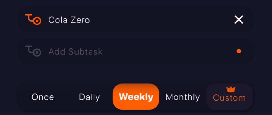
Then I added the task repetition, the time if the task will be repeated, and the start and end date respectively.

For the alarm setting, I added an alarm at the start and end of the task in line with the users’ suggestions. Thus; Especially users who study against time, and solve tests will receive a notification X minutes before the end of the task they are focused on.
Finally, I added a customizable color selection palette, similar to the current design, so that users can choose the color of the task while completing the task creation.
You can test the task creation screen I created with 👉 Protopie prototype 👈
Inbox
Inbox’s integration with Apple Reminders is a well-thought-out feature. However, it’s not as user-friendly as creating reminders in Apple’s Reminders, so it takes a while for users to understand Inbox at first.


The biggest change I made to this screen is to create tasks in the same convenient way as in Reminders. The user can create a task by simply typing the task name and a description if needed. If the user wants to add a task duration or subtasks, just tap the “i” button. Tapping the “i” button opens the task creation screen where the user can fill in the required information.
The task is considered complete when the checkbox to the left of the created task is tapped. If the user accidentally taps the checkbox or changes their mind, a 3-second countdown starts where the “i” button was. This allows users to uncheck the checkbox and stop approving.
Users can hide or make visible completed tasks in the list. They can also enable or disable Apple Reminders synchronization.
Settings
I recreated the flow of the settings, grouping similar sections together and separating some others. I placed the remaining sections in a similar layout.

Bonus Feature
At last; I have added the analysis section to inform the users. All tasks with or without tasks marked as “completed” will be reported for analysis.

In the analysis section users can:
• They can look at the longest task they have done so far.
• They can look at the tasks they have repeated so far.
• For repetitive tasks such as reading a book or doing sports, they can see how many times they have repeated the task, how many hours they have spent on it, or how many times they have missed it.
• They can start a challenge, as in Duolingo.
• In a social context, in challenges all users can see their consistent progress on similar tasks.
In challenges, users are given the chance to miss several times. When the task is due, motivational notifications are sent to users. This encourages users to complete tasks.
Thank you for reading and reviewing this far,
💙 I hope you like my work. 💙


