

NAHNU
BRANDING + EMBALAGENS
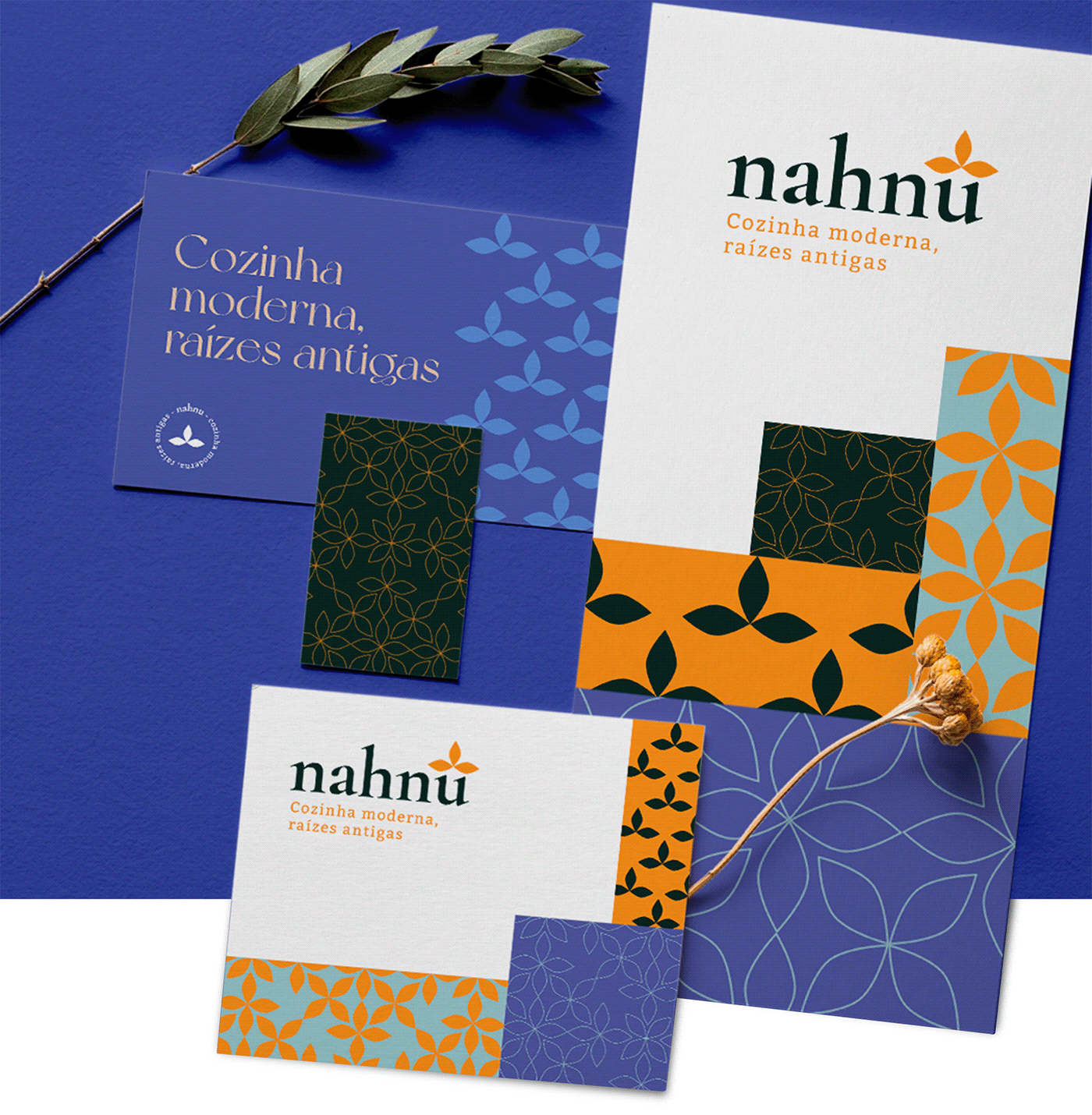
Fui contratado para criar a identidade visual de uma nova empresa focada na venda de produtos da culinária árabe principalmente, feitos por mãe e filha com receitas passadas de geração em geração e com toques de modernidade e personalidade próprias da cliente.
Um dos primeiros passos do desenvolvimento foi a criação do nome, onde diversos processos foram feitos com a cliente a fim de se encontrar um nome que ressonasse com as palavras chave obtidas através do briefing: Família, raízes, cultura, energia e modernidade.
Nahnu significa "nós" em árabe, o que evoca perfeitamente o espírito culinário familiar da história da cliente.
Na busca por um símbolo foi utilizada a forma geometrizada da folha da planta do grão de bico, ingrediente principal da pasta e grão de bico, um dos primeiros produtos pensados para serem comercializados através da marca.
O resultado final é uma identidade visual alinhada com a ideia de modernizar mantendo um pé nas raízes da cultura e culinária libanesa e árabe.
_______________________________________________________________________
I was hired to create the visual identity of a new company focused on selling Arabic cuisine products mainly, made by mother and daughter with recipes passed down from generation to generation and with touches of modernity and the client's own personality.
I was hired to create the visual identity of a new company focused on selling Arabic cuisine products mainly, made by mother and daughter with recipes passed down from generation to generation and with touches of modernity and the client's own personality. One of the first steps in the development was the creation of the name, where several processes were carried out with the client in order to find a name that resonated with the key words obtained through the briefing: Family, roots, culture, energy and modernity.
Nahnu means "we" in Arabic, which perfectly evokes the family culinary spirit of the client's story.
In the search for a symbol, the geometric shape of the leaf of the chickpea plant, the main ingredient of chickpea paste, was used, one of the first products designed to be sold through the brand.
The end result is a visual identity aligned with the idea of modernizing while keeping one foot in the roots of Lebanese and Arab culture and cuisine.


OBRIGADO /// THANKS FOR WATCHING


