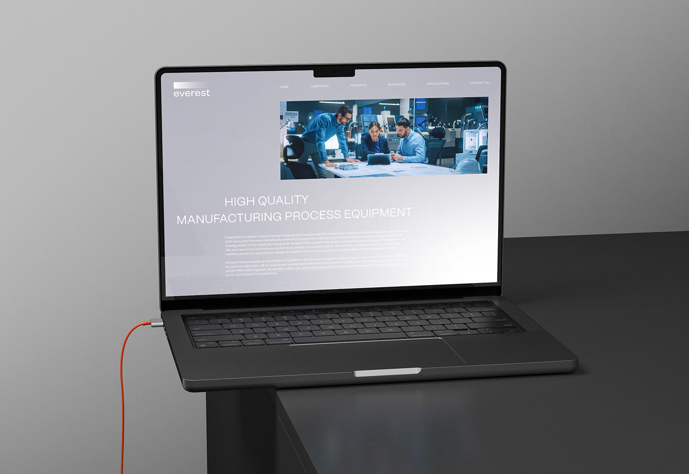
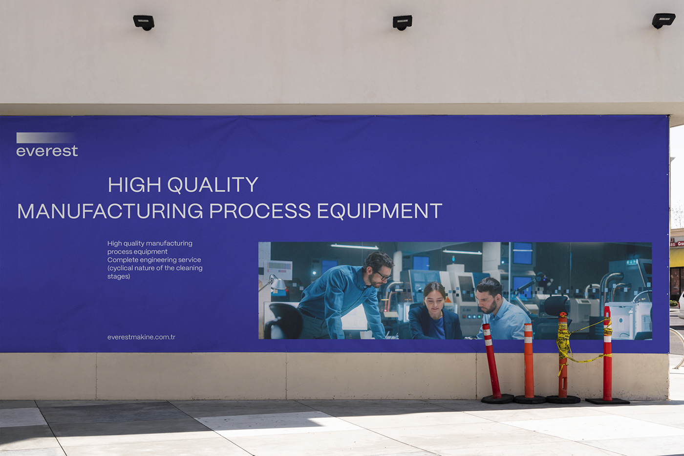
Everest designs and produces innovative industrial cleaning systems offering the complete engineering service in automation. Everest is committed to driving innovation in the cleaning equipment industry with a focus on sustainable and innovative solutions.
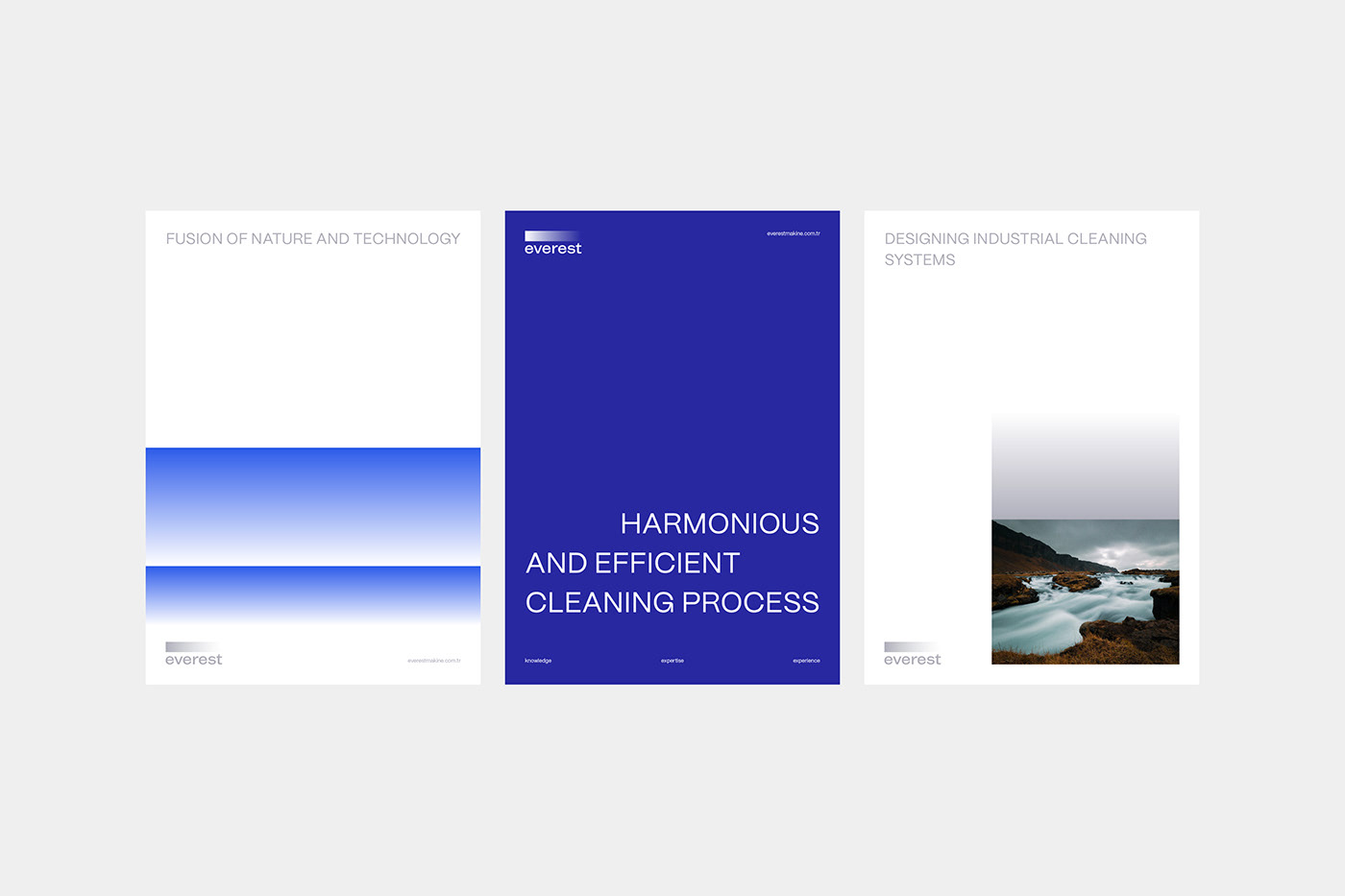
That's why its brand identity aims to visually communicate the stages of cleaning in an engineering system through a harmonious and minimalist approach, reflecting the rhythm, efficiency, and solution-oriented nature of the process.
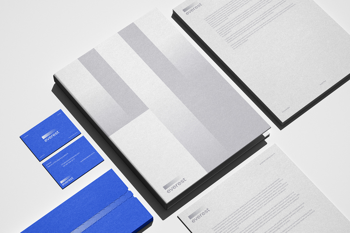
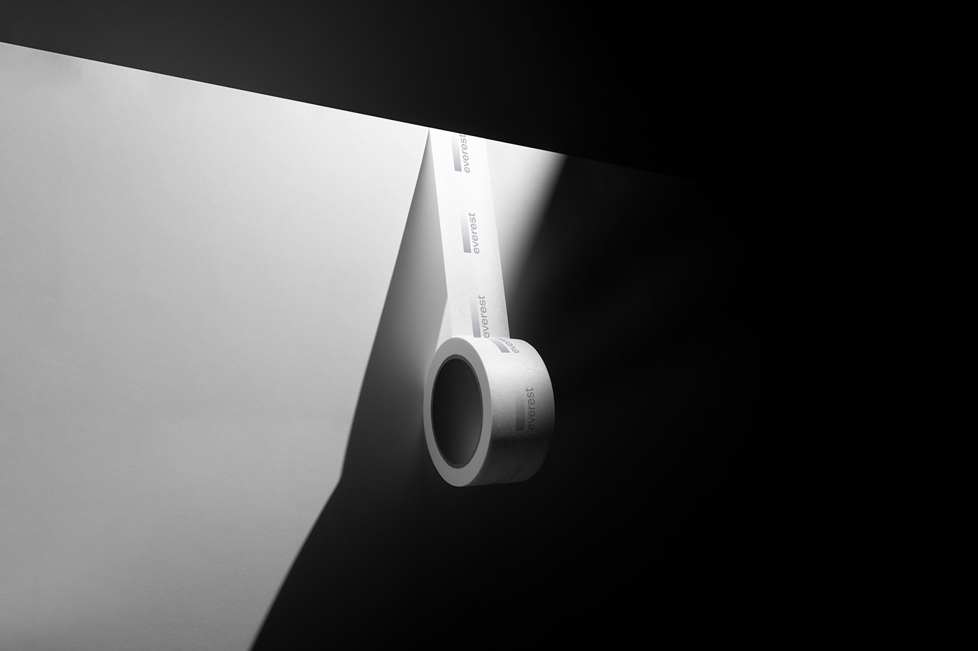
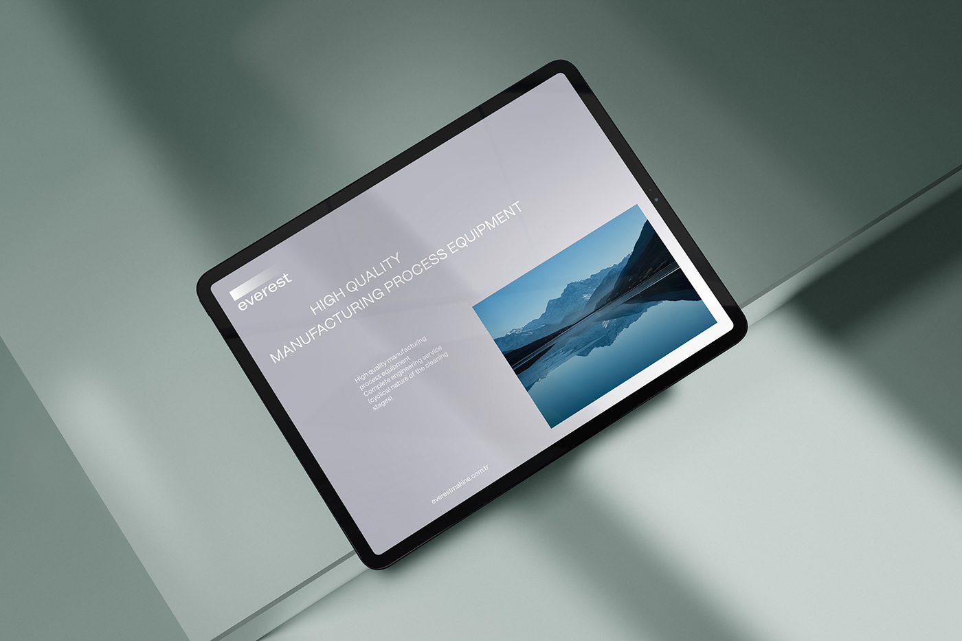
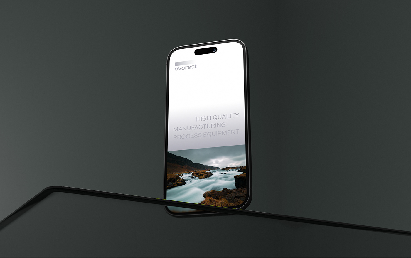
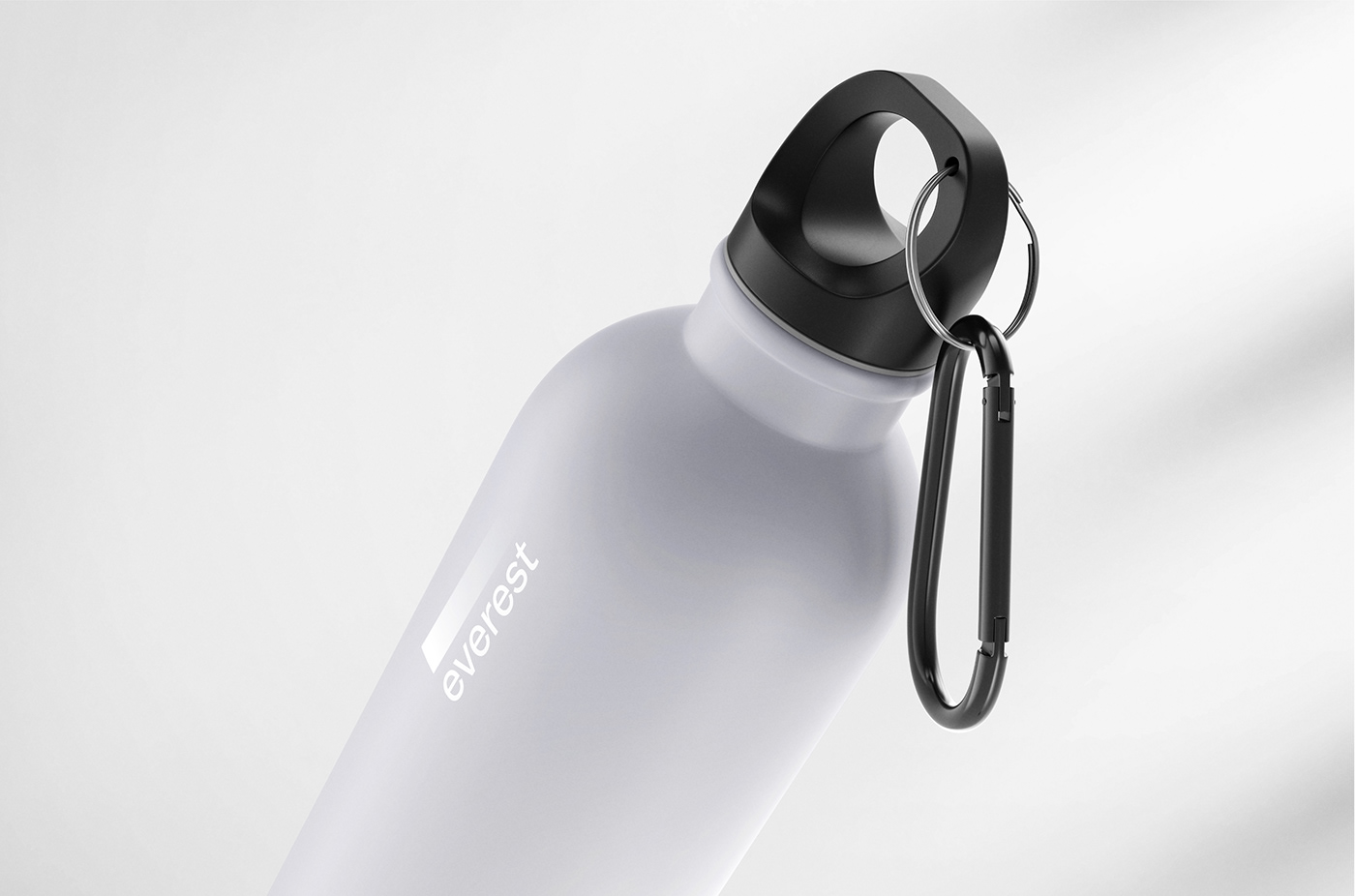
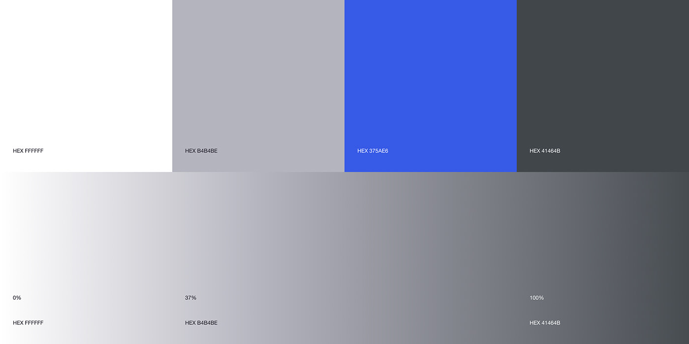
The gradient stripe in the logo symbolizes the flow of water. It evokes a sense of depth and movement, emphasizing the fluidity of the cleaning process. The stainless steel-inspired metallic hues convey to the logo a touch of sleekness and modernity.

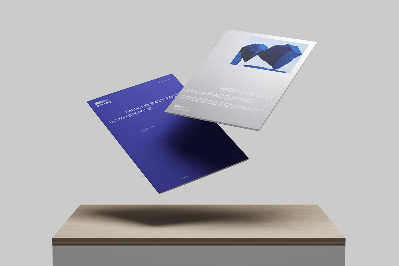
The design concept draws inspiration from nature, incorporating an allegory of purity and minimalism. It embraces streamlined shapes, water, steel color and the idea of cyclical nature of cleaning stages.
The color palette consists of cool tones like stainless steel and shades of blue, which helps to blend the concepts of nature and technology.
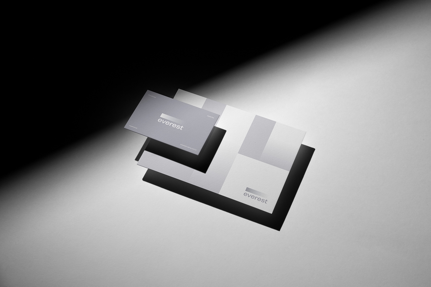
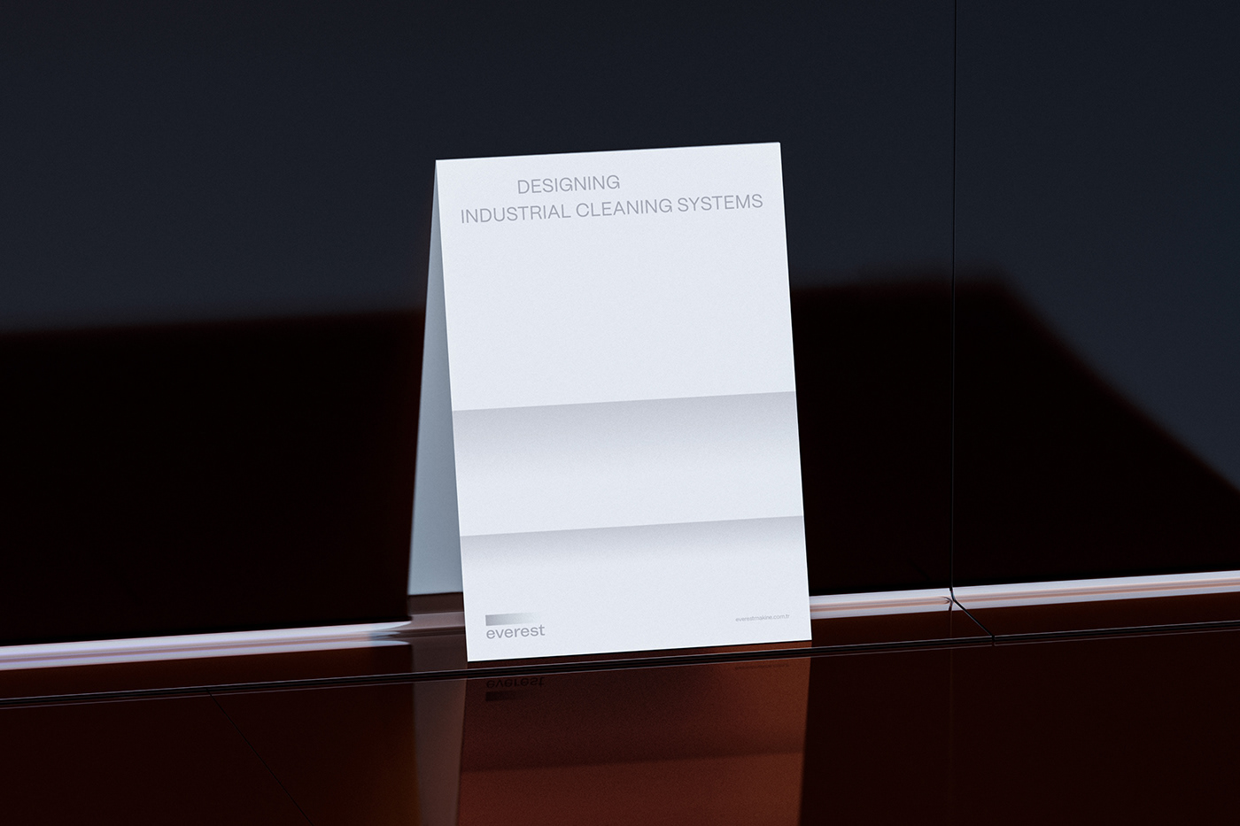
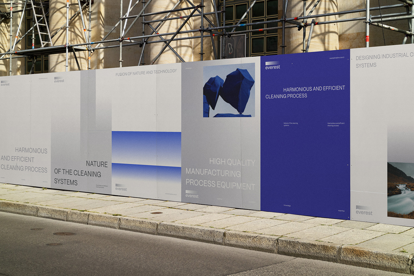
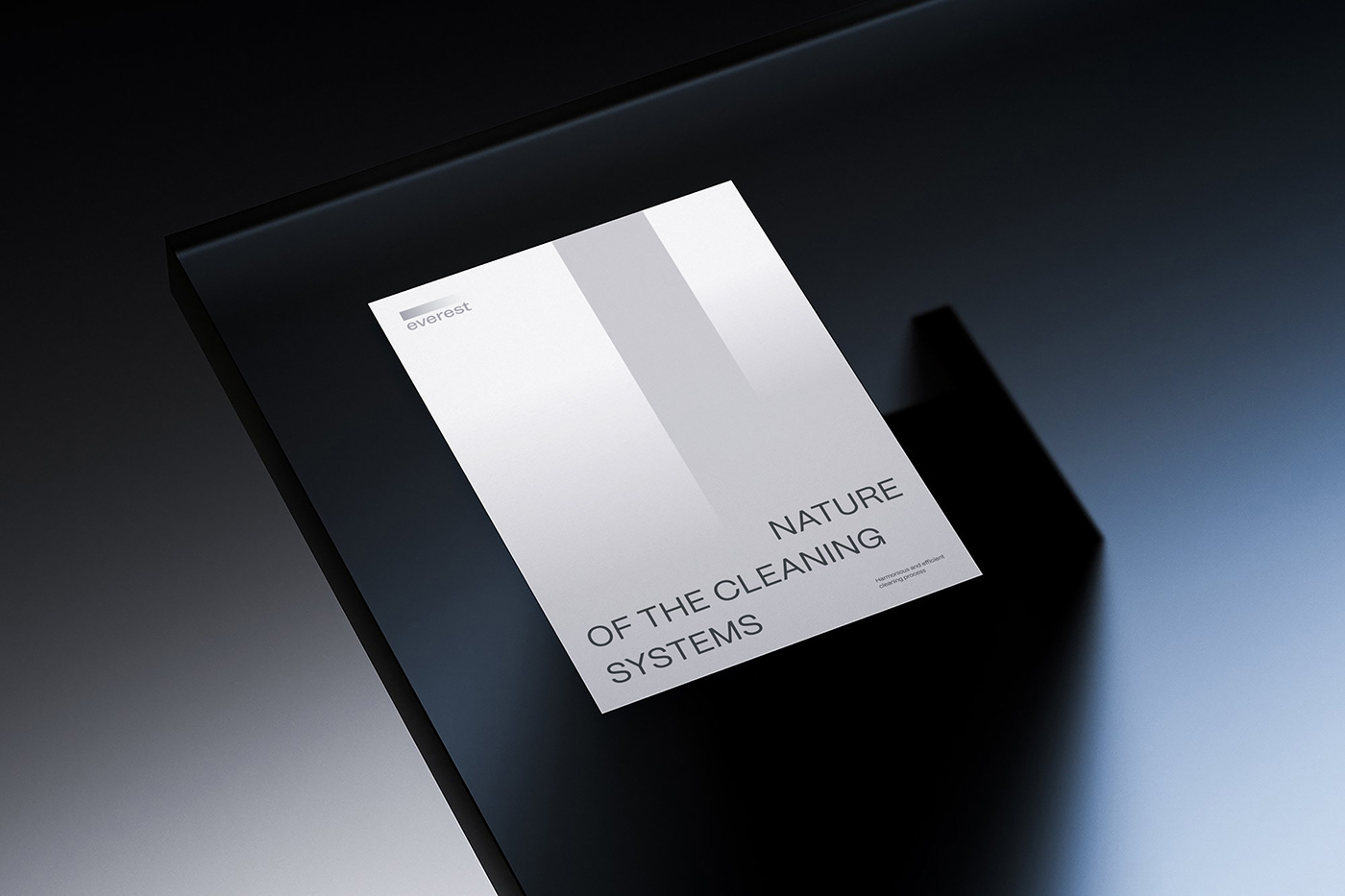
A series of interconnected blocks representing various stages of purification. Each block have a different level of transparency, symbolizing levels of purification achieved at each stage.
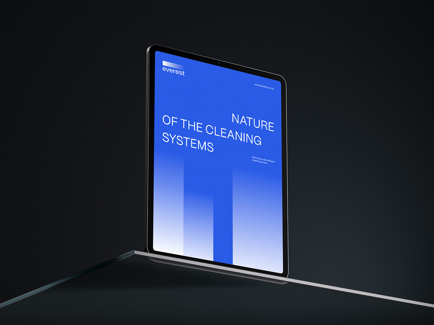
It is essential to have a lot of space and air in the layout system. Blocks of text are always written with a large indentation. The gradient is structured in blocks, resembling rhythm of cleaning stages.