'ABSOLUT VODKA / BULGARIAN NEIGHBORHOOD "KAPANA"
***
LOGO COMPETITION
***
HISTORY OF KAPANA
ABSOLUT VODKA, the leading brand representative of visual arts worldwide, along with ONE DESIGN WEEK and the The Municipality of Plovdiv (Bulgaria), invite graphic designers from all over the world to participate in the ABSOLUT KAPANA LOGO COMPETITION. You get the chance to create the visual identity of KAPANA – the art center of Plovdiv. A logo that tells both the story of its’ past and future will become the neighborhood’s calling card form now to eternity. Now, it is up to you to do the work.
THE GOAL
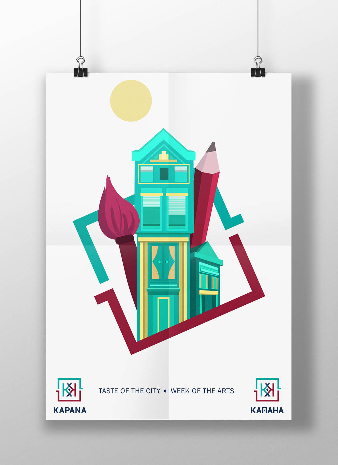
KAPANA is situated right in the center of Plovdiv. A late 19-th century neighborhood, it used to house worksmiths both from the practical and fine side of art. Nowadays, The Municipality of Plovdiv wishes to revive the narrow streets of KAPANA and let local, national and international artists inhabit and evolve with them. Two years ago, Kapana was in ruins, ready to disappear from Bulgaria’s cultural map. Today, the goal is for Kapana to be compared with its Western counterparts like Kreuzberg (Berlin) and Tophane (Istanbul).
A sizeable amount of investments has already set the project on its course. Plovdiv has announced its candidature for European Capital of Culture 2019 and the Municipality has already attracted local and foreign architects, designers and artists to the project.
A sizeable amount of investments has already set the project on its course. Plovdiv has announced its candidature for European Capital of Culture 2019 and the Municipality has already attracted local and foreign architects, designers and artists to the project.
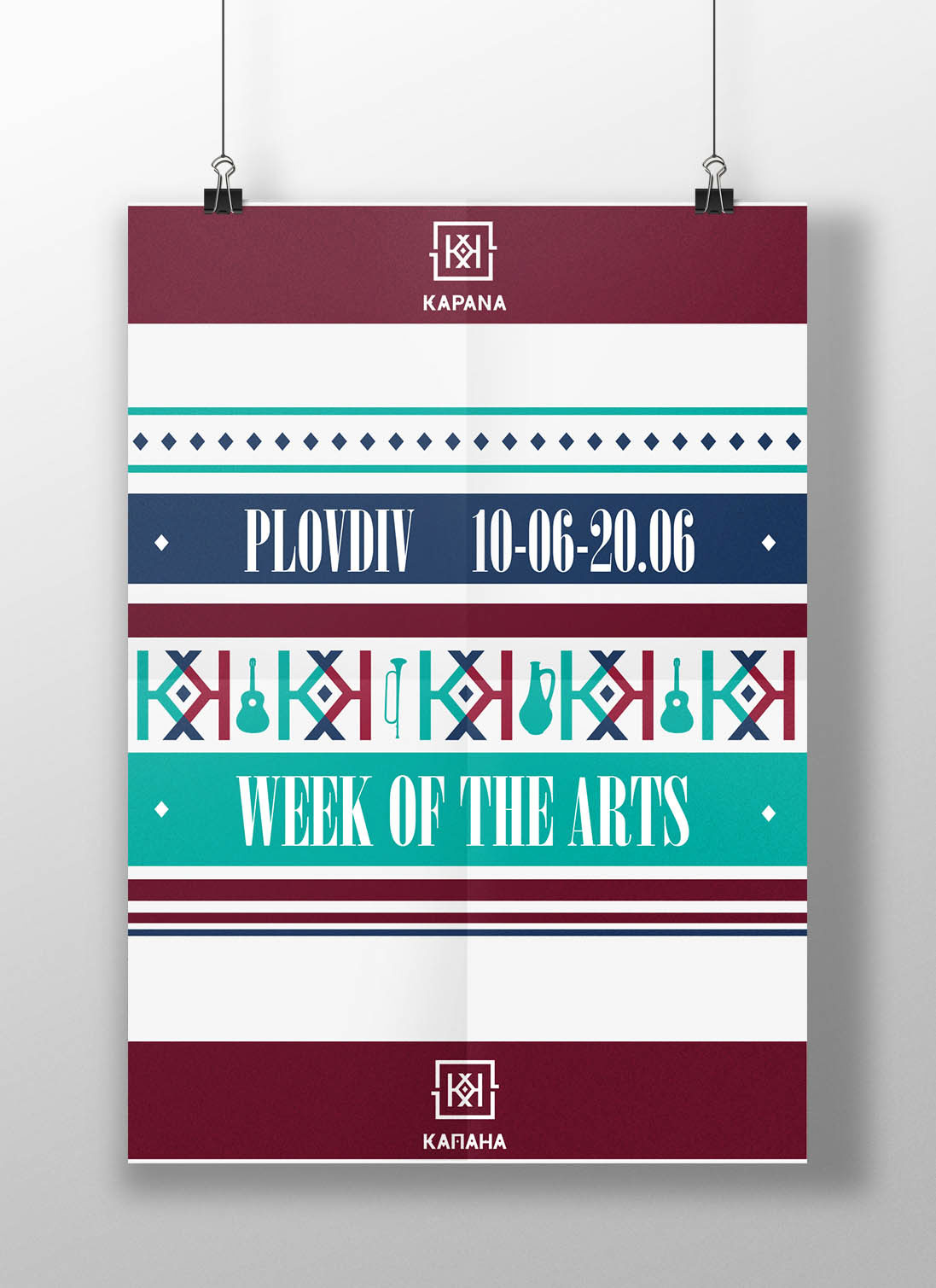
This June, Kapana will gather artists from various creative fields and begin the experiment of turning the neighborhood into a center of art and culture. The winners from a competition conducted by the Plovdiv 2019 Foundation, will occupy and use ten separate spaces in Kapana absolutely free of charge. During the same month, Kapana will be completely transformed by ONE DESIGN WEEK. Designers form Plovdiv, other Bulgarian cities and more than 10 European countries are developing conceptual projects, which will enrich and transform the area.
***
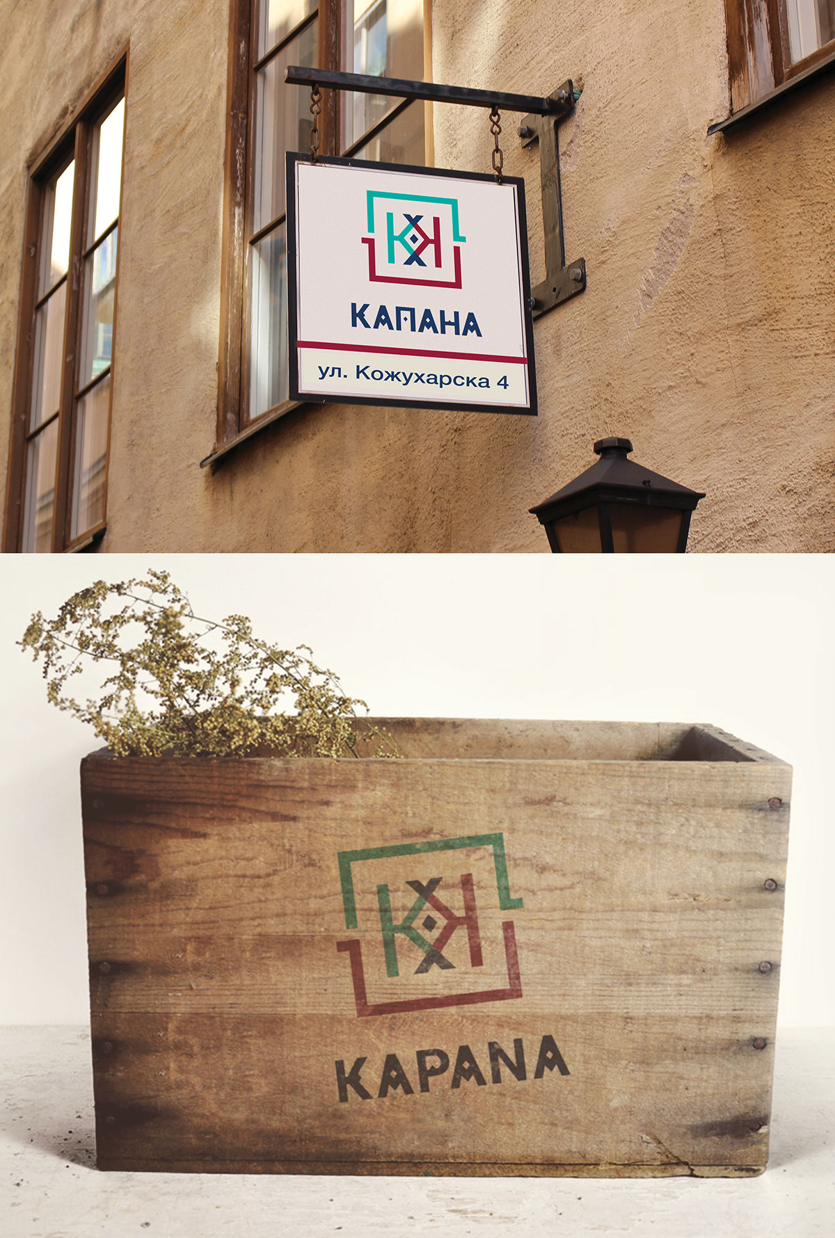
MY IDEA OF THE LOGO PROJECT:
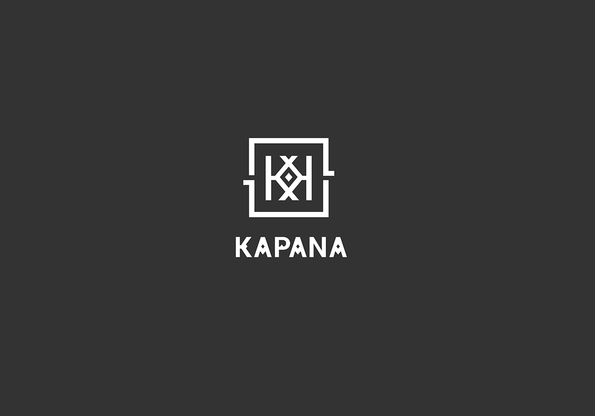
The final look of my vision of the logo is made with few important symbols:
1.The symbol of the labirynth
( as everybody knows , Kapana is an interesting neighborhood
situated in “the old town” in Plovdiv, Bulgaria - a place wich has specific small streets and a place where you can immediately got lost by its similar streets and old houses.
1.The symbol of the labirynth
( as everybody knows , Kapana is an interesting neighborhood
situated in “the old town” in Plovdiv, Bulgaria - a place wich has specific small streets and a place where you can immediately got lost by its similar streets and old houses.
2.The symbol of the bulgarian clothes and folklore decorations
which is important part of old traditional folklore arts in Bulgaria - with that symbol i wanted to make a
connection with the beautifull bulgarian history of arts and old bulgarian handicrafts .
connection with the beautifull bulgarian history of arts and old bulgarian handicrafts .
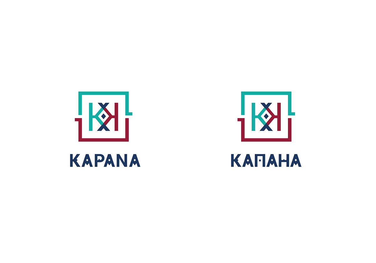
The symbiosis of old looking vision: with the labyrinth and the ethno motiv and new looking minimalistic style: with geometric forms are my idea for logo about that competition where i took place. Unfortunately, i wasn’t among the finalists, but me and some friends and team leaders liked my project and i decided to share it in Behance.

Bulgarian traditional embroidery + labyrinth = my idea of the logo