Joaquim Pacheco is a long-standing, family-owned restaurant known for its delicious piglet dishes. While the restaurant had a loyal customer base, it recognized the need to adapt to changing market dynamics and appeal to a younger, social media-savvy audience, primarily millennials.
Challenge:
The main challenge was to create a rebranding strategy that would modernize Joaquim Pacheco's visual identity, while preserving its legacy and the essence of its renowned piglet dishes. The goal was to attract millennials through an appealing visual identity and effective social media presence.
Research:
We analyzed the branding of similar restaurants targeting younger audiences to identify trends and opportunities.
Solution:
Solution:
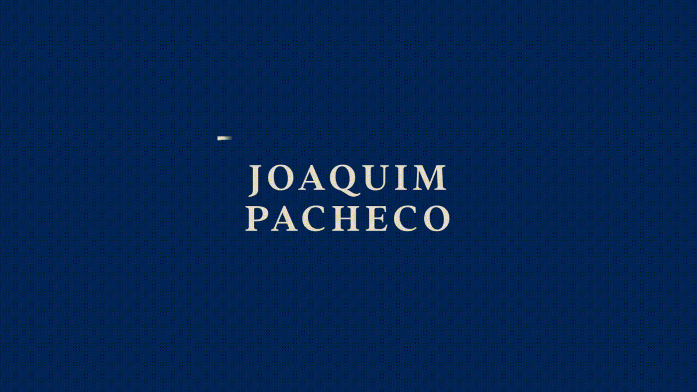
The existing logo was outdated and didn't resonate with the younger generation. Our goal was to create a modern, versatile identity that would not only capture attention but also adapt seamlessly to various mediums and platforms. To achieve this, we decided to infuse the logo with a playful piglet icon, injecting a dynamic vibe into Joaquim Pacheco's visual identity with geometric forms, patterns and colors.
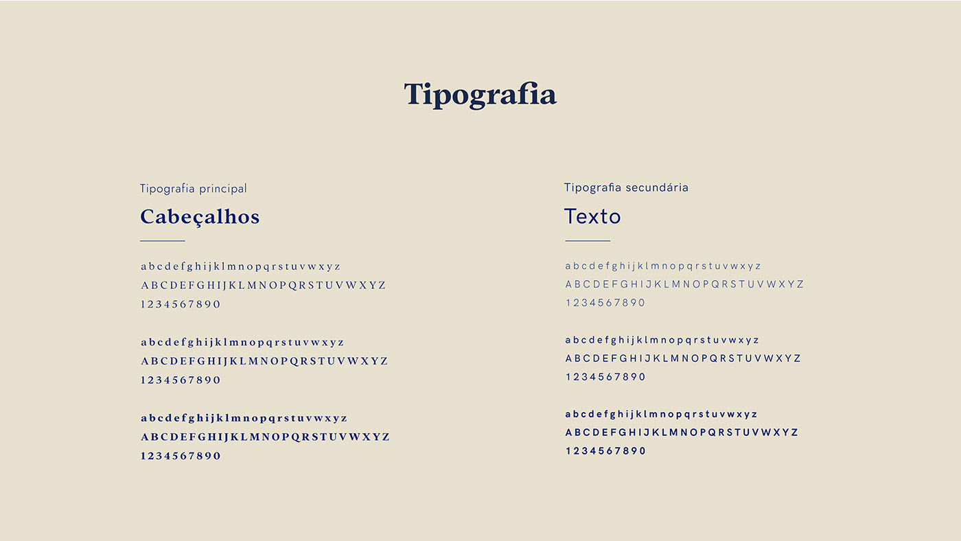
The new serif font combines tradition with contemporary style, effectively aligning with the restaurant's essence.
We introduced a fresh color palette featuring unique shades of blue that set us apart from competitors, along with colors inspired by the piglet theme.
The new serif font combines tradition with contemporary style, effectively aligning with the restaurant's essence.
We introduced a fresh color palette featuring unique shades of blue that set us apart from competitors, along with colors inspired by the piglet theme.
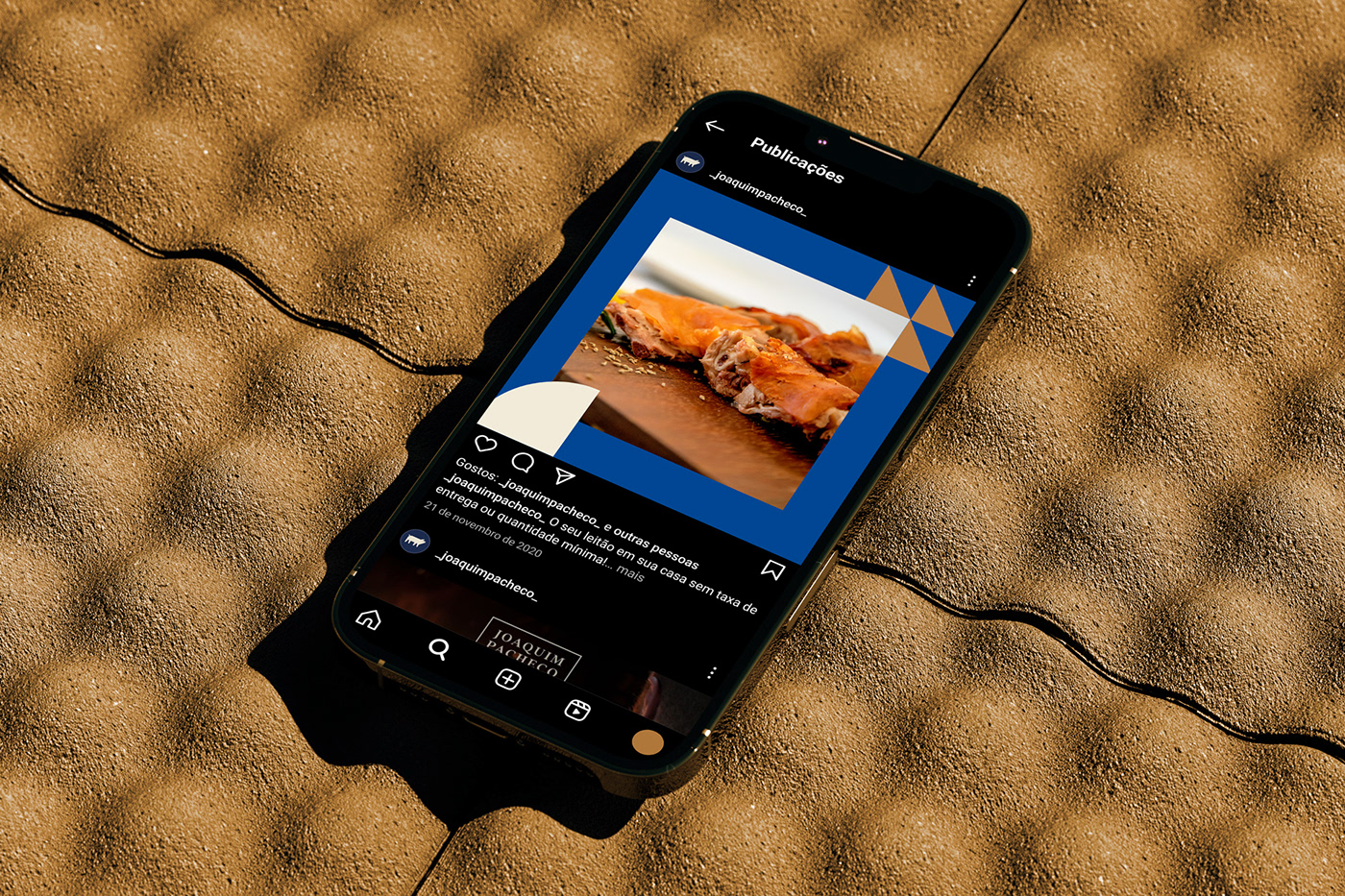
We also developed a library of high-quality images and template posts for social media and revamped the restaurant's website .