CANAL+ Spain, the pay television satellite network, is a brand that has evolved into a worldwide reference for quality, originality and ambition in terms of content. Its commitment to technology has made it possible to bring this product to any time and place, “where and whenever you want”, thereby creating an intense and personalized experience.
The branding project developed by Erretres. The Strategic Design Company, faced the challenge of renewing the brand’s connection with its audience through a completely new identity. Its objective is to transmit the differential experience enjoyed by CANAL+ users, through their own points of view.
This project is rooted in the need to take this platform’s five million users and place them at its core, making them its protagonists.
The project includes the development of the corporate strategy, brand architecture, communication tone and visual identity, as well as the implementation of the above throughout different services and products. This implies a profound change in the company’s corporate culture, made possible through a disruptive project that was internally given the code name “the Erretres project”.
For nearly a year, Erretres has been developing a 360º branding project that includes: core elements, broadcast identity, website and online presence, above and below the line advertising, internal and external communication, social networks, corporate graphics, media and events, retail spaces, vehicles, packaging, merchandising, etc.


The visual identity maintains the original logotype and CANAL+ typography (a variation of Paul Renner’s Futura), but changes everything else in a clearly disruptive way. The incorporation of color and a flat design look – without any striking visual effects – serves to rejuvenate the brand’s positioning. The photographic style facilitates the incorporation of both the content and the brand’s more than 5 million users.
The secondary elements of identity were developed starting with the CANAL+ logotype, thereby expanding the reach of its communications. On the one hand, the logotype becomes a window for incorporating images and for, literally, letting the user in.
The secondary elements of identity were developed starting with the CANAL+ logotype, thereby expanding the reach of its communications. On the one hand, the logotype becomes a window for incorporating images and for, literally, letting the user in.
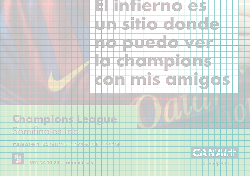
And on the other, the logotype transforms into a dialog box that serves as a graphic tool for the incorporation of titles, messages and, again, the user’s voice. This resource has multiple variations, from highlighting information to underlining titles, or displaying conversations, etc.
Additionally, we developed what we call the “tread”, a reserved area that is located on the pieces’ inferior or superior margins, creating a space where the corporate elements – including the logo, website, contact numbers, Yomvi product and product information – can be incorporated.
The new brand’s launch is being carried out in tandem with the #abusadetuimaginación (abuse your imagination) advertising campaign, and it includes a website (www.erretres.com.abusadetuimaginacion.com) where people can create their own “bumper” to appear on-air. The development of the on air identity was made by Plenty.tv and CANAL+ design team.