The FOUNDATION project, which unites research parents around the topic of Family Wealth.
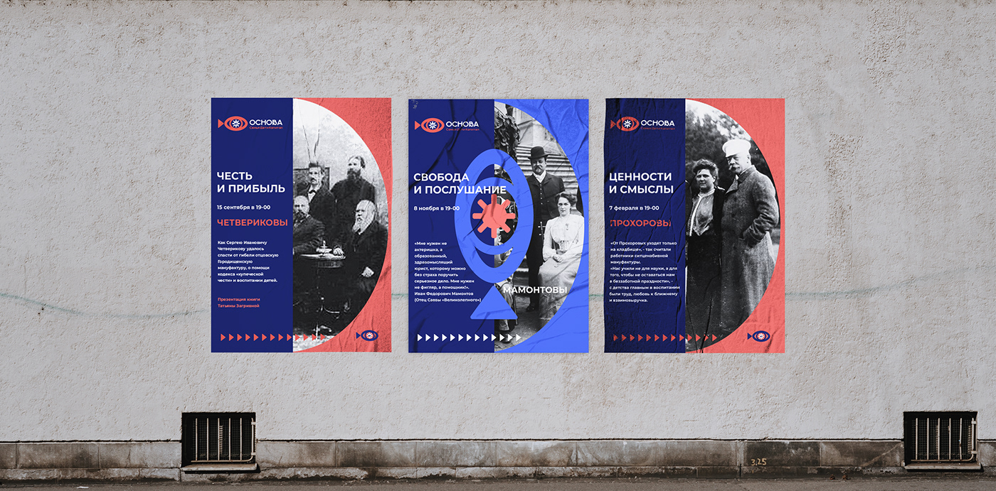
Atmospheric lecture hall. The history of the families of Russian merchants, the methods of raising heirs and our arguments about the type of family capital - financial, intellectual, human.
The task was to create a logo, corporate identity and landing page for the "School of Smart Parents". The idea is to combine lectures on entrepreneurship and family economics with a historical excursion about the life, business and upbringing of children of famous merchant families.
Meetings are accompanied by:
TATIANA ZAGRIVNAYA is the author of the educational practice of developing entrepreneurs in their own lives.
DENIS KOROTYCH is a historian, teacher, entrepreneur.
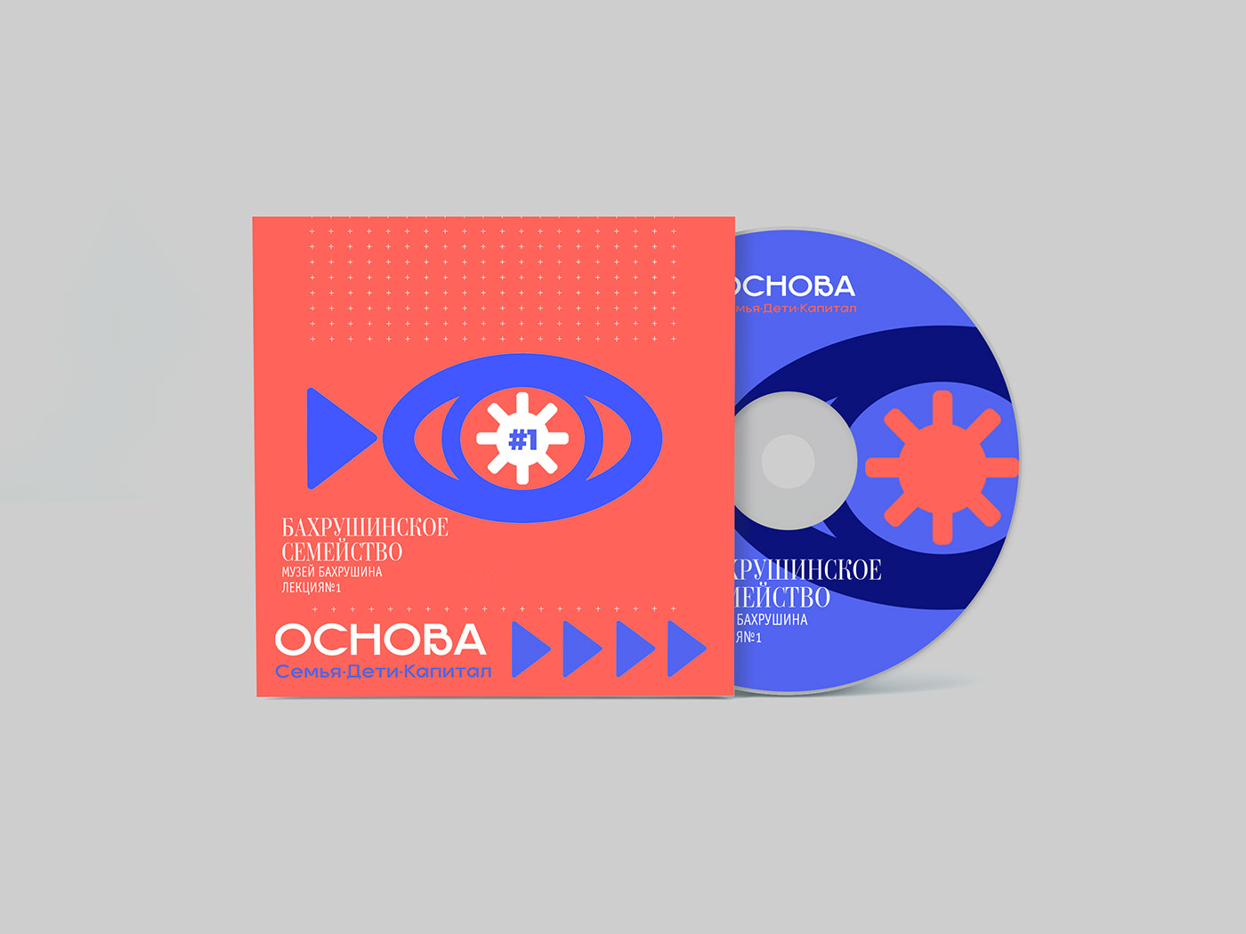
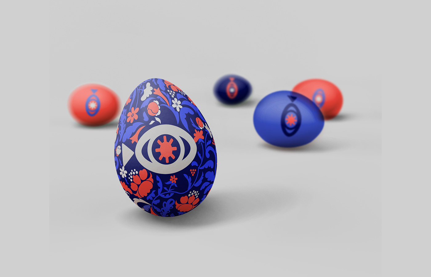
The idea of the logo IS TO COMBINE MODERNITY AND RUSSIAN TRADITIONS. Therefore, the logo has many meanings, there is both the letter O and the eye and the sun with 8 rays, since there will always be eight lectures!! and a computer arrow showing forward movements and a symbolic fish as the basis of Orthodoxy and an egg as the first foundation of the universe. The colors are also chosen for a reason, they are all laid down in the Russian tradition.
The task was to create a logo, corporate identity and landing page for the "School of Smart Parents". The idea is to combine lectures on entrepreneurship and family economics with a historical excursion about the life, business and upbringing of children of famous merchant families.
Meetings are accompanied by:
TATIANA ZAGRIVNAYA is the author of the educational practice of developing entrepreneurs in their own lives.
DENIS KOROTYCH is a historian, teacher, entrepreneur.
The idea of the logo IS TO COMBINE MODERNITY AND RUSSIAN TRADITIONS. Therefore, the logo has many meanings, there is both the letter O and the eye and the sun with 8 rays, since there will always be eight lectures!! and a computer arrow showing forward movements and a symbolic fish as the basis of Orthodoxy and an egg as the first foundation of the universe. The colors are also chosen for a reason, they are all laid down in the Russian tradition.